

Common Desktop Environment: Application Builder User's Guide
5 Creating and Editing Panes, Menus, and Messages
Contents of Chapter:
- Creating and Editing Pane Entities
-
- Child Panes
-
 To Create a Child Pane
 -
- Layered Panes
-
 To Create a Layered Pane
 -
 To View Layered Panes
 -
- Paned Windows
-
 To Create a Paned Window
 -
 To Add a Pane to a Paned Window
 -
 To Unmake a Paned Window
 -
- Creating and Editing Menus
-
- Menu Property Editor
-
 To Create a Menu
 -
 To Edit a Menu
 -
 To Attach an Existing Menu to an Object
 -
 To Create and Attach a Menu
 -
 To Attach an Existing Submenu to a Menu Item
 -
 To Create and Attach a Submenu
 -
 To Create and Attach a Help Menu
-
- Creating and Editing Messages
-
- Message Editor
-
 To Create a Message Dialog Box
 -
 To Edit a Message
 -
 To Connect a Non-Modal Message to a Function
 -
- Example: Writing Code for Messages
-
 To Write Code for Modal Messages
-
 To Write Code for Non-Modal Messages
-
Most App Builder objects are dragged from the windows, panes, or controls palettes. Some objects (layered panes, paned windows, menus, and messages) are created objects. This chapter explains how to create, use, and edit these objects.
There are four types of pane objects on the Panes palette of the App Builder primary window: control pane, text pane, draw area pane, and term pane. In addition, there are three types of created pane entities: child panes, layered panes, and paned windows.
Child Panes
A child pane is a text pane, term pane, or draw area pane that has been dropped on a control pane and made a "child" of the control pane. In App Builder, for example, the Label field in the Label Property Editor is a text pane that is a child of a control pane.
- Drop a text pane, draw area pane, or term pane on a control pane in the interface.
A message dialog box will be displayed, asking if you want to create the dropped pane as a child of the control pane or as a layered pane.
Click Cancel if you do not want to create a child pane or a layered pane.
- Click Child.
The pane will be instantiated at the drop location, just as if it were a control object. The pane will be a sibling of the control objects on the control pane. You will be able to select the pane and move it around on the control pane just like any other control object.
A layered pane is a "stack" of two or more panes, one on top of the other. In App Builder, for example, the Revolving Property Editor, which is used to display the properties of each of the interface objects, is a layered pane.
- Drop a pane on another pane in the interface.
A message dialog box will be displayed, giving you the option to create a layered pane.
If you have dropped a text pane, draw area pane, or term pane on a control pane, you will also have the option to create the object as a child of the control pane.
Click Cancel if you do not want to create a child pane or a layered pane.
- Click Layer.
The pane will be instantiated as a layered pane on top of the pane it was dropped on. Because it is the same size as the original pane, it will obscure the original pane completely. If you resize one of the layers of a layered pane, all panes are resized. See "To View Layered Panes"" for instructions for viewing the layers of a layered pane.
Once you have completed the interface you may want to change the Size Policy of any panes in a layered pane to Fit Contents (the default value is Fixed, which should be retained until the interface is complete). Each of the panes might be a different size.
Note: There is no direct way to unmake a layered pane, but you can accomplish the task by selecting one of the layers and choosing Cut from the Edit menu of the App Builder primary window or from one of the pop-up menus (displayed by pressing mouse button 3 in the interface or in the Module Browser).
If you want to save the layer you cut, select an empty window and choose Paste from the Edit menu. Repeat the Cut and Paste process until there are no more layers (this is easiest to see in the Browser). If you don't want to save the layers, choose Delete instead of Cut.
Only one layer of a layered pane is visible. To view other layered panes:
- Select the visible pane of the layered panes in the interface or in the Module Browser.
Note: Selecting a layered pane in the Browser does not pop the selected pane to the top of the stack of panes in the interface.
- Choose NextLayer from the View menu of the primary window or from the interface pop-up menu (displayed by pressing mouse button 3).
The layer immediately beneath the current pane will be displayed. Repeat this step to view other layers.
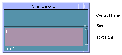
A paned window is a combination of two or more panes (control, text, draw area, or term panes, in any combination) into one virtual window with multiple panes, one above the other, separated by a movable sash. While the paned window maintains a constant height, the individual panes become smaller or larger as you move the sash between them.

A paned window's initial size and position are determined by the position and size of its panes: the left margin of the paned window is determined by the left (West) edge of the pane that is furthest to the left. The width of the paned window is determined by the width of its widest pane.
You can set limits on the minimum and maximum heights of any of the panes by setting Pane Height in the Paned Window property editor. See Appendix B, "Revolving Property Editor," for more details.
Once you have created a paned window you can resize the panes by pressing mouse button 1 or mouse button 2 on the sash and moving it up or down.
- Drag a pane from the Panes palette and drop it on a main window or a custom dialog.
If you want the paned window to span the top of the parent window, drop the pane on the top-left corner of the parent. The pane will be attached to the window at its left and top margins with an offset of 0.
- Resize the pane, if necessary.
If you want the paned window to span its parent window, drag the right edge of the pane beyond the right edge of the window. The pane will be attached to this edge, also.
- Drag one or more additional panes to the main window or dialog and drop them on an unoccupied portion of the window.
- Select all panes that you want to be part of the paned window.
Use mouse button 1 to select one pane and mouse button 2 to select additional panes.
- Choose Make Paned Window from the Layout menu or from the interface or Module Browser pop-up menu (displayed by pressing mouse button 3).
The paned window will be created.
Note: If one of the panes is attached to the right (East) edge of its parent and one or more of the other panes are not attached to the right edge of the parent, the right edge of the panes not attached to the right edge will be attached to the right edge. A message dialog box will be displayed, explaining that the children of the paned window have different East attachments and that the East attachment has been set to that of the rightmost pane. You can adjust the right attachment in the Attachments Editor. Click OK.
- Drop a pane on the paned window.
A message dialog box will be displayed, giving you the option to include the new pane as a child of the control pane (if you drop a text pane, draw area pane, or a term pane on a control pane), create as a layered pane, or to add it to the paned window.
- Click Pane to add the pane to the paned window.
The new pane will be added to the bottom of the paned window.
- Select the paned window.
Select a paned window by clicking at its edge. Be sure you select the paned window and not one of its panes. You will know you have selected the paned window if a dark box is drawn around the paned window.
Or, open the Module Browser and select the paned window there. This is the easiest, surest way to select a paned window.
- Choose Unmake Paned Window from the Layout menu or from the pop-up menu in the interface or the Module Browser (displayed by pressing mouse button 3).
The panes that made up the paned window will become separate panes again.
A menu is a list of items with meaningful labels. Each item is connected to a function which is performed when the menu is displayed and the item is selected. This section explains how to create and edit menus, how to attach menus to objects, and how to connect menu items to programmatic functions.
Menus can be attached to menu buttons, menubar items, lists, and any of the four types of panes. A menu is automatically attached to an option menu, so there is no need to attach a menu to it.
The Menu Property Editor is used to create menus. A menu, unlike most of the objects edited in the Revolving Property Editor, is a created object and is not available from the object palettes.
Only properties unique to a menu object are described here. See "Property Editor: Universal Properties" for descriptions of Object Type, Objects, Object Name, and Color. See "Property Editor: Common Properties" for descriptions of Items, Label, and Item State (Active).
- Add New Menu
- Adds a new menu to the list of menus.
- Edit
- Performs edit functions (Cut, Copy, Paste, Delete) on the selected item in the list of menu objects. Cut and Copy place the selected item in a buffer, ready for Paste. Delete removes the item, but does not place it in a buffer.
- Tearoff
- Specifies whether tearoff is Enabled or Disabled. If tearoff is enabled the selected menu will be "postable." That is, the menu will be displayed until you explicitly dismiss it if you click on the Tearoff indicator (a dotted line).
- Item Label Type
- Specifies the type of label (String, Graphic, or Separator) for the item selected in the Items list. If Graphic is chosen, Label becomes Graphic Filename. If Separator is chosen, Label or Graphic Filename becomes inactive and Line Style becomes active. A Separator menu item is used to create a visual division in a menu, such as that seen in the Editors menu of the App Builder primary window.
- Item Mnemonic
- Specifies one of the letters in the selected item as a keyboard shortcut for choosing the item when the menu is posted. The letter specified will be underlined. Pressing the mnemonic letter when the menu is posted causes that item to be chosen. Note that case is significant and that a particular letter can be used as a mnemonic only once within a menu.
- Accelerator
- Specifies a keyboard shortcut for choosing the selected item. An accelerator is comprised of a prefix (Ctrl, Alt, Meta, or Shift), <key>, and a letter (uppercase or lowercase). To make Control-x an accelerator, for instance, type the following:
- Ctrl<key>x
- When you display the menu in test mode or in the compiled application, Ctrl+x will be included to the right of the menu item label. If you press the Control key and type x with focus in the window that contains the menu, the action specified in the menu item will be performed.
- You can combine the Shift key with one of the other keys to form a compound prefix, if you wish. To make Shift Control-x an accelerator, type the following:
- Shift Ctrl<key>x
- Line Style
- Specifies the type of line style for the selected separator item; active only when Item Label Type is Separator. Choices are None, Etched In, Etched Out, Etched In Dash, Etched Out Dash, Single Line, Double Line, Single Dashed Line, and Double Dashed Line. A separator of the chosen line style will be displayed in the menu instead of a graphic or text label.
- Item SubMenu
- A menu button and a text field for attaching, de-attaching, creating, or editing a submenu for the selected item in the Items list. If a submenu is attached to the selected item, the name of the submenu will be displayed in the text field. Not valid for separator item type.
This description assumes you are creating a menu and attaching it to an interface object as two separate procedures. To combine these procedures, see "To Create and Attach a Menu".
Note: Menus are available within modules only. Be sure the menu created is in the same module as the object you wish to attach the menu to. Menus are created in the current module, which is determined by what is selected in the interface. The Editing Module field in the object information area of the App Builder primary window indicates the current module.
- Display the Menu Property Editor by choosing Menus from the Editors menu in the App Builder primary window.
Or, display the Revolving Property Editor and choose Menu as the Object Type.
Choosing Menus from the Editors menu in the primary window is the same as clicking the Tear-off button in the Revolving Property Editor when the Object Type is Menu.
See "Menu Property Editor" for a description of the editor.
If no menus exist in the current project, the Menu Objects list will be blank and only the Add New Menu and Edit buttons will be active.
If any menus exist in the current project, they will be listed in the Menu Objects list. One of the menus will be selected in the list and the menu's properties will be displayed for editing.
- Click Add New Menu.
A menu will be created with a default Object Name ("menu," "menu2," and so on, depending on how many menus there are in the current module), and with two items in the Items list ("Item1" and "Item2"). The menu will be added to the end of the Menu Objects list, with the name of the current module preceding the menu name. The menu will have default values for Object Name, Tearoff, Items, Item Label Type, Label, and Item State.
If you know you are going to need a number of menus, you could create them all at the same time by clicking Add New Menu the appropriate number of times. You can also create menus that will be used as submenus, to be attached to menu items, at this time.
- Edit the menu, as described in "To Edit a Menu".
You can edit the menu immediately after creating it or you can edit it later.
After you have created and edited a menu you will want to attach it to an interface object and make the menu functional by creating connections between menu items and specific actions. See "To Attach an Existing Menu to an Object" and "Connecting Menu Items to Actions" for instructions. See "To Attach an Existing Submenu to a Menu Item" if you want to attach a submenu to a menu item.
After creating a menu you will need to edit the menu: add menu items, give the menu items meaningful names, add submenus, and so on.
- Display the Menu Property Editor by choosing Menus from the Editors menu in the App Builder primary window.
Or, display the Revolving Property Editor and choose Menu as the Object Type.
See "Menu Property Editor" for a description of the editor.
- Change Object Name, if necessary.
The automatically-generated Object names, which are unique within modules, do not usually need to be changed.
- Click Enabled to enable the Tearoff function, if necessary.
This will make the menu "postable," meaning that if you click on the Tearoff indicator (a dotted line) the menu will not be dismissed as soon as you select a menu item. The menu will remain posted until you dismiss it.
- Add menu items to the Items list, if necessary.
Click Add Item to add an item after the selected item; choose from the Edit menu button to perform other edit functions.
- Change Item Label Type for menu items in the Items list, if necessary.
Choices are String (text), Graphic, or Separator. Label becomes Graphic Filename if Graphic is chosen; Line Style becomes active if Separator is chosen.
- Type a different Label or Graphic Filename for the selected item, if necessary.
Note: The easiest way to edit labels for menu items is to select the first one in the Items list, thus selecting it in the Label field. Type a new name and click Return. The new name will be displayed in the Items list and the next item in the list will be selected. Continue down the list with this select, type, Return process until all labels are completed.
If Graphic Item Label Type was chosen, the Graphic Filename must be an xpm or xbm graphic file.
- Type an Item Mnemonic, if necessary.
Type one of the letters in the item label. That letter will be underlined in the menu item label. If the menu is posted, pressing that key will cause the action connected with the menu item to be performed.
Note: The same mnemonic letter, regardless of case, cannot be used more than once in a menu.
- Type an Accelerator, if necessary.
An accelerator is comprised of a prefix (Ctrl, Alt, Meta, or Shift), <key>, and a letter (uppercase or lowercase). See "Menu Property Editor" for more information.
- Choose a Line Style, if Item Label Type is Separator.
See "Menu Property Editor" for the list of choices.
- Attach an Item Submenu, if appropriate.
See "To Attach an Existing Submenu to a Menu Item" for instructions.
- Change Item State, if necessary.
By default the item state is Active. If you want the menu item to be inactive when the application is started, click the Active check box to deselect it.
- Select Background and Foreground Colors, if necessary.
Type in a color or choose Color Chooser from the menu and select a color from the Color Chooser. See "To Select Colors from the Color Chooser" for details.
- Click Connections to add programmatic connections to menu items, as necessary.
See "Connecting Menu Items to Actions" for instructions.
- Click Apply or OK to apply the changes.
If you click Apply the property editor will remain displayed.
The following instructions assume you have created one or more menus as described in "To Create a Menu" and that you are ready to attach a menu to an object in the interface. Menus can be attached to menu buttons, menubar items, lists, and any of the four types of panes. A menu is automatically attached to an option menu, so there is no need to attach a menu to it.
- Display the Revolving Property Editor with the object to which you wish to attach a menu selected in the editor.
Double-click the object in the interface or the Module Browser or choose the appropriate Object Type in the Revolving Property Editor and select the desired object in the Objects list.
- Select a menu to attach to the selected object.
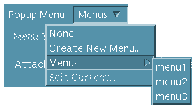
Click mouse button 2 or press mouse button 1 or 3 on the Popup Menu or Pulldown Menu menu button. Choose the appropriate menu from the Menus submenu.

The name of the selected menu will be displayed in the text field of the Popup Menu or Pulldown Menu.
- Click OK or Apply.
The menu will be attached to the selected object. See "Making Connections Between Objects" for instructions for making the menu functional.
Note: If you attach a menu to one of the pane objects or to a list, the menu will be a pop-up menu, displayed in test mode or in the compiled application by pressing mouse button 3 with the cursor on the pane or the list.
One method of creating and attaching a menu to an object is described in "To Create a Menu" and "To Attach an Existing Menu to an Object". With the method described here you create and attach the menu at one time. Use whichever method is most convenient.
- Display the Revolving Property Editor with the object to which you wish to attach a menu selected in the editor.
Double-click the object in the interface or the Module Browser or choose the appropriate Object Type in the Revolving Property Editor and select the desired object in the Objects list.
- Choose Create New Menu from the Pulldown Menu or Popup Menu button available for some objects.
Pulldown menus are available for menu buttons and menu bars. Popup menus are available for all pane objects and for lists. An Item SubMenu is available for menus themselves.
The Menu Property Editor will be displayed, with a newly-created menu selected in the Menu Objects list. The menu will have default values for Object Name, Tearoff, Items, Item Label Type, Label, and Item State.
The Object Name will be of the form "object_type_menu," "object_type_menu2," and so on., depending on what type of object was selected in the property editor when Create New Menu was chosen and how many menus have been created for the current module. The menu will be added to the end of the Menu Objects list, with the name of the current module preceding the menu name.
- Edit the menu and click OK to apply the changes and dismiss the Menu Property Editor.
See "To Edit a Menu" for instructions. You can edit the menu later if you like.
- Click Apply or OK in the Revolving Property Editor to attach the menu to the selected object.
See "Making Connections Between Objects" for instructions for making the menu functional.
The following instructions assume you have created two or more menus as described in "To Create a Menu" and that you are ready to attach one of them as a submenu for a menu item.
- Display the Menu Property Editor or the Revolving Property Editor with Menu chosen as the Object Type.
- In the Menu Objects or Objects list select the menu that contains the menu item to which you want to attach a submenu.
- In the Items list select the menu item to which you want to attach a submenu.
- Select a menu to attach to the selected menu item.
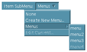
Click mouse button 2 or press mouse button 1 or 3 on the Item SubMenu menu button. Choose the appropriate menu from the Menus submenu.

The name of the selected menu will be displayed in the text field of the Item SubMenu.
- Click OK or Apply.
The submenu will be attached to the selected menu item. See "Making Connections Between Objects" for instructions for making the submenu functional.
 To Create and Attach a Submenu
The following instructions assume you have created one or more menus and that you want to create and attach a submenu to one of the items in one of the menus. With this method you create the submenu and attach it as part of a single procedure. Another method for accomplishing this task is to create the menu as described in "To Create a Menu" and to attach it to a menu item as described in "To Attach an Existing Submenu to a Menu Item". Use whichever method is most convenient.
Note: When you create and attach a submenu you will be using two editors--one to create the menu and the other to attach the submenu to the menu item. If you start this procedure in the Menu Property Editor, you will be attaching the submenu in the Menu Property Editor but creating it in the Revolving Property Editor. If you start the procedure in the Revolving Property Editor, you will be attaching the menu there but creating it in the Menu Property Editor.
The example below assumes you are starting the procedure in the Menu Property Editor.
- Display the Menu Property Editor by choosing Menus from the Editors menu of the App Builder primary window.
- In the Objects list select the menu that contains the menu item to which you want to attach a submenu.
- In the Items list select the menu item to which you want to attach a submenu.
- Choose Create New Menu from the Item SubMenu menu.
The Revolving Property Editor will be displayed, with the new menu selected in the Objects list.
- Edit the menu and click OK to apply the editing changes you made and to dismiss the Revolving Property Editor
See "To Edit a Menu" for instructions. You can edit the menu later if you like.
- Click Apply in the Menu Property Editor to attach the submenu to the menu item selected in Step 2. See "Connecting Menu Items to Actions" for instructions for making the submenu functional.
A help menu at the right end of the menu bar in the application primary main window is a common feature of applications. Do the following to create a help menu and attach it to the Help item of a menu bar. These instructions assume you have included a menu bar in the primary main window and that Help is one of the menu bar items.
- Display the Revolving Property Editor with Menubar selected in the editor.
Double-click the appropriate menu bar in the interface or the Module Browser or choose Menubar from the Object Type menu in the Revolving Property Editor and select the desired menu bar in the Objects list. This will normally be the menu bar in the primary main window.
- Select Help in the Items list.
This is the Help item on the menu bar.
- Click mouse button 2 or press mouse button 1 or 3 on the Pulldown Menu menu button. Choose Create New Menu from the Menus submenu.
The name of the new menu will be displayed in the text field of the Pulldown Menu and the Menu Property Editor will be displayed with the new menu loaded.
- Edit the menu.
a. If you want a Help menu that looks like the App Builder Help menu, for instance, add four items to the two default items in the Items list. Select each item in turn and type appropriate labels (Overview, Tasks, Reference, On Item, Using Help, and About [application_name], for instance).
b. Add item mnemonics and accelerators, if appropriate.
See "Menu Property Editor" for details.
c. Make other changes to the menu, if appropriate.
- Click OK or Apply in the Menu Property Editor.
The menu is complete. The Menu Property Editor will be dismissed if you click OK.
- Click OK or Apply in the Revolving Property Editor.
The Help menu has been attached to the Help item in the menu bar. The Revolving Property Editor will be dismissed if you click OK.
This section describes the Message Editor and explains how to create and edit message dialog boxes.
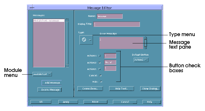
The Message Editor is used to create various types of messages to be displayed at appropriate times in the compiled application. It is shown in Figure 5-1 and then described. See "To Create a Message Dialog Box" and "To Edit a Message" for instructions on its use.
Figure 5-1 Message Editor

- Messages
- Lists all messages for the current project. The module name precedes the message name in the list.
- Module menu
- Specifies the module for which you wish to add a new message. The module name precedes the message name in the Messages list.
- Add Message
- Adds a new message to the Messages list and to the current project. The message is for the module selected in the module option menu.
- Delete Message
- Deletes the selected message.
- Name
- Specifies the instance name of the current message object. Messages are given names such as "message," "message2," "message3," by default.
- Dialog Title
- Specifies the title that will appear at the top of the message dialog box.
- Type
- Specifies the type of message to be created. The choices are Error, Information, Working, Question, and Warning. The message type appears above the message text pane. The appropriate message icon appears in the message dialog box in the compiled applications.
- Message text pane
- A text pane for entering the text of the message. Press Return when you want the text to start a new line. The label above the text pane varies, depending on what type of message you have chosen.
- Button check boxes
- Specifes which buttons will be included at the bottom of the message dialog box. Each message type has a different set of buttons specified by default; these default choices can be changed. Actions associated with the Action1, Action2, Action3, and Cancel buttons are set in the Connections Editor. See "To Create a Message Dialog Box" for detailed instructions.
- Default Button menu
- Specifies the default button for the selected message dialog.
- Connections
- Displays the Connections Editor for specifying what functions to call for each of the Action buttons and the Cancel button.
- Help Text
- Displays the Help Editor, in which you write help text to be displayed when the Help button is clicked in the message dialog box.
- Show Dialog
- A push button for displaying the selected message in a message dialog box that looks like the actual dialog box in the compiled application. Click one of the buttons other than Help to dismiss the dialog box.
See "Property Editor: Common Buttons" for descriptions of the buttons at the bottom of the editor.
See "Message Editor" for descriptions of each of the fields in the editor. See "To Connect a Non-Modal Message to a Function" for a discussion of how to connect messages to the functions that cause them to be displayed, with examples.
- Choose Messages from the Editors menu of the App Builder primary window to display the Message Editor.
- Choose the module to which you want to add a message in the option menu below the Messages list.
- Click Add Message.
A unique name ("message," "message2," and so on, depending on how many messages are in the current module) will be displayed in the Name field. The module name and the message name will be added to the Messages list.
- Modify the Name if you wish.
This is the name used to identify the message internally--in the Connections Editor, for instance. This name is not displayed in the compiled message dialog box.
- Type a title for the message dialog in the Dialog Title field.
This will appear in the title bar of the compiled message dialog box.
- Choose a message type from the Type menu.
The icon for the message type will be displayed in the Type menu and the message type (Error, Information, Working, Question, or Warning) will be displayed above the message text pane (to the right of the Type menu).
- Type the message text in the message text pane, pressing Return when you want a new line to start in the compiled message.
- Specify which buttons will appear in the message dialog box by clicking the check boxes below the message text pane and typing the labels you want on the Action1, Action2, and Action3 buttons.
Each of the message types includes a default set of buttons that you can modify:
- Error: Action2 (Retry), Cancel, Help.
- Information: Action1 (OK), Help.
- Working: Action1 (Close), Action2 (Stop), Help.
- Question: Action1 (Yes), Action2 (No), Help.
- Warning: Action2 (Continue), Cancel, Help.
- Choose a default button from the Default Button menu.
This is the button that will have an extra border when the message dialog box is displayed. This is the button that will be activated if Return is pressed. Each of the message types has a default Default Button that you can modify:
- Error: Action2
- Information: Action1
- Working: Action1
- Question: Action1
- Warning: Action2
- Click the Help Text button and create help text, as appropriate.
See "To Create Help" for instructions.
- Click OK or Apply to apply the changes.
The Message Editor will be dismissed if you click OK.
- Choose Messages from the Editors menu of the App Builder primary window to display the Message Editor.
- Select the message you want to edit in the Messages list.
- Edit the message, as appropriate.
- To delete a message, click Delete Message.
- To modify the dialog box title, click in the Dialog Title text field and type the new label.
- To change the message type, choose a different Type icon.
- To modify the message text, click in the message text pane and type the appropriate changes.
- To change the available buttons, select the check boxes and type new button labels, if appropriate.
- To change the default button, choose another from the Default Button menu.
- To modify help text, click Help Text, make the changes in the Help Editor, and click OK in the Help Editor.
- Click OK or Apply to apply the changes.
The Message Editor will be dismissed if you click OK.
See "Example: Writing Code for Messages" for a discussion of how to connect a message to the function that causes it to be displayed, with examples. In particular, read that section to see how to attach a modal (blocking) message to a function.
- Display the Connections Editor by clicking Connections in the Message Editor or by choosing Connections from the Editors menu of the App Builder primary window.
If you select a message in the Message Editor and click Connections, the selected message will be selected in the Source list of the Connections Editor. You can skip the next two steps.
- Display messages in the Source list by choosing Message from the Source menu.
- Select a message in the Source list.
- Choose Call Function as the Action Type.
This activates the When menu on the Source side of the Connections Editor.
- Choose a When item (Action1, Action2, Action3, or Cancel Activated, depending on which buttons were checked in the Message Editor).
- Type the name of the Function to be called when the selected button is selected.
When code is generated, this function is created in <module_name>_stubs.c. You will have to substitute appropriate code before running make.
- Click Connect to create the connection.
The connection will be displayed in the View list at the bottom of the Connections Editor.
- Repeat the previous three steps for each button except Help.
- Click Cancel to dismiss the Connections Editor.
Once you have created a message as described in "To Create a Message Dialog Box", you must determine when and how it should be displayed. Usually messages are displayed after a certain piece of logic has been executed. For example, if a user types digits in a text field that is designed to accept a name, you will want to post an error message informing the user that digits are not valid.
Message boxes in Motif can be displayed in one of two ways: modally or non-modally (equivalently, blocking or non-blocking). The App Builder code generator (dtcodegen) supplies two routines, corresponding to the two modes of display. They are found in dtb_utils.c and are named:
- dtb_show_modal_message()
- dtb_show_message()
If you want to display a particular message modally, use dtb_show_modal_message(). If you want to display a particular message non-modally, use dtb_show_message().
One of the key differences in the way these two types of of messages are handled is in how the application determines which button was pressed by the user in the message dialog box. For non-modal messages callbacks are added to each button via the Connections Editor. When the user clicks a button the corresponding callback is called. Since modal dialogs are blocking, the button callbacks are not called. Instead, the value is returned by dtb_show_modal_message, which indicates which button is pressed by the user.
 To Write Code for Modal Messages
If a message is to be displayed modally, use dtb_show_modal_message(). This routine returns a value which indicates which message box button the user has pressed. The value is an enum that is defined in dtb_utils.h:
/*
 * Returns answer value for modal MessageBox
 */
typedef enum {

    DTB_ANSWER_NONE,
    DTB_ANSWER_ACTION1,
    DTB_ANSWER_ACTION2,
    DTB_ANSWER_ACTION3,
    DTB_ANSWER_CANCEL,
    DTB_ANSWER_HELP

} DTB_MODAL_ANSWER;
You can then examine the return value (for example via a switch statement) and execute the appropriate piece of code.
Here's an example of displaying a message modally. Say that you have created a simple application, named foo. The project is named foo.bip and consists of one module, foo.bil. The module foo.bil consists of a main window, control pane, and two text fields, one for the user to enter a person's first name and the other to enter the last name. If the user types digits, an error message will be posted, informing the user that digits are not allowed, and giving the user a couple of options. The user can start over, which means the text entered will be erased, or the user can continue, which means that the text entered will be left intact, giving the user discretion as to how to modify the text.
A call-function connection is made for both text fields, which will be called each time the user types something. The function for the first text field will check if the character typed is a digit. If so, it will post the error message modally:
void
verify_first_nameCB(
    Widget widget,
    XtPointer clientData,
    XtPointer callData
)
{
    /*** DTB_USER_CODE_START vvv Add C variables and code below vvv ***/
    char                *text = (char *)NULL;
    int                 textlen = 0;
    DTB_MODAL_ANSWER    answer = DTB_ANSWER_NONE;
    DtbFooMainwindowInfo instance = (DtbFooMainwindowInfo) clientData;
    /*** DTB_USER_CODE_END   ^^^ Add C variables and code above ^^^ ***/

    /*** DTB_USER_CODE_START vvv Add C code below vvv ***/

    text = XmTextFieldGetString(widget);
    if ((text != NULL) && (*text != NULL))
    {
        textlen = strlen(text);
        if (isdigit(text[textlen-1]))
        {
            dtb_foo_message_initialize(&dtb_foo_message);
            answer = dtb_show_modal_message(instance->textfield,
                        &dtb_foo_message, NULL, NULL, NULL);
            switch (answer)
            {
                case DTB_ANSWER_ACTION1:        /* Start Over */
                    XmTextFieldSetString(widget, "");
                    break;

                case DTB_ANSWER_ACTION2:	/* Continue */
                    break;
            }
        }
    }

    /*** DTB_USER_CODE_END   ^^^ Add C code above ^^^ ***/
}
 To Write Code for Non-Modal Messages
If you want to post a non-modal message, use dtb_show_message(). Since this function is not modal and does not return a return value, callbacks for the message box buttons should be specified via the Connections Editor, as described in "To Connect a Non-Modal Message to a Function". The buttons that are specified for the message box are displayed as When items for the message object in the Connections Editor.
Using the same example as above, make the last name text field display the error message non-modally if the user types a digit. As previously mentioned, first you'll need to make a couple of call-function connections for the two buttons in the message box, labelled "Start Over" and "Continue." When code is generated, add code to those routines to do the right thing. The start over routine will clear out the text field and the continue routine will do nothing, in this case.
void
verify_last_nameCB(
    Widget widget,
    XtPointer clientData,
    XtPointer callData
)
{
    /* DTB_USER_CODE_START vvv Add C variables and code below vvv*/
    char                *text = (char *)NULL;
    int                 textlen = 0;
    DtbFooMainwindowInfo instance = (DtbFooMainwindowInfo) clientData;

    /* DTB_USER_CODE_END   ^^^ Add C variables and code above ^^^*/

    /*** DTB_USER_CODE_START vvv Add C code below vvv ***/

    text = XmTextFieldGetString(widget);
    if ((text != NULL) && (*text != NULL))
    {
        textlen = strlen(text);
        if (isdigit(text[textlen-1]))
        {
            dtb_foo_message_initialize(&dtb_foo_message);
            dtb_show_message(instance->textfield,
                        &dtb_foo_message, NULL, NULL);
        }
    }

    /*** DTB_USER_CODE_END   ^^^ Add C code above ^^^ ***/
}
void
start_overCB(
    Widget widget,
    XtPointer clientData,
    XtPointer callData
)
{
    /* DTB_USER_CODE_START vvv Add C variables and code below vvv*/

    DtbFooMainwindowInfo instance = (DtbFooMainwindowInfo) clientData;

    /* DTB_USER_CODE_END   ^^^ Add C variables and code above ^^^*/

    /* DTB_USER_CODE_START vvv Add C code below vvv*/

    XmTextFieldSetString(dtb_foo_mainwindow.textfield2, "");

    /*** DTB_USER_CODE_END   ^^^ Add C code above ^^^ ***/
}
void
continueCB(
    Widget widget,
    XtPointer clientData,
    XtPointer callData
)
{
    /* DTB_USER_CODE_START vvv Add C variables and code below vvv*/
    /* DTB_USER_CODE_END   ^^^ Add C variables and code above ^^^*/

    /* DTB_USER_CODE_START vvv Add C code below vvv*/
    /*** DTB_USER_CODE_END   ^^^ Add C code above ^^^ ***/
}
The two routines above, start_overCB() and continueCB(), are added as callbacks for the two buttons via the call to dtb_show_message(). Here is the code fragment that adds the callback (from dtb_utils.c):
    /* Add Callbacks if necessary */
    if (mbr->action1_callback != (XtCallbackProc) NULL)
        XtAddCallback(msg_dlg, XmNokCallback, mbr->action1_callback, NULL);
    if (mbr->cancel_callback != (XtCallbackProc) NULL)
        XtAddCallback(msg_dlg, XmNcancelCallback, mbr->cancel_callback, NULL);
    if (mbr->action2_callback != (XtCallbackProc) NULL)
    {
        action_btn = dtb_MessageBoxGetActionButton(msg_dlg, DTB_ACTION2_BUTTON);
        if (action_btn != NULL)
            XtAddCallback(action_btn, XmNactivateCallback,
                          mbr->action2_callback, NULL);
    }
    if (mbr->action3_callback != (XtCallbackProc) NULL)
    {
        action_btn = dtb_MessageBoxGetActionButton(msg_dlg, DTB_ACTION3_BUTTON);
    if (action_btn != NULL)
        XtAddCallback(action_btn, XmNactivateCallback, mbr->action3_callback, NULL);
    }
The structure mbr contains all the necessary information for the message. The structure is filled in with the values specified in the Message Editor when the message object was created via the dtb_&_&_initialize() routine--in this example, dtb_foo_message_initialize().


Generated with CERN WebMaker
To Create a Child Pane
To Create a Layered Pane
To View Layered Panes
To Create a Paned Window
To Add a Pane to a Paned Window
To Unmake a Paned Window


