Common Desktop Environment: Application Builder User's Guide

4 Editing Properties of Interface Objects


Contents of Chapter:
To Open a Property Editor
To Edit Properties of an Object
To Display a Fixed Property Editor
To Select Colors from the Color Chooser
Example: Editing Main Window Properties
To Edit Properties of a Main Window
All objects dragged from the App Builder palettes have properties that can be edited. These properties include object name, color, and a variety of other characteristics, depending on the object type. Once you have dropped an object or have created an object in the interface, you will want to customize the object by editing it in the Revolving Property Editor. See Appendix B, "Revolving Property Editor," for an illustration of a property editor and descriptions of each of the elements in all of the property editors.

To Open a Property Editor

To Edit Properties of an Object

Once you have displayed the property editor, do the following to edit the properties of an object:

  1. Choose the object type that you want to edit from the Object Type menu at the top of the Revolving Property Editor, if necessary.

    If you double-clicked an object to display the Revolving Property Editor or if the object was selected when you chose Props from one of the pop-up menus, the object type and the specific object will already be selected.

    If a tear-off (Fixed) editor is displayed, there is no Object Type menu.

  2. Select the object that you want to edit in the Objects scrolling list, if necessary.

    The object may already be selected.

  3. Modify any of the properties, as appropriate.

    See Appendix B, "Revolving Property Editor," for descriptions of each of the elements of the property editors.


    Note: List item editing: once you have the appropriate number of items in the list, the easiest way to perform item editing in those property editors that have an item list* is to select the first item in the list, thus selecting it in the label text field. Type a new name for the item and click Return. The new name will be displayed in the item list and the next item in the list will be selected. Continue down the list with this select, type, Return sequence until all items are completed.

    *Property editors with item lists include the choice objects (Radio Box, Check Box, Option Menu), Combo Box, List, Menu, Menubar, and Spin Box.

  4. Click the Apply button to apply the changes and leave the property editor displayed.

    Click the OK button to apply the changes and close the property editor.

    Click Reset to reset all changed elements to their values at the last Apply.

    Click Cancel to reset all elements to their values at the last Apply and close the property editor.

See "Example: Editing Main Window Properties" for specific instructions for editing the properties of a main window.

To Display a Fixed Property Editor

The Revolving Property Editor is a single dialog box that displays one of 20 property editors, depending on the item you choose from the Object Type option menu. To display a separate, fixed property editor of a specific object type:

  1. Select the object you want to edit in the interface or in the Module Browser. See "Module Browser" for a description of the Browser.

  2. Choose Props from the pop-up menu (displayed by pressing mouse button 3 in the interface or in the Module Browser) and select Fixed from the Props submenu.

    A fixed version of the property editor for the selected object type will be displayed.

Or

  1. Choose the object type you want to edit in the Object Type menu of the Revolving Property Editor.

  2. Click the Tear-off button at the top-right of the Revolving Property Editor.

    A fixed version of the property editor for the selected object type will be displayed.

To Select Colors from the Color Chooser

Most property editors have background and foreground color properties. If you know the name of the color you want to use, type it in the text field next to Color:Background or Color:Foreground. To select a color from the Color Chooser palette:

  1. Click the Background or Foreground menu button and choose Color Chooser.

    The Color Chooser, with an array of color choices available, will be displayed.
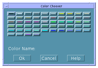
  2. Click the desired color in the palette.

    The name of the selected color will be displayed after Color Name.

  3. Click OK to select the color and dismiss the Color Chooser.

    The selected color will be displayed in the rectangle next to the Background or Foreground menu and the name of the color will be displayed in the text field next to the colored rectangle.

  4. Repeat the process for Background or Foreground, if desired.

  5. Click Apply in the property editor to apply the changes.

    The background or foreground of the object in the interface will display the selected color.

Example: Editing Main Window Properties

Use the procedure for editing a main window below as an example for editing other object types.

Your application might have multiple main windows, but only one primary main window, which is the starting point for the application. By default, the first main window created in the current project is designated as the primary main window. This designation can be changed in the Application Framework Editor, described in "To Establish Application Framework Behavior".

To Edit Properties of a Main Window

Once you have dropped a main window on the workspace do the following to edit its properties. See Appendix B, "Revolving Property Editor," for descriptions of each of the elements of the property editor.

  1. Double-click the main window to display the Revolving Property Editor.

    Or, Choose Properties from the Editors menu of the App Builder primary window, choose Main Window from the Object Type menu, and select the main window in the Objects list.

    The main window will be selected in the Revolving Property Editor.

  2. Change the Object Name, if necessary.

  3. Change the Window Title to something appropriate.

    This is the label that appears in the title bar of the main window.

  4. Type the names of an Icon File, an Icon Mask File, and an Icon Label, if you want an icon to represent the window when it is minimized.

    The Icon File and Icon Mask File must be xpm or xbm graphics files.

  5. Change the User Resize Mode, if appropriate.

    This determines if a user can resize the window in the compiled application.

  6. Select Menubar, Toolbar, and Footer, as appropriate, to add these functional areas to the window.

    If you select Menubar, you will want to create menus after you finish editing main window properties. See "Creating and Editing Menus" for instructions.


    Note: Selecting Menubar is the same as dragging a menu bar from the Controls palette and dropping it on a main window.

    If you select Toolbar or Footer, you will want to edit the properties of the control panes that comprise these objects after you finish editing main window properties. You can drop controls on the control panes, make connections to programmatic actions, and do other things that can be done to any control pane.

  7. Change the Size Policy and Size, as appropriate.


    Note: For all main windows and custom dialogs you will probably want to leave the Size Policy as Fixed while you are creating the application, and change it to Fit Contents as you finish the application, for internationalization and other purposes. When Size Policy is Fit Contents, the window will change size to accommodate changes in the size of objects as the text in the objects changes--or if the font size changes, for example.

  8. Set Initial State to Iconic if you want the application to appear as an icon when it is started.

  9. If you want the main window to be invisible when the application is started, deselect the visible setting for Initial State.

    If the Visible check box is checked, click it to deselect it.

  10. Set Background and Foreground colors, if appropriate.

    Type in a color name if you know it or press mouse button 1 on the Background or Foreground menu button and choose Color Chooser to display the Color Chooser. Select a color and click OK. Background sets the color of the blank pane area of the window. Foreground does nothing that is visible in the completed interface.

  11. Click Help Text to add on item help, if appropriate.

    See "To Create Help" for instructions.

  12. Click OK to apply the changes and dismiss the Revolving Property Editor.

    Unless you are creating a primary main window, you are finished with this task.

  13. If you are creating a primary main window, choose Application Framework Editor from the Editors menu.

  14. Type a Vendor Name and Version number in the Application section of the Application Framework Editor, if appropriate.

    See "To Establish Application Framework Behavior" for details about the editor.

  15. Click OK in the Application Framework Editor to apply the changes and close the editor.


Generated with CERN WebMaker