


Common Desktop Environment: Style Guide and Certification Checklist
Contents of Chapter:
- How to Use the Checklist
-
- Preface
-
- Input Models
-
- Keyboard Focus Model
-
- Input Device Model
-
- Navigation
-
- Mouse-Based Navigation
-
- Keyboard-Based Navigation
-
- Menu Traversal
-
- Scrollable Component Navigation
-
- Selection
-
- Selection Models
-
- Selection Actions
-
- Transfer Models
-
- Component Activation
-
- Basic Activation
-
- Accelerators
-
- Mnemonics
-
- Tear-off Activation
-
- Help Activation
-
- Default Activation
-
- Expert Activation
-
- Previewing and Autorepeat
-
- Cancel Activation
-
- Window Management
-
- Window Support
-
- Window Decorations
-
- Window Navigation
-
- Icons
-
- Application Window Management
-
- Session Management Support
-
- Application Design Principles
-
- Layout
-
- Attachments
-
- Installation
-
- Interaction
-
- Visuals
-
- Toolbars
-
- Expandable Windows
-
- Messages
-
- Work-in-Progress Feedback
-
- Controls, Groups, and Models
-
- CheckButton
-
- ComboBox
-
- CommandBox
-
- FileSelectionBox
-
- List
-
- Option Button
-
- Paned Window
-
- Panel
-
- Push Button
-
- Radio Button
-
- Sash
-
- Scale
-
- ScrollBar
-
- SelectionBox
-
- SpinBox
-
- Text
-
- Gauge
-
- Accessibility
-
The Common Desktop Environment Certification Checklist provides the list of requirements for Common Desktop Environment application-level certification. Common Desktop Environment requirements consist of the OSF/Motif Release 1.2 requirements with Common Desktop Environment-specific additions.
How to Use the Checklist
You certify your own application by comparing its behavior with that specified in the checklist. For each checklist item, check Yes only if your application performs exactly as described for that item. If you have not implemented a specified type of behavior in any manner anywhere in your application, check N/A (not applicable) for the items pertaining to that behavior.
The checklist describes keys using a model keyboard mechanism. Wherever keyboard input is specified, the keys are indicated by the engravings that they have on the OSF/Motif model keyboard. Mouse buttons are described using a virtual button mechanism to better describe behavior independent from the number of buttons on the mouse. For more information on the model keyboard and virtual button mechanisms, consult the Preface and Section 2.2.1, "Pointing Devices" of the OSF/Motif Style Guide, Revision 1.2.
Note: This checklist uses Common Desktop Environment typographical
conventions for keyboard and mouse inputs. These conventions differ from
those used in the OSF/Motif Style Guide, Revision 1.2. For
information, see "What Typographic Changes and Symbols Mean".
By default, this checklist assumes that your application is being designed for a left-to-right language environment in an English-language locale. Some sections of the checklist may require appropriate changes for other locales.
As you compare the behavior of your application to the requirements in the checklist, we recommend that you follow along in the OSF/Motif Style Guide, Revision 1.2. Each item in this checklist contains the corresponding section number from the OSF/Motif checklist, if the item came from that list. Each item in the checklist is also followed by a brief explanation or justification. If you do not understand a particular item, refer to the appropriate section in the OSF/Motif guide and check the glossary for any terms that are unclear.
The headings used in this checklist correspond to the headings in the OSF/Motif Style Guide, Revision 1.2 and the checklist items are labeled with the numbers used in that book. The Common Desktop Environment-specific additions are labeled with alphabetic identifiers.
Each checklist item also has a priority label: Required, Recommended, or Optional. The Required items must be followed for an application to be Common Desktop Environment compliant. Recommended items should be followed where feasible. Optional items are alternative implementations which the interface designer can choose.
Preface
Required [ ]yes [ ]n/a [ ]no
1-1:
- Each of the nonoptional keys described on the OSF/Motif model keyboard is available either as specified or by using other keys or key combinations if the specified key is unavailable (Preface).
The model keyboard does not correspond directly to any existing keyboard; rather, it assumes a keyboard with an ideal set of keys. However, to ensure consistency across applications, the nonoptional keys or substitutes for them must always be available.
Input Models
Keyboard Focus Model
Required [ ]yes [ ]n/a [ ]no
2-1:
- Only one window at a time has the keyboard focus. The window that has the focus is highlighted. Within the window that has the keyboard focus, only one component at a time has the focus.
The keyboard focus determines which component on the screen receives keyboard events. This rule prevents confusion about which window and component have the focus.
Required [ ]yes [ ]n/a [ ]no
2-2:
- When your application uses an explicit focus policy, pressing BSelect does not move focus to a component that is not traversable or does not accept input.
An explicit focus policy requires the user to explicitly select which window or component receives the keyboard focus. Generally, the user gives the focus to a window or component by pressing BSelect over it. However, this policy must not allow the user to give focus to a component that is not traversable or does not accept input.
Required [ ]yes [ ]n/a [ ]no
2-3:
- When your application uses an explicit focus policy, the component with the keyboard focus is highlighted by a location cursor.
The user needs to know the location of the keyboard focus to be able to control an application.
Input Device Model
Required [ ]yes [ ]n/a [ ]no
2-4:
- Your application supports methods of interaction for keyboard-only users. All features of your application are available from the keyboard.
Some users may not have access to a pointing device. These users need to be able to access the full functionality of the application from the keyboard. Additionally, advanced users will be able to use the keyboard to perform some tasks more quickly than with a pointing device.
Required [ ]yes [ ]n/a [ ]no
2-5:
- Your application uses the following bindings for mouse buttons:
- BSelect
- Used for selection, activation, and setting the location cursor, and is the leftmost button, except for left-handed users, where it can be the rightmost button.
- BTransfer
- Used for moving and copying elements, and is the middle mouse button, unless dragging is integrated with selection or the mouse has fewer than three buttons.
- BMenu
- Used for popping up menus, and is the rightmost button, except for left-handed users, where it can be the leftmost button, or unless the mouse has fewer than three buttons. If the mouse has one button, BMenu is bound to Alt+BSelect.
- These bindings ensure a consistent interface for using standard mouse-based operations across applications.
Required [ ]yes [ ]n/a [ ]no
2-6:
- Your application does not warp the pointer unless you have given the user a means of disabling the behavior.
The pointer position is intended only as input to applications, not as an output mechanism. An application warps the pointer when it changes the pointer's position. This practice is confusing to users and reduces their sense of control over an application. Warping the pointer can also cause problems for users of absolute location pointing devices.
Required [ ]yes [ ]n/a [ ]no
a:
- Components and applications that have functions corresponding to the Motif/Common Desktop Environment virtual keys must support those keys.
- If these virtual keys are available, the following mappings should be used. Priorities indicate the importance of implementing these functions in your application.
Required [ ]yes [ ]n/a [ ]no
Help = F1
- Pressing the Help key provides the user with help information in a window or in the status area.
Required [ ]yes [ ]n/a [ ]no
Properties = Control+I
- Pressing the Properties key invokes a dialog box for making object-specific settings.
Required [ ]yes [ ]n/a [ ]no
Undo = Control+Z
Pressing the Undo key reverses the effect of the last applied operation. This is the primary key mapping for Undo.
Optional [ ]yes [ ]n/a [ ]no
Undo = Alt+Backspace
- This is a secondary key mapping for Undo. It should be supported in addition to Control+Z to help users migrating from previous versions of Motif, Microsoft Windows, or OS/2.
Required [ ]yes [ ]n/a [ ]no
Cut = Control+X
Pressing the Cut key removes the selected object and places it in the clipboard. This is the primary key mapping for Cut.
Optional [ ]yes [ ]n/a [ ]no
Cut = Shift+Delete
- This is a secondary key mapping for Cut. It should be supported in addition to Control+X to help users migrating from previous versions of Motif, Microsoft Windows, or OS/2.
Required [ ]yes [ ]n/a [ ]no
Copy = Control+C
Pressing the Copy key places a copy of the selected object in the clipboard. This is the primary key mapping for Copy.
Optional [ ]yes [ ]n/a [ ]no
Copy = Control+Insert
- This is a secondary key mapping for Copy. It should be supported in addition to Control+C to help users migrating from previous versions of Motif, Microsoft Windows, or OS/2.
Required [ ]yes [ ]n/a [ ]no
Paste = Control+V
Pressing the Paste key places the contents of the clipboard at the selected location. This is the primary key mapping for Paste.
Optional [ ]yes [ ]n/a [ ]no
Paste = Shift+Insert
- This is a secondary key mapping for Paste. It should be supported in addition to Control+V to help users migrating from previous versions of Motif, Microsoft Windows, or OS/2.
Optional [ ]yes [ ]n/a [ ]no
Open = Control+O
- Pressing the Open key opens the object, which is typically the default action.
Optional [ ]yes [ ]n/a [ ]no
Stop = Control+S
- Pressing the Stop key cancels an operation.
Optional [ ]yes [ ]n/a [ ]no
Again = Control+A
- Pressing the Again key repeats the last operation.
Optional [ ]yes [ ]n/a [ ]no
Print = Control+P
Pressing the Print key initiates printing.
Optional [ ]yes [ ]n/a [ ]no
Save = Control+S
Pressing the Save key saves the current file.
Optional [ ]yes [ ]n/a [ ]no
New = Control+N
Pressing the New key will create a new object.
Navigation
Mouse-Based Navigation
Required [ ]yes [ ]n/a [ ]no
3-1:
- When the keyboard focus policy is explicit, pressing BSelect on a component moves focus to it, except for components, such as scroll bars, that are used to adjust the size and location of other elements.
BSelect provides a convenient mechanism for using the mouse to move focus when the keyboard focus policy is explicit.
Required [ ]yes [ ]n/a [ ]no
3-2:
- When the pointer is on a menu, your application uses BSelect Press to activate the menu in a spring-loaded manner.
A spring-loaded menu is one that appears when the user presses a mouse button, remains on the screen for as long as the button is pressed, and disappears when the user releases the button. BSelect, mouse button 1, provides a means of activating spring-loaded menus that is consistent across applications.
Required [ ]yes [ ]n/a [ ]no
3-3:
- When the pointer is in an element with an inactive pop-up menu and the context of the element allows the pop-up menu to be displayed, your application uses BMenu Press to activate the pop-up menu in a spring-loaded manner.
The availability of a pop-up menu can depend on the location of the pointer within an element, the contents of an element, or the selection state of an element. BMenu, mouse button 3, provides a consistent means of activating a spring-loaded pop-up menu.
Required [ ]yes [ ]n/a [ ]no
3-4:
- If the user takes an action to post a pop-up menu, and a menu can be posted for both an inner element and an outer element that contains the inner element, the pop-up menu for the internal element is posted.
This specification ensures that the pop-up menu for an internal element is always accessible.
Required [ ]yes [ ]n/a [ ]no
3-5:
- Once a pop-up menu is posted, BMenu behaves just as BSelect does for any menu system.
The specified operation of BMenu is for manipulating pop-up menus.
Required [ ]yes [ ]n/a [ ]no
3-6:
- BSelect is also available from within posted pop-up menus and behaves just as in any menu system.
Once a pop-up menu is posted, the user can select an element from it using the standard selection mechanism, BSelect.
Required [ ]yes [ ]n/a [ ]no
3-7:
- When a menu is popped up or pulled down in a posted manner, your application places the location cursor on the menu's default entry, or on the first entry in the menu if there is no default entry.
A posted menu remains visible until it is explicitly unposted. Placing the location cursor on the default entry allows the user to select the default operation easily. When there is no default entry, placing the location cursor on the first entry yields uniform behavior across applications.
Required [ ]yes [ ]n/a [ ]no
3-8:
- Your application removes a spring-loaded menu system when the mouse button that activated it is released, except when the button is released on a cascading button in the menu hierarchy.
The concept of a spring-loaded menu system requires that the menu disappear when the mouse button is released.
Required [ ]yes [ ]n/a [ ]no
3-9:
- While a spring-loaded menu system is popped up or pulled down, moving the pointer within the menu system moves the location cursor to track the pointer.
Once a spring-loaded menu system has appeared on the screen, the user needs to be able to maneuver the location cursor through the menu system using the mouse.
Required [ ]yes [ ]n/a [ ]no
3-10:
- When a spring-loaded menu system is popped up or pulled down and the pointer rests on a cascading button, the associated menu is pulled down and becomes traversable. The associated menu is removed, possibly after a short delay, when the pointer moves to a menu item outside of the menu or its cascading button.
The user needs to be able to use the mouse to access all of the associated menus of a menu system. This feature allows the user to move quickly to any menu in a menu system.
Required [ ]yes [ ]n/a [ ]no
3-11:
- When a spring-loaded menu system that is part of the menu bar is pulled down, moving the pointer to any other element on the menu bar unposts the current menu system and posts the pull-down menu associated with the new element.
This feature of a spring-loaded menu system allows the user to browse quickly through all of the menus attached to a menu bar.
Required [ ]yes [ ]n/a [ ]no
3-12:
- When a spring-loaded menu system is popped up or pulled down, and the button that activated the menu system is released within a component in the menu system, that component is activated. If the release is on a cascading button or an option button, the associated menu is activated in a posted manner if it was not posted prior to the associated button press.
Releasing the mouse button that activated a spring-loaded menu provides a means of activating a menu element that is consistent across applications.
Required [ ]yes [ ]n/a [ ]no
3-13:
- When the pointer is in an area with a pop-up menu, your application uses BMenu Click to activate the menu in a posted manner if it was not posted prior to the BMenu Click.
BMenu Click provides a means of posting a pop-up menu that is consistent across applications.
Required [ ]yes [ ]n/a [ ]no
3-14:
- Once a pull-down or option menu is posted, BSelect Press in the menu system causes the menu to behave as a spring-loaded menu.
This feature of a posted pull-down or option menu allows the user to switch easily between using a posted menu and a spring-loaded menu.
Required [ ]yes [ ]n/a [ ]no
3-15:
- If a button press unposts a menu and that button press is not also passed to the underlying component, subsequent events up to and including the button release are not passed to the underlying component.
When a button press unposts a menu, the press can be passed to the underlying component. Whether or not it is passed to the underlying component, the press can have additional effects, such as raising and giving focus to the underlying window. If the press is not passed to the underlying component, events up to and including the release must not be passed to that component.
Required [ ]yes [ ]n/a [ ]no
3-16:
- Once a pop-up menu is posted, BSelect Press or BMenu Press in the menu system causes the menu to behave as a spring-loaded menu.
This feature of a posted pop-up menu allows the user to switch easily between using a posted menu and a spring-loaded menu.
Optional [ ]yes [ ]n/a [ ]no
b:
- BMenu Press or BMenu Click on a menu bar item displays the menu.
Required [ ]yes [ ]n/a [ ]no
c:
- BMenu Press or BMenu Click on an option button displays the option menu.
Required [ ]yes [ ]n/a [ ]no
d:
- BSelect Press on a text field causes the text cursor to be inserted at the mouse cursor position.
Keyboard-Based Navigation
Required [ ]yes [ ]n/a [ ]no
3-17:
- In a text component, the text cursor is shown differently when the component does and does not have the keyboard focus.
In a text component, the text cursor serves as the location cursor and, therefore, must indicate whether the component has keyboard focus.
Required [ ]yes [ ]n/a [ ]no
3-18:
- If a text component indicates that it has lost the keyboard focus by hiding the text cursor and if the component subsequently regains the focus, the cursor reappears at the same position it had when the component lost focus.
To ensure predictability, it is important that the text cursor not change position when a text component loses and then regains the keyboard focus.
Required [ ]yes [ ]n/a [ ]no
3-19:
- If a small component, such as a sash, indicates that it has the keyboard focus by filling, no other meaning is associated with the filled state.
This rule reduces possible confusion about the significance of filling in a small component.
Required [ ]yes [ ]n/a [ ]no
3-20:
- All components are designed and positioned within your application so that adding and removing each component's location cursor does not change the amount of space that the component takes up on the screen.
For visual consistency, the sizes and positions of components should not change when keyboard focus moves from one component to another.
Required [ ]yes [ ]n/a [ ]no
3-21:
- Control+Tab moves the location cursor to the next field, and Control+Shift+Tab moves the location cursor to the previous field. Unless Tab and Shift+Tab are used for internal navigation within a field, Tab also moves the location cursor to the next field, and Shift+Tab also moves the location cursor to the previous field.
These keys provide a consistent means of navigating among fields in a window.
Required [ ]yes [ ]n/a [ ]no
3-22:
- Tab (if not used for internal navigation) and Control+Tab move the location cursor forward through fields in a window according to the following rules:
- If the next field is a control, Tab (if not used for internal navigation) and Control+Tab move the location cursor to that control.
- If the next field is a group, Tab (if not used for internal navigation) and Control+Tab move the location cursor to a traversable component within the group.
- If the next field contains no traversable components, Tab (if not used for internal navigation) and Control+Tab skip the field.
- These rules ensure the consistent operation of Tab (if not used for internal navigation) and Control+Tab across applications.
Required [ ]yes [ ]n/a [ ]no
3-23:
- Shift+Tab (if not used for internal navigation) and Control+Shift+Tab move the location cursor backward through fields in the order opposite to that of Tab (if not used for internal navigation) and Control+Tab.
These rules result in the uniform operation of Shift+Tab (if not used for internal navigation) and Control+Shift+Tab across applications.
Required [ ]yes [ ]n/a [ ]no
3-24:
- When a window acquires focus, the location cursor is placed on the control that last had focus in the window, providing that all the following conditions are met:
- The window uses an explicit keyboard focus policy.
- The window acquires the focus through keyboard navigation or through a button press other than within the client area of the window.
- The window had the focus at some time in the past.
- The control that last had focus in the window is still traversable.
- This rule ensures that when the user returns to a window after navigating away, the focus returns to the component where the user left it.
Required [ ]yes [ ]n/a [ ]no
3-25:
- Field navigation wraps between the first and last fields in the window.
This feature of field navigation provides the user with a convenient way to move through all of the fields in a window.
Required [ ]yes [ ]n/a [ ]no
3-26:
- When the Down Arrow and Up Arrow keys are used for component navigation within a field, they behave according to the following rules:
- In a left-to-right language environment, the Down Arrow key moves the location cursor through all traversable controls in the field, starting at the upper left and ending at the lower right, then wrapping to the upper left. If the controls are aligned in a matrix-like arrangement, Down Arrow first traverses one column from top to bottom, then traverses the column to its right, and so on. In a right-to-left language environment, Down Arrow moves the location cursor through all traversable controls, starting at the upper right and ending at the lower left.
- Up Arrow moves the location cursor through all traversable controls in the field in the order opposite to that of Down Arrow.
- These rules ensure a consistent means of navigating among components using the directional keys.
Required [ ]yes [ ]n/a [ ]no
3-27:
- When the Right Arrow and Left Arrow keys are used for component navigation within a field, they behave according to the following rules:
- In a left-to-right language environment, the Right Arrow moves the location cursor through all traversable controls in the field, starting at the upper left and ending at the lower right, then wrapping to the upper left. If the controls are aligned in a matrix-like arrangement, the Right Arrow first traverses one row from left to right, then traverses the row below it, and so on. In a right-to-left language environment, the Right Arrow moves the location cursor through all traversable controls, starting at the lower left and ending at the upper right.
- Left Arrow moves the location cursor through all traversable controls in the field in the order opposite to that of the Right Arrow.
- These rules ensure a consistent means of navigating among components using the directional keys.
Required [ ]yes [ ]n/a [ ]no
3-28:
- If a control uses the Right Arrow and Left Arrow for internal navigation, Begin moves the location cursor to the leftmost edge of the data or the leftmost element in a left-to-right language environment. In a right-to-left language environment, Begin moves the location cursor to the rightmost edge of the data or the rightmost element.
This rule permits convenient navigation to the left or right edge of the data or the left or right element in a control.
Required [ ]yes [ ]n/a [ ]no
3-29:
- If a control uses the Right Arrow and Left Arrow keys for internal navigation, the End key moves the location cursor to the rightmost edge of the data or the rightmost element in a left-to-right language environment. In a right-to-left language environment, End moves the location cursor to the leftmost edge of the data or the leftmost element.
This rule permits convenient navigation to the left or right edge of the data or the left or right element in a control.
Required [ ]yes [ ]n/a [ ]no
3-30:
- If a control uses the Up Arrow and Down Arrow keys for internal navigation, Control+Begin moves the location cursor to one of the following:
- The first element
- The topmost edge of the data
- In a left-to-right language environment, the topmost left edge of the data; in a right-to-left language environment, the topmost right edge of the data
- This rule permits convenient navigation to the beginning of the data in a control.
Required [ ]yes [ ]n/a [ ]no
3-31:
- If a control uses the Up Arrow and Down Arrow keys for internal navigation, Control+End moves the location cursor to one of the following:
- The last element
- The bottommost edge of the data
- In a left-to-right language environment, the bottommost right edge of the data; in a right-to-left language environment, the bottommost left edge of the data
- This rule permits convenient navigation to the end of the data in a control.
Optional [ ]yes [ ]n/a [ ]no
e:
- Each time a new window is opened, keyboard focus is placed in the first field or location within the window or in a default location, if this is appropriate for the particular window.
Required [ ]yes [ ]n/a [ ]no
f:
- The Tab key moves input focus between push buttons within a group.
The arrow keys also move the selected focus per the OSF/Motif Style Guide, Revision 1.2.
Required [ ]yes [ ]n/a [ ]no
g:
- Use the Control, Shift, and Alt keys only to modify the function of other keys or key combinations.
Optional [ ]yes [ ]n/a [ ]no
h:
- Use the Alt key only to provide access to mnemonics.
Menu Traversal
Required [ ]yes [ ]n/a [ ]no
3-32:
- If the user traverses to a menu while the keyboard focus policy is implicit, the focus policy temporarily changes to explicit and reverts to implicit whenever the user traverses out of the menu system.
Menus must always be traversable, even when the keyboard focus policy is generally implicit.
Required [ ]yes [ ]n/a [ ]no
3-33:
- Your application uses the F10 key to activate the menu bar system if it is inactive. The location cursor is placed on the first traversable cascading button in the menu bar. If there are no traversable cascading buttons, the key does nothing.
F10 provides a consistent means of traversing to the menu bar using the keyboard.
Required [ ]yes [ ]n/a [ ]no
3-34:
- When the keyboard focus is in an element with an inactive pop-up menu and the context of the element allows the pop-up menu to be displayed, your application uses the menu key to activate the pop-up menu. The location cursor is placed on the default item of the menu, or on the first traversable item in the pop-up menu if there is no default item.
The Menu key provides a uniform way of activating a pop-up menu from the keyboard.
Required [ ]yes [ ]n/a [ ]no
3-35:
- When the keyboard focus is in an option button, your application uses the Select key or the Spacebar to post the option menu. The location cursor is placed on the previously selected item in the option menu; or, if the option menu has been pulled down for the first time, the location cursor is placed on the default item in the menu. If there is an active option menu, the Return, Select, or Spacebar keys select the current item in the option menu, unpost the menu system, and return the location cursor to the option button.
These keys provide a means of posting an option menu from the keyboard that is consistent across applications.
Required [ ]yes [ ]n/a [ ]no
3-36:
- Your application uses the Down Arrow, Left Arrow, Right Arrow, and Up Arrow keys to traverse through the items in a menu system.
The Down Arrow, Left Arrow, Right Arrow, and Up Arrow directional keys provide a consistent means of navigating among items in a menu system.
Required [ ]yes [ ]n/a [ ]no
3-37:
- When a menu traversal action traverses to the next or previous component in a menu or menu bar, the order of traversal and the wrapping behavior are the same as that of the corresponding component navigation action within a field.
This specification provides consistency between menu traversal and component navigation within a field.
Required [ ]yes [ ]n/a [ ]no
3-38:
- If your application uses any two-dimensional menus, they do not contain any cascading buttons.
Cascading buttons in a two-dimensional menu would restrict the user's ability to navigate to all of the elements of the menu using the keyboard.
Required [ ]yes [ ]n/a [ ]no
3-39:
- When focus is on a component in a menu or menu bar system, the Down Arrow key behaves in the following way:
- If the component is in a vertical or two-dimensional menu, traverse down to the next traversable component, wrapping within the menu if necessary.
- If the component is in a menu bar, and the component with the keyboard focus is a cascading button, post its associated pull-down menu and traverse to the default entry in the menu or, if the menu has no default, to the first traversable entry in the menu.
- This rule results in consistent operation of the directional keys in a menu or menu bar system.
Required [ ]yes [ ]n/a [ ]no
3-40:
- When focus is on a component in a menu or menu bar system, the Up Arrow key behaves in the following way:
If the component is in a vertical or two-dimensional menu, this action traverses up to the previous traversable component, wrapping within the menu if necessary, and proceeding in the order opposite to that of the Down Arrow key.
This rule results in consistent operation of the directional keys in a menu or menu bar system.
Required [ ]yes [ ]n/a [ ]no
3-41:
- When focus is on a component in a menu or menu bar system, the Left Arrow key behaves in the following way:
- If the component is in a menu bar or two-dimensional menu, but not at the left edge, traverse left to the previous traversable component.
- If the component is at the left edge of a menu bar, wrap within the menu bar.
- If the component is at the left edge of a vertical or two-dimensional menu that is the child of a vertical or two-dimensional menu, unpost the current menu and traverse to the parent cascading button.
- If the component is at the left edge of a vertical or two-dimensional menu that is the child of a menu bar, unpost the current menu and traverse left to the previous traversable entry in the menu bar. If that entry is a cascading button, post its associated pull-down menu and traverse to the default entry in the menu or, if the menu has no default, to the first traversable entry in the menu.
- This rule results in consistent operation of the directional keys in a menu or menu bar system.
Required [ ]yes [ ]n/a [ ]no
3-42:
- When focus is on a component in a menu or menu bar system, the Right Arrow key behaves in the following way:
- If the component is a cascading button in a vertical menu, post its associated pull-down menu and traverse to the default entry in the menu or, if the menu has no default, to the first traversable entry in the menu.
- If the component is in a menu bar or two-dimensional menu, but not at the right edge, traverse right to the next traversable component.
- If the component is at the right edge of a menu bar, wrap within the menu bar.
- If the component is not a cascading button and is at the right edge of a vertical or two-dimensional menu, and if the current menu has an ancestor cascading button (typically in a menu bar) from which the Down Arrow key posts its associated pull-down menu, unpost the menu system pulled down from the nearest such ancestor cascading button and traverse right from that cascading button to the next traversable component. If that component is a cascading button, post its associated pull-down menu and traverse to the default entry in the menu or, if the menu has no default, to the first traversable entry in the menu.
- This rule results in consistent operation of the directional keys in a menu or menu bar system.
Required [ ]yes [ ]n/a [ ]no
3-43:
- All menu traversal actions, with the exception of menu posting, traverse to tear-off buttons in the same way as for other menu entries.
Traversal of tear-off buttons needs to be consistent with traversal of other menu items.
Required [ ]yes [ ]n/a [ ]no
3-44:
- If your application uses the F10, Menu, or Cancel key to unpost an entire menu system and an explicit focus policy is in use, the location cursor is moved back to the component that had it before the menu system was posted.
Returning the location cursor to the component that had it previously allows the user to resume a task without disruption.
Scrollable Component Navigation
Required [ ]yes [ ]n/a [ ]no
3-45:
- Any scrollable components within your application support the appropriate navigation and scrolling operations. Your application uses the page navigation keys Page Up, Page Down, Control+Page Up (for Page Left), and Control+Page Down (for Page Right) for scrolling the visible region by a page increment.
A user needs to be able to view and access the entire contents of a scrollable component.
Required [ ]yes [ ]n/a [ ]no
3-46:
- When scrolling by a page, your application leaves at least one unit of overlap between the old and new pages.
The overlap between one page and the next yields visual continuity for the user.
Required [ ]yes [ ]n/a [ ]no
3-47:
- Any keyboard operation that moves the cursor to or in the component, or that inserts, deletes, or modifies items at the cursor location scrolls the component so that the cursor is visible when the operation is complete.
The user needs to be able to see the results of moving the location cursor or operating on the contents of the scrollable component.
Required [ ]yes [ ]n/a [ ]no
3-48:
- If a mouse-based scrolling action is in progress, the Cancel key cancels the scrolling action and returns the scrolling device to its state prior to the start of the scrolling operation.
The Cancel key provides a convenient way for the user to cancel a scrolling operation.
Selection
Selection Models
Required [ ]yes [ ]n/a [ ]no
4-1:
- Your system supports five selection models: single selection, browse selection, multiple selection, range selection, and discontiguous selection.
Each collection has one or more appropriate selection models. The model limits the kinds of choices the user can make in the collection. Some collections enforce a selection model, while others allow the user or application to change it.
Mouse-Based Single Selection
Required [ ]yes [ ]n/a [ ]no
4-2:
- In a collection that uses single selection, when BSelect is clicked in a deselected element, the location cursor moves to that element, that element is selected, and any other selection in the collection is deselected.
Single selection is the simplest selection model, used to select a single element. BSelect, the first mouse button, provides a consistent means of selecting an object within a group using the mouse.
Mouse-Based Browse Selection
Required [ ]yes [ ]n/a [ ]no
4-3:
- In a collection that uses browse selection, when BSelect is released in a selectable element, that element is selected, and any other selection in the collection is deselected. As BSelect is dragged through selectable elements, each element under the pointer is selected, and the previously selected element is deselected. The selection remains on the element where BSelect is released, and the location cursor is moved there.
Browse selection is used to select a single element. It also allows the user to browse through the collection by dragging BSelect. See "Mouse-Based Multiple Selection".
- 4-4:
- This item has been deleted.
Required [ ]yes [ ]n/a [ ]no
i:
- If your application contains collections that follow the multiple selection model, BAdjust is supported and behaves just like BSelect, when the BTransfer button is currently configured to behave as BAdjust.
On a three-button mouse, button 2 is typically used for the BTransfer (or BSelect) function. However, in a Common Desktop Environment environment, the user may change an environment setting indicating that mouse button 2 should be used for the BAdjust function instead. BAdjust can be used to toggle the selection state of elements under the multiple selection model.
Required [ ]yes [ ]n/a [ ]no
j:
- In a collection that uses multiple selection, clicking BSelect or BAdjust on an unselected element adds that element to the current selection. Clicking BSelect or BAdjust on a selected element removes that element from the current selection. Clicking BSelect or BAdjust moves the location cursor to that element.
- 4-5:
- This item has been replaced by items k: and l:.
Required [ ]yes [ ]n/a [ ]no
k:
- In a collection that uses range selection, pressing BSelect on an unselected element sets an anchor on the element, or at the position where BSelect was pressed, and deselects all elements in the collection. If BSelect is released before the drag threshold has been exceeded, then the element under the pointer should be selected. If BSelect Motion exceeds the drag threshold, then a new selection should begin. The anchor and the current position of the pointer determine the current range. As BSelect is dragged through the collection, the current range is highlighted. When BSelect is released, the anchor does not move, and all the elements within the current range are selected.
Range selection allows the user to select multiple contiguous elements of a collection by pressing and dragging BSelect.
Required [ ]yes [ ]n/a [ ]no
l:
- In a collection that uses range selection, pressing BSelect on an currently selected element should
not cause all other elements in the selection set to be deselected. If BSelect is released before the drag threshold is exceeded, then, at that point, all other elements should be deselected and the element under the pointer should remain selected. If BSelect Motion exceeds the drag threshold, then no element should be deselected and a drag operation should begin.
Required [ ]yes [ ]n/a [ ]no
4-6:
- In a text-like collection that uses range selection, the anchor point is the text pointer position when BSelect is pressed, and the current range consists of all elements between the anchor point and the current text pointer position.
In text-like collections, elements are ordered linearly, and a text pointer is always considered to be between elements at a point near the actual pointer position.
Required [ ]yes [ ]n/a [ ]no
4-7:
- In a graphics-like or list-like collection that uses a marquee to indicate the range of a range selection, the current range consists of those elements that fall completely within the marquee. If there is an anchor element, the marquee is always made large enough to enclose it completely. Otherwise, an anchor point is used and is the point at which BSelect was pressed; the anchor point determines one corner of the marquee. If the collection is not arranged as a list or matrix, the marquee is extended to the pointer position. If the collection is arranged as a list or matrix, the marquee is either extended to completely enclose the element under the pointer or extended to the pointer position. Clicking BSelect on a selectable element makes it an anchor element, selects it, and deselects all other elements.
A marquee, or highlighted rectangle, is often used to indicate the range of a selection in graphics-like and list-like collections.
- 4-8:
- This item has been deleted.
Required [ ]yes [ ]n/a [ ]no
m:
- If your application contains collections that follow the range selection model, BAdjust is supported and behaves just like Shift+BSelect, when the BTransfer button is currently configured to behave as BAdjust.
On a three-button mouse, button 2 is typically used for the BTransfer function. However, in a Common Desktop Environment environment, the user may change an environment setting indicating that mouse button 2 should be used for the BAdjust function instead. BAdjust can be used to extend the selection set in the same manner as Shift+BSelect.
Required [ ]yes [ ]n/a [ ]no
n:
- In a collection that uses range selection, when the user presses Shift+BSelect, or BAdjust, the anchor remains unchanged, and an extended range for the selection is determined, based on one of the extension models.
Optional [ ]yes [ ]n/a [ ]no
Reselect
- The extended range is determined by the anchor and the current pointer position, in exactly the same manner as when the selection was initially made.
Optional [ ]yes [ ]n/a [ ]no
Enlarge Only
- The selection can only be enlarged. The extended range is determined by the anchor and the current pointer position, but then is enlarged to include the current selection.
Optional [ ]yes [ ]n/a [ ]no
Balance Beam
- A balance point is defined at the midpoint of the current selection. When the user presses Shift+BSelect or BAdjust on the opposite side of the balance point from the anchor, this model works exactly like the reselect model. When the user presses Shift+BSelect, BAdjust, or starts a navigation action modified by Shift on the same side of the balance point as the anchor, this model moves the anchor to the opposite end of the selection and then works exactly like the reselect model.
- When the user releases BSelect or BAdjust, the anchor does not move, all the elements within the extended range are selected, and all the elements outside of it are deselected.
Mouse-Based Discontiguous Selection
Required [ ]yes [ ]n/a [ ]no
4-9:
- In a collection that uses discontiguous selection, the behavior of BSelect is exactly the same as in the range selection model. After the user sets the anchor with BSelect, Shift+BSelect works exactly as in the range selection model.
Discontiguous selection is an extension of range selection that allows the user to select multiple discontiguous ranges of elements.
Required [ ]yes [ ]n/a [ ]no
4-10:
- In a collection that uses discontiguous selection, when the current selection is not empty and the user clicks Control+BSelect, the anchor and location cursor move to that point. If the current selection is not empty and the user clicks Control+BSelect on an element, the selection state of that element is toggled, and that element becomes the anchor element.
In discontiguous selection, Control+BSelect Click provides a convenient means of moving the anchor and toggling the selection state of the element under the pointer.
Required [ ]yes [ ]n/a [ ]no
4-11:
- In a collection that uses discontiguous selection, Control+BSelect Motion toggles the selection state of a range of elements. The range itself is determined exactly as for BSelect Motion. Releasing Control+BSelect toggles the selection state of the elements in the range according to one of two models:
- Anchor Toggle
- Toggling is based on an anchor element. If the range is anchored by a point, and is not empty, the anchor element is set to the element within the range that is nearest to the anchor point. Toggling sets the selection state of all elements in the range to the inverse of the initial state of the anchor element.
- Full Toggle
- The selection state of each element in the extended range is toggled.
- In discontiguous selection, Control+BSelect provides a convenient means of toggling the selection state of elements in a range.
Required [ ]yes [ ]n/a [ ]no
4-12:
- In a collection that uses discontiguous selection, after Control+BSelect toggles a selection, Shift+BSelect or Control+Shift+BSelect extends the range of toggled elements. The extended range is determined in exactly the same way as when Shift BSelect is used to extend a range selection. When the user releases Control+Shift+BSelect, the selection state of elements added to the range is determined by the toggle model in use (either Anchor Toggle or Full Toggle). If elements are removed from the range, they either revert to their state prior to the last use of Control+BSelect or change to the state opposite that of the elements remaining within the extended range.
Shift+BSelect and Control+Shift+BSelect provide a convenient means of extending the range of toggled elements.
Required [ ]yes [ ]n/a [ ]no
o:
- In a collection that uses discontiguous selection, BAdjust can be used to extend the range of a discontiguous selection. The extended range is determined in exactly the same way as when BAdjust is used to extend a range selection.
On a three-button mouse, mouse button 2 is typically used for the BTransfer function. However, in a Common Desktop Environment environment, the user may change an environment setting indicating that mouse button 2 should be used for the BAdjust function instead. BAdjust can be used to extend the selection set in the same manner as Shift+BSelect.
Keyboard Selection
Required [ ]yes [ ]n/a [ ]no
4-13:
- The selection models support keyboard selection modes according to the following rules:
- Single selection supports only add mode.
- Browse selection supports only normal mode.
- Multiple selection supports only add mode.
- Range selection supports normal mode. If it also supports add mode, normal mode is the default.
- Discontiguous selection supports both normal mode and add mode. Normal mode is the default.
- Selection must be available from the keyboard. In normal mode, used for making simple contiguous selections from the keyboard, the location cursor is never disjoint from the current selection. In add mode, used for making more complex and possibly disjoint selections, the location cursor can move independently of the current selection.
Required [ ]yes [ ]n/a [ ]no
4-14:
- If a collection supports both normal mode and add mode, Shift+F8 switches from one mode to the other. Mouse-based selection does not change when the keyboard selection mode changes. In editable components, add mode is a temporary mode that is exited when the user performs an operation on the selection or deselects the selection.
Shift+F8 provides a convenient means of switching between normal mode and add mode.
Keyboard-Based Single Selection
Required [ ]yes [ ]n/a [ ]no
4-15:
- In a collection that uses single selection, the navigation keys move the location cursor independently from the selected element. If the user presses the Select key or the Spacebar on an unselected element, the element with the location cursor is selected, and any other selection in the collection is deselected.
Single selection supports only add mode. Pressing the Select key or the Spacebar is similar to clicking BSelect.
Keyboard-Based Browse Selection
Required [ ]yes [ ]n/a [ ]no
4-16:
- In a collection that uses browse selection, the navigation keys move the location cursor and select the cursored element, deselecting any other element. If the application has deselected all elements or if the cursor is left disjoint from the selection, the Select key or the Spacebar selects the cursored element and deselects any other element.
Browse selection supports only normal mode. A navigation operation is similar to dragging BSelect.
Keyboard-Based Multiple Selection
Required [ ]yes [ ]n/a [ ]no
4-17:
- In a collection that uses multiple selection, the navigation keys move the location cursor independently from the current selection. The Select key or the Spacebar on an unselected element adds the element to the current selection. Pressing the Select key or the Spacebar on a selected element removes the element from the current selection.
Multiple selection supports only add mode. Pressing the Select key or the Spacebar is similar to clicking BSelect.
Keyboard-Based Range Selection
Required [ ]yes [ ]n/a [ ]no
4-18:
- In a collection that uses range selection and is in normal mode, the navigation keys move the location cursor and deselect the current selection. If the cursor is on an element, it is selected. The anchor moves with the location cursor.
Text-like collections can use a different model in which the navigation keys leave the anchor at its current location, except that, if the current selection is not empty, it is deselected and the anchor is moved to the location of the cursor prior to navigation.
Range selection supports normal mode, and, if the collection also supports add mode, normal mode is the default.
Required [ ]yes [ ]n/a [ ]no
4-19:
- In a collection that uses range selection, whether in normal mode or add mode, the Select key or Spacebar (except in a text component) moves the anchor to the cursor, deselects the current selection, and, if the cursor is on an element, selects the element. Unless the anchor is on a deselected item, Shift+Select or Shift+Spacebar (except in text) extends the selection from the anchor to the cursor, based on the extension model used by Shift+BSelect (Reselect, Enlarge Only, or Balance Beam.
In range selection, pressing the Select key or Spacebar is similar to clicking BSelect, and pressing Shift+Select or Shift+Spacebar extends the range as with Shift+BSelect.
Required [ ]yes [ ]n/a [ ]no
4-20:
- In a collection that uses range selection and is in normal mode, using Shift in conjunction with the navigation keys extends the selection, based on the extension model used by Shift+BSelect. If the current selection is empty, the anchor is first moved to the cursor. The cursor is then moved according to the navigation keys, and the selection is extended based on the extension model used by Shift+BSelect.
In range selection, shifted navigation extends the selection in a similar manner to dragging Shift+BSelect.
Required [ ]yes [ ]n/a [ ]no
4-21:
- In a collection that uses range selection and is in add mode, the navigation keys move the location cursor but leave the anchor unchanged. Shifted navigation moves the location cursor according to the navigation keys, and the selection is extended based on the extension model used by Shift+BSelect.
Shifted navigation in add mode is similar to shifted navigation in normal mode, except that when the selection is empty the anchor does not move to the cursor prior to navigation.
Keyboard-Based Discontiguous Selection
Required [ ]yes [ ]n/a [ ]no
4-22:
- In a collection that uses discontiguous selection and is in normal mode, all keyboard operations have the same effect as in the range selection model.
Normal mode does not permit multiple discontiguous selections.
Required [ ]yes [ ]n/a [ ]no
4-23:
- In a collection that uses discontiguous selection and is in add mode, the Select key or Spacebar moves the anchor to the location cursor and initiates toggling. If the cursor is on an element, the selection state of that element is toggled, but the selection state of all other elements remains unchanged. Shift+Select or Shift+Spacebar and shifted navigation operations extend the selection between the anchor and the location cursor, based on the toggle mechanism used by Control+BSelect (Anchor Toggle or Full Toggle).
Add mode permits use of the keyboard to make multiple discontiguous selections.
Canceling a Selection
Required [ ]yes [ ]n/a [ ]no
4-24:
- Your application uses the Cancel key to cancel or undo any incomplete motion operation used for selection. Once the user presses the Cancel key to cancel a motion operation, the application ignores subsequent key and button releases until after all buttons and keys are released. Pressing the Cancel key while extending or toggling leaves the selection state of all elements as they were prior to the button press.
The Cancel key allows the user to cancel an incomplete selection operation quickly and consistently.
Autoscrolling and Selection
Required [ ]yes [ ]n/a [ ]no
4-25:
- If the user drags the pointer out of a scrollable collection during a motion-based selection operation, autoscrolling is used to scroll the collection in the direction of the pointer. If the user presses the Cancel key with BSelect pressed, the selection operation is canceled.
Autoscrolling provides a convenient means of extending a selection to elements outside the viewport of a scrollable collection.
Selecting and Deselecting All Elements
Required [ ]yes [ ]n/a [ ]no
4-26:
- In a collection that uses multiple, range, or discontiguous selection, Control+/ selects all the elements in the collection, places the anchor at the beginning of the collection, and leaves the location cursor at its previous position.
Control+/ provides the user with a convenient means of selecting all of the objects in a collection.
Required [ ]yes [ ]n/a [ ]no
4-27:
- In a collection that is in add mode, Control+\ deselects all the elements in the collection. In a collection that is in normal mode, Control+\ deselects all the elements in the collection, except the element with the location cursor if the location cursor is being displayed. In either mode, Control+\ leaves the location cursor at its current position and moves the anchor to the location cursor.
Control+\ allows the user to deselect all of the selected objects quickly and uniformly.
Using Mnemonics for Elements
Required [ ]yes [ ]n/a [ ]no
4-28:
- If your application supports mnemonics associated with selectable elements, typing a mnemonic while the collection has the keyboard focus is equivalent to moving the location cursor to the element and pressing the Select key or Spacebar.
Mnemonics within a collection of selectable elements provide an additional selection method.
Selection Actions
Required [ ]yes [ ]n/a [ ]no
4-29:
- When the keyboard focus policy is explicit, the destination component is the editable component that last had the keyboard focus. When the keyboard focus policy is implicit, the destination component is the editable component that last received mouse button or keyboard input.
The destination component is used to identify the component on which certain operations, primarily data transfer operations, act. There is only one destination component at a time.
Required [ ]yes [ ]n/a [ ]no
4-30:
- If the keyboard focus is in a component (or a pop-up menu of a component) that supports selections, operations that act on a selection act on the selection in that component.
A selection operation acts on the component that has focus, if that component supports selections.
Required [ ]yes [ ]n/a [ ]no
4-31:
- If the keyboard focus is in a component (or a pop-up menu of a component) that supports some operation that does not act on a selection, invoking the operation acts on that component.
An operation that does not act on a selection acts on the component that has focus, if that component supports the operation.
Required [ ]yes [ ]n/a [ ]no
4-32:
- Inserting or pasting elements into a selection, except for a primary transfer operation at the bounds of the primary selection, first deletes the selection if pending delete is enabled.
Pending delete controls the conditions under which the selection is deleted. It is enabled by default.
Required [ ]yes [ ]n/a [ ]no
4-33:
- In normal mode, inserting or pasting elements disjoint from the selection also deselects the selection, except for primary transfer operations whose source and destination are in the same collection. In add mode, the selection is not deselected.
In add mode, a transfer operation that is disjoint from the selection does not affect the selection.
Required [ ]yes [ ]n/a [ ]no
4-34:
- In editable list-like and graphics-like collections, Delete deletes the selected elements.
Delete provides a consistent means of deleting the selection.
Required [ ]yes [ ]n/a [ ]no
4-35:
- In editable text-like collections, Delete and Backspace behave as follows:
- If the selection is not empty and the control is in normal mode, the selection is deleted.
- If the selection is not empty, the control is in add mode, and the cursor is not disjoint from the selection, the selection is deleted.
- If the selection is not empty and the control is in add mode, but the cursor is disjoint from the selection, Delete deletes one character forward, and Backspace deletes one character backward.
- If the selection is empty, Delete deletes one character forward, and Backspace deletes one character backward.
- In text, Delete and Backspace provide a convenient way to delete the entire selection or single characters.
Transfer Models
Required [ ]yes [ ]n/a [ ]no
4-36:
- If the move, copy, or link operation the user requests is not available, the transfer operation fails.
Three transfer operations are generally available: copy, move, and link. The user requests one of these operations by pressing the buttons or keys appropriate for the type of transfer. In general, for mouse-based operations, the modifier Control forces a copy, Shift forces a move, and Control+Shift forces a link. However, any requested transfer operation must fail if that operation is not available.
Required [ ]yes [ ]n/a [ ]no
4-37:
- If a collection does not have a fixed insertion point or keep elements ordered in a specific way, the insertion position for transferred data is determined as follows:
- The insertion position is the position in the destination where transferred data is placed. Some mouse-based transfer operations place data at the pointer position if possible. Other operations, including keyboard-based transfer, generally place the data at the location cursor.
Required [ ]yes [ ]n/a [ ]no
p:
- Your application supports the use of mouse button 1 to perform drag-and-drop operations.
In Motif 1.2, drag and drop is typically performed using button 2 on a three-button mouse (BTransfer). However, in the Common Desktop Environment environment, mouse button 1 (BSelect) should be supported for drag and drop to support mouse usage compatible with other graphical user interface (GUI) environments. A drag can be initiated with either mouse button 1 or mouse button 2.
Required [ ]yes [ ]n/a [ ]no
q:
- When button 2 of a three-button mouse is configured to operate as BAdjust, your application does not perform any BTransfer operations when clicking mouse button 2.
On a three-button mouse, button 2 is typically used for the BTransfer (or BSelect) function. However, in a Common Desktop Environment environment, the user can change an environment setting indicating that mouse button 2 should be used for the BAdjust function instead. When this is the case, BAdjust click should not result in the transfer of any data.
Required [ ]yes [ ]n/a [ ]no
r:
- BSelect should always initiate a drag if the drag is started on a selected item. The drag starts once the drag threshold has been reached. This is true for text regions, scrolling lists, and other similar elements.
Clipboard Transfer
Required [ ]yes [ ]n/a [ ]no
4-38:
- Keyboard-based clipboard selection actions are available in every editable collection in your application.
Clipboard selection actions need to be available from the keyboard.
Required [ ]yes [ ]n/a [ ]no
4-39:
- Your application uses the Cut key (or Shift+Delete) and the Cut entry on the Edit menu to cut the selected elements from an editable component to the clipboard.
The Cut key (or Shift+Delete) and the Cut entry on the Edit menu offer a consistent means of cutting the selection to the clipboard from the keyboard.
Required [ ]yes [ ]n/a [ ]no
4-40:
- Your application uses the Copy key (or Control+Insert) and the Copy entry on the Edit menu to copy the selected elements to the clipboard.
The Copy key or (Control+Insert) and the Copy entry on the Edit menu offer a consistent means of copying the selection to the clipboard from the keyboard.
Required [ ]yes [ ]n/a [ ]no
4-41:
- Your application uses the Paste key (or Shift+Insert) to paste the contents of the clipboard into an editable component.
The Paste key (or Shift+Insert) offers a consistent way of pasting the contents of the clipboard from the keyboard.
Required [ ]yes [ ]n/a [ ]no
4-42:
- If Paste or Paste Link is invoked using a component's pop-up menu, the data is pasted at the insertion position of the component. However, if the pop-up menu is popped up over a selection, the selection is first deleted, even if pending delete is disabled, and the pasted data replaces it, if possible.
Popping up a pop-up menu over a selection indicates that a Paste or Paste Link operation should replace the selection.
Required [ ]yes [ ]n/a [ ]no
4-43:
- If Paste or Paste Link is invoked from the Edit menu or by a keyboard operation, and the insertion position in the target component is not disjoint from a selection, the pasted data replaces the selection contents if pending delete is enabled.
Pending delete determines whether the selection is deleted when the insertion position is not disjoint from the selection and Paste or Paste Link is invoked from the Edit menu or by a keyboard operation.
Primary Transfer
Required [ ]yes [ ]n/a [ ]no
4-44:
- In an editable collection, BTransfer Click, Control+BTransfer Click, Alt, Copy, and Control+Alt+Insert copy the primary selection to the insertion position. (Note that the insertion position is usually different for mouse and keyboard operations.)
These operations provide a convenient way for the user to force a copy operation.
Required [ ]yes [ ]n/a [ ]no
4-45:
- In an editable collection, Shift+BTransfer Click, Alt+Cut, and Alt+Shift+Delete move the primary selection to the insertion position. (Note that the insertion position is usually different for mouse and keyboard operations.)
These operations provide a convenient way for the user to force a move operation.
Required [ ]yes [ ]n/a [ ]no
4-46:
- In an editable collection, Control+Shift+BTransfer Click places a link to the primary selection at the insertion position.
Control+Shift+BTransfer provides a convenient way for the user to force a link operation.
Required [ ]yes [ ]n/a [ ]no
4-47:
- A Primary Move moves the primary selection as well as the elements selected; that is, the element moved to the destination becomes selected as the primary selection. Primary Copy and Primary Link do not select transferred data at the destination.
This rule provides the expected treatment of the selection in a move, copy, and link operation.
Quick Transfer
Required [ ]yes [ ]n/a [ ]no
4-48:
- All text components support quick transfer.
Quick transfer is used to make a temporary selection and then immediately move, copy, or link that selection to the insertion position of the destination component. In text, quick transfer provides a convenient way to move, copy, or link text without disturbing the primary selection.
Required [ ]yes [ ]n/a [ ]no
4-49:
- If a component supports quick transfer, Alt+BTransfer Motion or Control+Alt+BTransfer Motion temporarily selects elements in the specified range and, on release, copies them to the insertion position of the destination component.
These operations provide a convenient way to perform a quick copy.
Required [ ]yes [ ]n/a [ ]no
4-50:
- If a component supports quick transfer, Alt+Shift+BTransfer Motion temporarily selects elements in the specified range and, on release, moves them to the insertion position of the destination component.
This operation provides a convenient way to perform a quick cut.
Required [ ]yes [ ]n/a [ ]no
4-51:
- If a component supports quick transfer, Control+Alt+Shift+BTransfer Motion temporarily selects elements in the specified range and, on release, places a link to them at the insertion position of the destination component.
This operation provides a convenient way to perform a quick link.
Required [ ]yes [ ]n/a [ ]no
4-52:
- Quick transfer does not disturb the primary selection or affect the clipboard, except when the destination of the transfer is within or on the boundaries of the primary selection and pending delete is enabled. In this case, quick transfer deletes the contents of the primary selection, leaving an empty primary selection, before pasting the transferred elements.
Quick transfer is a secondary selection mechanism, so it cannot disrupt the primary selection. When the destination of the transfer is in the primary selection, quick transfer replaces the primary selection with the secondary selection.
Required [ ]yes [ ]n/a [ ]no
4-53:
- With quick transfer, the range of the temporary selection is determined by using the same model as when BSelect Motion determines the range of a primary selection.
This rule provides consistency between primary selection and quick transfer operations.
Required [ ]yes [ ]n/a [ ]no
4-54:
- If the user drags the pointer out of a scrollable collection while making the temporary selection, autoscrolling is used to scroll the collection in the direction of the pointer. If the user releases BTransfer with the pointer outside of the collection, or if the user presses the Cancel key with BTransfer pressed, the highlighting is removed and a transfer is not performed.
Autoscrolling provides a convenient means of extending a temporary selection to elements outside the viewport of a scrollable collection.
Drag Transfer
Required [ ]yes [ ]n/a [ ]no
4-55:
- In a collection that supports selection, Shift+BTransfer Release or Shift+BSelect Release forces a drag move operation. If a move is not possible, the operation fails.
This mechanism offers a convenient way for the user to force a move operation.
Required [ ]yes [ ]n/a [ ]no
4-56:
- In a collection that supports selection, Control+BTransfer Release or Shift+BSelect Release forces a drag copy operation. If a copy is not possible, the operation fails.
This mechanism offers a convenient way for the user to force a copy operation.
Required [ ]yes [ ]n/a [ ]no
4-57:
- In a collection that supports selection, Control+Shift+BTransfer Release pr Shift+BSelect Release forces a drag link operation. If a link is not possible, the operation fails.
This mechanism offers a convenient way for the user to force a link operation.
Required [ ]yes [ ]n/a [ ]no
4-58:
- When a drag move operation moves a selection within the same component, the selection moves along with the elements selected.
In other words, when selected elements are moved with a drag operation, they should stay selected after the move. This mechanism offers a convenient way to move the selection within a component.
Required [ ]yes [ ]n/a [ ]no
4-59:
- In text-like collections, initiating a drag within a selected region drags the entire text selection.
To be consistent, drag-and-drop actions need to operate on the entire selection.
Required [ ]yes [ ]n/a [ ]no
4-60:
- In list-like and graphics-like collections, initiating a drag with either BSelect or BTransfer on a selected element drags the entire selection.
To be consistent, drag-and-drop actions need to operate on the entire selection.
Required [ ]yes [ ]n/a [ ]no
4-61:
- In list-like and graphics-like collections, initiating a drag with BTransfer or BSelect on an unselected element drags just that element and leaves the selection unaffected.
Unselected elements can be dragged without affecting the selection.
Required [ ]yes [ ]n/a [ ]no
4-62:
- When a drag is initiated in an unselected region and the pointer is over two possible draggable elements, the drag uses the draggable element highest in the stacking order.
This guideline ensures the consistency of drag operations.
Required [ ]yes [ ]n/a [ ]no
4-63:
- When your application starts a drag operation, the pointer is replaced with a drag icon.
A drag icon provides visual feedback that a drag operation is in progress.
Required [ ]yes [ ]n/a [ ]no
4-64:
- All drag icons used by your application include a source indicator.
A source indicator gives a visual representation of the elements being dragged.
Required [ ]yes [ ]n/a [ ]no
4-65:
- Pressing the Cancel key ends a drag-and-drop operation by canceling the drag in progress.
The Cancel key provides a consistent way for the user to cancel a drag operation.
Required [ ]yes [ ]n/a [ ]no
4-66:
- Releasing BTransfer ends a drag-and-drop operation.
Releasing BTransfer offers a consistent means of ending a drag operation.
Required [ ]yes [ ]n/a [ ]no
4-67:
- When BTransfer (or BSelect) is released, the drop operation ordinarily occurs at the location of the hot spot of the drag icon pointer and into the highest drop zone in the stacking order. However, if a drop occurs within a selection and pending delete is enabled, the transferred data replaces the contents of the entire selection.
This rule provides consistency in the treatment of mouse-based transfer operations.
Required [ ]yes [ ]n/a [ ]no
4-68:
- After a successful transfer, the data is placed in the drop zone, and any transfer icon used by your application is removed.
A transfer icon can be used to represent the type of data being transferred during a drop operation. A successful drop operation results in the transfer of data.
Required [ ]yes [ ]n/a [ ]no
4-69:
- After a failed transfer, the data remains at the drag source and is not placed in the drop zone. Any transfer icon used by your application is removed.
A failed drop operation does not result in the transfer of data.
Recommended [ ]yes [ ]n/a [ ]no
s:
- In a collection that supports selection, if BTransfer Motion (or BSelect Motion) results in the start of a drag operation, feedback is presented to the user that indicates that a copy, move, or link operation is in progress. Whether the operation is a copy, move, or link depends on the type of object created at the drop zone and whether the source object is removed.
Although, typically, an unmodified drag results in a move operation, depending on the location of the source object and the target drop zone, the drag may in fact result in a copy or link operation. For example, dragging an icon representing an attachment to a mail message typically results in a copy of the attachment being created as opposed to the original being removed from the mail message. Any feedback presented should incorporate use of a drag icon that portrays the source object being manipulated.
Recommended [ ]yes [ ]n/a [ ]no
t:
- In a collection that supports selection, if Control+BTransfer Motion or Control+BSelect Motion results in the start of a drag operation, feedback is presented to the user that indicates that a copy operation is in progress.
The feedback presented should incorporate use of a drag icon that portrays the source object being copied.
Recommended [ ]yes [ ]n/a [ ]no
u:
- In a collection that supports selection, if Control+Shift+BTransfer Motion or Control+Shift+BSelect Motion results in the start of a drag operation, feedback is presented to the user that indicates that a link operation is in progress.
The feedback presented should incorporate use of a drag icon that portrays the source object being linked.
Recommended [ ]yes [ ]n/a [ ]no
v:
- In a collection that supports copy, move, or link operations that can be performed by dragging, the feedback presented to the user during the drag operation indicates whether a single object or multiple objects are being manipulated.
Feedback provided during the drag operation should ensure that the user feels confident that the desired set of objects is being dragged. The drag icon used for multiobject drag operations should integrate the feedback used to indicate whether the operation is a move, copy, or link.
Optional [ ]yes [ ]n/a [ ]no
w:
- If your application allows the user to paste data into its data pane, it allows the user to drag and drop files from the File Manager into the data pane.
The user should be able to drag and drop files into application data panes. The result should be the inclusion of some element of the file, or the display of an error message indicating that the file selected cannot be incorporated into the application's data. Drag transfers that are accepted can result in a number of different responses from your application: 1) the icon image for the file might be inserted at the drop point; 2) the application might perform some activity using the data contained within the file as its input; 3) the data contained within the file might be inserted at the drop point; or 4) the name of the file might be inserted at the drop point.
Component Activation
Basic Activation
Required [ ]yes [ ]n/a [ ]no
5-1:
- Your application uses BSelect to activate a button.
BSelect, the first mouse button, provides a consistent means of activating a button using the mouse.
Required [ ]yes [ ]n/a [ ]no
5-2:
- When a button has the focus, your application uses the Select key or Spacebar to activate the button.
The Select key and Spacebar provide a uniform way of selecting a button. Selecting a button is equivalent to activating the button.
Required [ ]yes [ ]n/a [ ]no
5-3:
- When an activatable menu entry has the focus, your application uses the Select, Spacebar, Enter, or Return key to activate the entry.
The Select, Spacebar, Enter, and Return keys offer a consistent means of activating a menu entry using the keyboard.
Required [ ]yes [ ]n/a [ ]no
5-4:
- When BSelect is pressed over a button, the appearance of the button changes to indicate that releasing BSelect will activate the button. If, while BSelect is pressed, the pointer is moved outside of the button, the visual state is restored. If, while BSelect is still pressed, the pointer is moved back inside of the button, the visual state is again changed to indicate the pending activation. If BSelect is pressed and released within a button, the button is activated, regardless of whether the pointer has moved out of the button while it was pressed.
The visual state of a button offers a cue to the user about whether the button will be activated when the mouse button is released.
Required [ ]yes [ ]n/a [ ]no
5-5:
- If a selectable element of a collection is activatable, BSelect Click, the Select key, and Spacebar (except in text) select it. BSelect Click 2 selects and activates it.
This rule provides for consistent integration of activation and selection in a collection where elements can be both selected and activated.
Required [ ]yes [ ]n/a [ ]no
x:
- The time allowed to detect a double click (
*doubleClickTime: 500) should be no less than 500 milliseconds.
Accelerators
Required [ ]yes [ ]n/a [ ]no
5-6:
- If your application uses accelerators, the component with the accelerator displays the accelerator key or key combination following the label of the component.
An accelerator is a key or key combination that invokes the action of some component regardless of the position of the location cursor when the accelerator is pressed. So that the user knows that there is an accelerator associated with a component, the accelerator needs to be displayed.
Required [ ]yes [ ]n/a [ ]no
5-7:
- If a button with an accelerator is within a primary or secondary window, or within a pull-down menu system from its menu bar, it is activatable whenever the input focus is in the window or the menu bar system. If a button with an accelerator is within a pop-up menu system, it is activatable whenever the focus is in the pop-up menu system or the component with the pop-up menu.
An accelerator must be activatable from the window or component associated with the accelerator.
Mnemonics
Required [ ]yes [ ]n/a [ ]no
5-8:
- If your application uses mnemonics, the label for the component with the mnemonic contains the character that is its mnemonic. If the label does not naturally contain the character, the mnemonic is placed in parentheses following the label.
A mnemonic is a single character that can be associated with any component that contains a text label. Mnemonics provide a fast way of selecting a component from the keyboard. To let the user know that there is a mnemonic associated with a selection, the mnemonic is underlined in the label of the selection by the toolkit. For a mnemonic to be underlined, the label for a selection needs to contain the mnemonic character. If the label does not contain the mnemonic, putting the mnemonic in parentheses following the label provides visual consistency.
Required [ ]yes [ ]n/a [ ]no
y:
- Mnemonic characters must be chosen for ease-of-location within the text of a label. Wherever possible, use the first character of the label. If that is not possible, try to use the last character of the label, or if there is more than one word, the first character of the second word. After that, go through the label from the second character on until a unique mnemonic is found.
Required [ ]yes [ ]n/a [ ]no
5-9:
- All mnemonics are case insensitive for activation.
The user must be able to activate a mnemonic by pressing either the lowercase or the uppercase variant of the mnemonic key.
Required [ ]yes [ ]n/a [ ]no
5-10:
- When the location cursor is within a menu or a menu bar, pressing the mnemonic key of a component within that menu or menu bar moves the location cursor to the component and activates it. If a mnemonic is used for an option button or for a cascading button in a menu bar, pressing Alt and the mnemonic anywhere in the window or its menus moves the cursor to the component with that mnemonic and activates it.
A mnemonic is generally activatable when the location cursor is within the component that contains the mnemonic. Pressing Alt and the mnemonic provides a way to activate a visible mnemonic when the location cursor is within the window that contains the mnemonic.
Tear-off Activation
Required [ ]yes [ ]n/a [ ]no
5-11:
- Activating a tear-off button tears off the menu that contains the button.
A tear-off button is like a push button with the special interaction of tearing off the menu from its cascading button. Tear-off buttons use the same basic activation as other buttons.
Required [ ]yes [ ]n/a [ ]no
5-12:
- When a menu with a tear-off button is posted, pressing BTransfer in the tear-off button starts a tear-off action. As long as BTransfer is held, a representation of the menu follows the movement of the pointer. Releasing BTransfer ends the tear-off action by unposting the menu system, creating a new window at the current pointer location that contains the contents of the menu, and giving focus to the new window in explicit pointer mode.
Help Activation
Required [ ]yes [ ]n/a [ ]no
5-13:
- Your application uses the Help key on a component to invoke any context-sensitive help for the component or its nearest ancestor with context-sensitive help available.
The Help key offers the user a consistent mechanism for invoking context-sensitive help.
Required [ ]yes [ ]n/a [ ]no
z:
- Your application provides context-sensitive help at all locations.
The user should never get a "help not available" message.
Default Activation
Required [ ]yes [ ]n/a [ ]no
5-14:
- If your application uses default push buttons in a window, the current default push button is highlighted. When the focus is on a push button, its action is the default action, and the push button shows default highlighting. If the default action in a window varies, some push button always has default highlighting, except when there is no current default action.
Placing emphasis on the default push button in a dialog box provides the user with a visual cue about the expected reply to the dialog box.
Required [ ]yes [ ]n/a [ ]no
5-15:
- When focus is in a window with a default action and an activatable menu does not have the focus, the Enter key and Control+Return invoke the default action. If focus is in a component other than multiline text or an activated menu, Return also invokes the default action. These actions have no other effect on the component with the focus, unless the default action has some effect on that component.
These rules ensure that the means of invoking a default action are consistent across applications.
Required [ ]yes [ ]n/a [ ]no
5-16:
- Except in the middle of a button motion operation, pressing the Cancel key anywhere in a dialog box is equivalent to activating the Cancel push button in the dialog box.
The Cancel key provides a uniform means of canceling dialog box from the keyboard.
Expert Activation
Required [ ]yes [ ]n/a [ ]no
5-17:
- If your application supports expert activation, expert actions exist only as shortcuts to application features that are available through another mechanism.
Expert activation, using mouse double-clicking on buttons, provides a convenient way for experienced users to perform certain tasks quickly. However, new users and keyboard-only users need to be able to perform the same tasks.
Required [ ]yes [ ]n/a [ ]no
5-18:
- When the focus is on a button used for expert activation, no default action is available, unless the default and expert actions are the same.
This rule minimizes possible confusion between default and expert activation.
Required [ ]yes [ ]n/a [ ]no
5-19:
- If a component with an expert action is selectable, activating the expert action first selects the component and then performs the expert action.
A user needs to be able to select a component, even if it has an expert action associated with it.
Previewing and Autorepeat
Required [ ]yes [ ]n/a [ ]no
5-20:
- If your application supports activation preview using BSelect, the previewing information is removed when the user releases BSelect.
Activation preview presents the user with additional information that describes the effect of activating a button. This information cannot interfere with the normal operation of the application.
Cancel Activation
Required [ ]yes [ ]n/a [ ]no
5-21:
- Pressing the Cancel key stops current interaction in the following contexts:
- During a mouse-based selection or drag operation, it cancels the operation.
- During a mouse-based scrolling operation, it cancels the scrolling action and returns the system to its state prior to the start of the scrolling operation.
- Anywhere in a dialog box that has a Cancel push button, it is equivalent to activating that push button, except during a mouse-based selection or drag operation.
- In a pull-down menu, it either dismisses the menu and moves the location cursor to the cascading button used to pull it down, or unposts the entire menu system. In a pop-up menu, option menu, tear-off menu, or menu bar, it unposts the menu system.
- When the focus is in a torn off menu window, it closes the torn off menu window.
- These guidelines for the Cancel key ensure the consistent operation of the key across applications.
Window Management
Window Support
This section corresponds to section 7.2 of the OSF/Motif Style Guide, Revision 1.2. The different window types are discussed throughout the OSF/Motif Style Guide, Revision 1.2 and this book. In particular, see Chapter 6, "Application Design Principles."
Required [ ]yes [ ]n/a [ ]no
aa:
- Application windows should be clearly distinguishable as primary or secondary windows based on appearance and behavior.
- Primary Window:
- Secondary Window:
Required [ ]yes [ ]n/a [ ]no
ab:
- Windows that support particular window management functionality must request the corresponding window decoration (for example, a window that can be minimized should request the minimize button).
Required [ ]yes [ ]n/a [ ]no
ac:
- Windows that support any window management functionality (move, resize, minimize, maximize, close, and others) must have a window menu with items for that functionality.
Required [ ]yes [ ]n/a [ ]no
ad:
- Follow Common Desktop Environment window decoration conventions, as shown in
Table 10-1.
Table 10-1 Common Desktop Environment Window Decoration Conventions
1 Decorations for resize and maximize should be provided for primary windows if appropriate.
2 The Front Panel has custom visuals for the window decorations.
3 Secondary windows should be designed such that resizing and maximization are not necessary or appropriate. If a secondary window must be resizable and maximizable, the associated decorations should be displayed.
Required [ ]yes [ ]n/a [ ]no
ae:
- Follow Common Desktop Environment window menu conventions. Items should appear in the window menu if they are applicable to the window or its minimized window icon.
- Restore (R)
- Move (M)
- Size (S)
- Minimize (n)
- Maximize (x)
- Lower (L)
- Occupy Workspace ... (O)
- Occupy All Workspaces (A)
- Unoccupy Workspace (U)
- Close (C) Alt+F4
Optional [ ]yes [ ]n/a [ ]no
af:
- Applications should not add items to the window menu. If an extraordinary requirement has an application add items to the window menu, the items should be appended to the end of the menu with a separator between Close and the application items.
Optional [ ]yes [ ]n/a [ ]no
ag:
- Accelerators, aside from Alt+F4 for Close, should not be used in the window menu (to minimize conflict with other uses of the Alt key for application accelerators, localization, and others).
Window Navigation
This section corresponds to section 7. 4 of OSF/Motif Style Guide, Revision 1.2. There are no checklist items for application developers.
Icons
Optional [ ]yes [ ]n/a [ ]no
ah:
- Applications should provide unique window icons for their primary windows. The window icon image should have a similar appearance to the associated file or Front Panel icon image.
Optional [ ]yes [ ]n/a [ ]no
ai:
- The window icon label should contain the same text as the title of the corresponding primary window, or an abbreviated form of it. Refer to
"Layout" for window title guidelines.
Optional [ ]yes [ ]n/a [ ]no
aj:
- The window icon image should have a similar appearance to the associated file or Front Panel icon image. Refer to
"Design Philosophy and Helpful Hints".
Application Window Management
Window Placement
Recommended [ ]yes [ ]n/a [ ]no
ak:
- Applications should not require or force windows or window icons to be positioned at a particular screen location.
Recommended [ ]yes [ ]n/a [ ]no
al:
- A secondary window is placed by the application relative to the associated primary window. It should be placed close to, but not obscuring, the component that caused it to be displayed and the information that is necessary to interact with the dialog box.
Some suggestions are given in section 6.2.4.3, "Determining Dialog Box Location and Size," of the OSF/Motif Style Guide, Revision 1.2. Additional or modified recommendations include:
Optional [ ]yes [ ]n/a [ ]no
am:
- If a dialog box does not relate to specific items in the underlying window, it should be placed below the menu bar (if there is one) and centered (horizontally) over the work area.
Recommended [ ]yes [ ]n/a [ ]no
an:
- If a secondary window is allowed to be stacked below its associated primary window (not constrained to stay on top of the primary window), it should be placed such that it is not completely covered by the primary window. This recommendation takes precedence over other placement recommendations.
Recommended [ ]yes [ ]n/a [ ]no
ao:
- If a menu or dialog box is already on display, reinvoking the command that caused it to be displayed automatically brings that window or menu to the front of the window stack without changing its position on the screen.
Window (Document) Clustering
Optional [ ]yes [ ]n/a [ ]no
ap:
- Windows that are closely related in supporting a particular task should be placed in a window cluster. Secondary windows are automatically placed in a window cluster with the associated primary window. Windows in a window cluster are stacked together, minimized or normalized together, and kept in the same workspace.
Note: Currently the only mechanism for forming a window cluster that is supported by the Window Manager is to indicate a primary-secondary relationship.
Required [ ]yes [ ]n/a [ ]no
aq:
- Windows should follow Common Desktop Environment window management functionality conventions, as shown in Table 10-2
.
Table 10-2 Common Desktop Environment Window Management Conventions
1 Resize and maximize functionality should be provided for primary windows if appropriate.
2 Secondary windows can contain the Maximum and Resize window manager functions, if appropriate.
Required [ ]yes [ ]n/a [ ]no
ar:
- Windows that support particular window management functionality should request corresponding window decoration (for example, a window that can be minimized should request the minimize button).
Required [ ]yes [ ]n/a [ ]no
as:
- Windows that have form factor constraints need to set Window Manager hints for minimum size, maximum size, aspect ratio, and resize increment as appropriate.
Recommended [ ]yes [ ]n/a [ ]no
at:
- Maximizing a window should show more content (objects or controls) if appropriate (as opposed to scaling up the sizes of objects and controls).
Required [ ]yes [ ]n/a [ ]no
au:
- Windows that have Close or Exit functionality need to support the window management protocol for Close if there is a window menu. In the case of dialog boxes, the Close item on the window menu corresponds to the Cancel functionality or dialog box dismissal with no further action taken.
Recommended [ ]yes [ ]n/a [ ]no
av:
- When your application creates a new window, it should come up in the user's current workspace and only occupy that single workspace.
Recommended [ ]yes [ ]n/a [ ]no
aw:
- Application windows that are related to a particular task should move together between workspaces.
Session Management Support
Required [ ]yes [ ]n/a [ ]no
ax:
- Applications should support
Interclient Communications Conventions Manual (ICCCM) mechanisms for session management of their primary windows and key properties.
Required [ ]yes [ ]n/a [ ]no
ay:
- Applications should support ICCCM mechanisms for session management of all associated windows (that is, secondary windows that may include help windows).
Optional [ ]yes [ ]n/a [ ]no
az:
- Applications should accept messages from the Common Desktop Environment Session Manager that inform them the user is logging out and should save their state at that time.
Optional [ ]yes [ ]n/a [ ]no
ba:
- Applications that have a single primary window that is open at the time the user logs out should restore the primary window, in the workspace last occupied, when the user logs in again.
Optional [ ]yes [ ]n/a [ ]no
bb:
- Save user context wherever possible. For example, applications that support the editing of files should save the state of the file at logout and should restore the file in the application window when users log in again.
Optional [ ]yes [ ]n/a [ ]no
bc:
- Applications that have multiple primary windows that are open at the time the user logs out should restore all primary windows, in their respective workspaces, when the user logs in again.
Application Design Principles
Main Window
Required [ ]yes [ ]n/a [ ]no
6-1:
- Your application should be composed of at least one main window.
A main window contains a client area and, optionally, a menu bar, a command area, a message area, and scroll bars. The client area contains the framework of the application. The use of a main window ensures interapplication consistency.
Required [ ]yes [ ]n/a [ ]no
bd:
- The default size of the application's main window must be large enough to accommodate a typical amount of data, but should not fill the entire physical display size to minimize visual conflicts with other applications.
Each application potentially must share the display with other applications. The default window size should not take up all the available screen space.
Required [ ]yes [ ]n/a [ ]no
be:
- Resize corners should be included in any main window that incorporates a scrolling data pane or list.
Resize corners should be included in any main window that incorporates a scrolling data pane or list. Any changes to the overall size of the window should result in a corresponding increase or decrease in the size of the scrollable portion. Additionally, your application might reorganize elements within the window based on the increased or decreased amount of space (for example, it might reorganize a row of buttons into two rows).
Required [ ]yes [ ]n/a [ ]no
6-2:
- If your application has multiple main windows that serve the same primary function, each window closes and iconifies separately.
For example, a text editor might allow the user to edit multiple documents, each in its own main window. Each window is then treated as a separate application and can be closed or iconified when it is not being used.
Required [ ]yes [ ]n/a [ ]no
6-3:
- If your application has multiple main windows that serve different primary functions, each window should be able to iconify independently of the other windows.
For example, a debugger might provide separate main windows for editing source code, examining data values, and viewing results. Each window can be iconified when it is not being used, but it is up to the application to decide whether each window closes separately or whether closing one window closes the entire application.
Window Titles
Optional [ ]yes [ ]n/a [ ]no
bf:
- The title of your primary window (the main window your application displays to the user) should be the name of your application.
Note that this does not have to be the actual name of the executable invoked by the user.
Carefully consider how the title you choose for your primary window works when it is used in icons and pop-up windows. If the name of the pop-up window is too long, you may remove the application title; however, without the title, users might have difficulty telling which pop-up window belongs with the originating primary window.
Optional [ ]yes [ ]n/a [ ]no
bg:
- Use initial capital letters for each word in the title (in languages that support capitalization).
Optional [ ]yes [ ]n/a [ ]no
bh:
- Follow the application name for each property window, as a minimum, with the title Properties and the name of the object it affects.
Optional [ ]yes [ ]n/a [ ]no
bi:
- Begin the title of each pop-up window with the application title followed by a colon, then the title of the pop-up window. The colon should have a space both before and after it for readibility.
Pop-up windows should always indicate which primary window they are associated with (which primary window invoked that pop-up).
Optional [ ]yes [ ]n/a [ ]no
bj:
- Use a hyphen to denote the current file name, when the application has files that can be loaded or saved. The hyphen should have a space before and after it. Only the base name of the file should be displayed, not the entire path.
The hyphen is used to denote specific instances of a window or data. The colon serves to delimit general categories or commands. For example, a file manager might have the following title for a Properties dialog box:
File Manager : Properties - myfile
Recommended [ ]yes [ ]n/a [ ]no
bk:
- Follow the application name for each command window with the same title that is on the window button or window item users choose to display that window.
Optional [ ]yes [ ]n/a [ ]no
bl:
- In the case of multiple primary windows, include the application name at the beginning of each window title, and add a name that uniquely identifies that primary window. No separator should be provided for these names (for example, Calendar Manager Multibrowse, Catalog Search, Admintool Databases).
Optional [ ]yes [ ]n/a [ ]no
bm:
Menu Bar
Note: These requirements apply only in a left-to-right language environment in an English-language locale. You must make the appropriate changes for other locales.
Required [ ]yes [ ]n/a [ ]no
6-4:
- If your application has a menu bar, it is a horizontal bar at the top edge of the application, just below the title area of the window frame. A menu bar organizes the most common features of an application. It contains a list of menu topics in cascading buttons; each button is associated with a distinct pull-down menu containing commands that are grouped by common functionality. The use of a menu bar yields consistency across applications.
Required [ ]yes [ ]n/a [ ]no
6-5:
- The menu bar for your application contains only cascading buttons.
When other buttons are included as topics in a menu bar, they inhibit menu browsing.
- 6-6:
- This item has been deleted. It is replaced by the following guideline.
Recommended [ ]yes [ ]n/a [ ]no
bn:
- There are several common menu operations that should be considered "standard". The standard menu bar entries are File, Edit, View, Options and Help. If your application provides that functionality to the user, it should be included in the menu bar under the appropriate name.The contents of these menu entries are discussed below in more detail.
Standard menu bar entries should be presented in the following order:
File Edit View Options Help
You should exclude from your menu bar any item shown in the preceding text if your application does not support the associated function. For example, if your application does not support the ability to display its data in different views, then you should not include a View menu.
You may add application-specific menus in between any of the standard menu items, with the following exceptions:
-- The File menu, if present, is located in the first menu position on the left.
-- The Help menu is located on the far right position.
-- If File and Edit are present, they should be next to each other.
For example, your application may have:
File Edit <category1> <category2> View Options <category3> Help
Recommended [ ]yes [ ]n/a [ ]no
bo:
- Applications that are not file-oriented in nature (or that manage files transparently, not exposing this activity to the user) should replace the File menu with one or more application-specific menus.
Replacing the File menu:
Replacement1: <app-label> Selected
Replacement2: <app-label><obj-type>
Replacement3: <obj-type>
You may use Replacement1 if your application has more than one object type. Items on <app-label> would be used for global actions that are not specific to an object type. The items in Selected are actions that pertain to objects that are currently selected, and may change depending on what objects are selected. If nothing is selected, this menu should have a single item that says (none selected). If an item is selected, but there are no items that apply to that object, this menu should have a single item that says (none).
You may use Replacement2 if your application has a single object type. Actions that are global to the application are on <app-label>, and actions that are specific to the object type are on <obj-type>.
You may use Replacement3 if your application has a single object type, and does not require an <app-label> menu. For example, a Print Manager might contain a Printer menu.
All other menubar guidelines that apply to File-oriented applications also apply to non-File-oriented applications. Thus, the following menubar would be valid:
<app-label> Selected Edit <category1> View <category2> Help
Applications that are complex or are extremely domain-specific (for example, an application for medical imaging and diagnosis of cat scan data) may require other approaches to their menu bar design. For example,
<app-label><category1><category2> Selected Edit <object-type> Options Help
Recommended [ ]yes [ ]n/a [ ]no
bp:
- Exit or Close should be located on the first (leftmost) menu of your menubar.
File Menu Contents
Note: These requirements apply only in a left-to-right language environment in an English-language locale. You must make the appropriate changes for other locales.
Required [ ]yes [ ]n/a [ ]no
bq:
- If the user chooses Exit, or in any other manner indicates that the application should be terminated, but there are changes to the current file that have not been saved, your application displays a dialog box asking whether the changes should be saved before exiting.
The user must always be given the opportunity to explicitly state whether unsaved changes should be saved or discarded. A dialog box similar to the one described should also be displayed if the user chooses the Open from the File menu, but has not saved changes to the current file.
Required [ ]yes [ ]n/a [ ]no
6-7:
- If your application uses a File menu, it contains the following choices, with the specified functionality, when the actions are actually supported by your application.
Required [ ]yes [ ]n/a [ ]no
New
- Creates a new file. If the current client area will be used to display the new file, your application clears the existing data from the client area. If changes made to the current file will be lost, your application displays a dialog box, asking the user about saving changes. The mnemonic is N.
Required [ ]yes [ ]n/a [ ]no
Open...
- Opens an existing file by prompting the user for a file name with a dialog box. If changes made to the current file will be lost, your application displays a dialog box asking the user about saving changes. The mnemonic is O.
Required [ ]yes [ ]n/a [ ]no
Save
- Saves the currently opened file without removing the existing contents of the client area. If the file has no name, your application displays a dialog box, prompting the user to enter a file name. The mnemonic is S.
Required [ ]yes [ ]n/a [ ]no
Save As...
- Saves the currently opened file under a new name by prompting the user for a file name with a dialog box. If the user tries to save the file using an existing name, your application displays a dialog box that warns the user about a possible loss of data. Does not remove the existing contents of the client area. The mnemonic is A.
Recommended [ ]yes [ ]n/a [ ]no
Print
- Schedules a file for printing. If your application needs specific information to print, it displays a dialog box, requesting the information from the user. In this case, the menu entry is followed by an ellipsis (Print...). The mnemonic is P.
Recommended [ ]yes [ ]n/a [ ]no
Close
- Closes the current primary window and its associated secondary windows. If your application uses only a single primary window or multiple dependent primary windows, this action is not supplied. The mnemonic is C.
Required [ ]yes [ ]n/a [ ]no
Exit
- Ends the current application and all windows associated with it. If changes made to the current file will be lost, your application displays a dialog box, asking the user about saving changes. The mnemonic is X.
- The use of a File menu with these common file operations yields consistency across applications.
<Object-type> / Selected Menu Contents
Recommended [ ]yes [ ]n/a [ ]no
br:
- If your application uses an <object-type> menu or a Selected menu, it contains the following choices, with the specified functionality, when the actions are actually supported by your application. Items should be presented to the user in the order listed below.
- The <object-type> menu contains controls that allow the user to create instances of the object-type. Both the <object-type> and Selected menus allow the user to manipulate object instances. Additional items should be added to the <object-type> or Selected menus if they relate solely to the manipulation of objects managed by the application (as opposed to more generic services that the application might provide).
Recommended [ ]yes [ ]n/a [ ]no
New...
- Creates a new instance of the object-type. If appropriate, a dialog box is presented allowing the user to specify the values for settings associated with that object.
Optional [ ]yes [ ]n/a [ ]no
Move To...
- Allows the user to move the selected objects into a folder. A file selection dialog box is displayed allowing the user to select the desired folder.
Optional [ ]yes [ ]n/a [ ]no
Copy To...
- Allows the user to copy the selected objects into a folder. A file selection dialog box is displayed allowing the user to select the desired folder.
Optional [ ]yes [ ]n/a [ ]no
Put in Workspace
Allows the user to put a link for the object onto the Common Desktop Environment desktop in the current workspace.
- Any of the preceding three menu choices should be provided only if the objects managed by your application are able to reside as separate entities outside of your application's main window. For example, a printer object created by a printer management application might be able to be placed in a Folder window and function as an application unto itself. Your application should also support drag and drop as a method for performing any of these actions.
Optional [ ]yes [ ]n/a [ ]no
Delete
- Removes the selected objects. A confirmation dialog box should be presented to the user before the object is actually deleted.
Recommended [ ]yes [ ]n/a [ ]no
Properties
- Displays a Properties window that shows the current values for settings associated with the selected object.
Recommended [ ]yes [ ]n/a [ ]no
<Default Action>
This choice should enact the default action for the selected object. "Open" is a typical default.
Edit Menu Contents
Note: These requirements apply only in a left-to-right language environment in an English-language locale. You must make the appropriate changes for other locales.
Required [ ]yes [ ]n/a [ ]no
6-8:
- If your application uses an Edit menu, it contains the following choices, with the specified functionality, when the actions are actually supported by your application:
Optional [ ]yes [ ]n/a [ ]no
Undo
- Reverses the most recently executed action. The mnemonic is U.
Optional [ ]yes [ ]n/a [ ]no
Cut
- Removes the selected portion of data from the client area and puts it on the clipboard. The mnemonic is T.
Optional [ ]yes [ ]n/a [ ]no
Copy
Copies the selected portion of data from the client area and puts it on the clipboard. The mnemonic is C.
Optional [ ]yes [ ]n/a [ ]no
Copy Link
- Copies a link of the selected portion of data from the client area and puts it on the clipboard. The mnemonic is K.
Optional [ ]yes [ ]n/a [ ]no
Paste
Pastes the contents of the clipboard into the client area. The mnemonic is P.
Optional [ ]yes [ ]n/a [ ]no
Paste Link
- Pastes a link of the data represented by the contents of the clipboard into the client area. The mnemonic is L.
Optional [ ]yes [ ]n/a [ ]no
Clear
Removes a selected portion of data from the client area without copying it to the clipboard and does not compress the remaining data. The mnemonic is E.
Optional [ ]yes [ ]n/a [ ]no
Delete
Removes a selected portion of data from the client area without copying it to the clipboard. The mnemonic is D.
Optional [ ]yes [ ]n/a [ ]no
Select All
- Sets the primary selection to be all the elements in a component of the client
area. The mnemonic is S.
Optional [ ]yes [ ]n/a [ ]no
Deselect All
- Removes from the primary selection all the elements in a component of the
client area. The mnemonic is l.
Optional [ ]yes [ ]n/a [ ]no
Select Pasted
- Sets the primary selection to the last element or elements pasted into a
component of the client area. The mnemonic is a.
Optional [ ]yes [ ]n/a [ ]no
Reselect
-
Sets the primary selection to the last selected element or elements in a
component of the client area. This action is available only in components that
do not support persistent selections and only when the current selection is
empty. The mnemonic is R.
Optional [ ]yes [ ]n/a [ ]no
Promote
- Promotes to the primary selection the current selection of a component of the client area. This action is available only for components that support persistent selections.
- The use of an Edit menu with these common editing operations yields consistency across applications.
Recommended [ ]yes [ ]n/a [ ]no
bs:
- If your application does not provide an <object-type> or Selected menu, but allows the user to select data within the window and manage settings for the selected data, then it provides a Properties ... choice as the last item in the Edit menu.
- 6-9:
- This item has been deleted.
View Menu
Recommended [ ]yes [ ]n/a [ ]no
bt:
- If your application provides a View menu, it only contains functions that affect the way the current data is presented. It does not contain any option that alters the data itself.
Options Menu
Recommended [ ]yes [ ]n/a [ ]no
bu:
- If your application has global settings that control the way the application behaves, it provides an Options menu from which these can be set.
Help Menu Contents
Note: These requirements apply only in a left-to-right language environment in an English-language locale. You must make the appropriate changes for other locales.
Recommended [ ]yes [ ]n/a [ ]no
bv:
- If your application includes a Help menu, it contains the following set of choices, with the specified functionality, when the actions are actually supported by your application. The Help choices included here supercede those listed for Motif 1.2.
Required [ ]yes [ ]n/a [ ]no
Overview
- Provides general information about the window from which help was accessed or about the application overall. The mnemonic is V. Place a separator after.
Optional [ ]yes [ ]n/a [ ]no
Index
- Provides an index listing topics for all help information available for your application. The mnemonic is I.
Recommended [ ]yes [ ]n/a [ ]no
Table of Contents
Provides a table of contents listing topics for all help information available for your application. The mnemonic is C.
Recommended [ ]yes [ ]n/a [ ]no
Tasks
- Provides access to help information indicating how to perform different tasks using your application. The mnemonic is T.
Recommended [ ]yes [ ]n/a [ ]no
Reference
- Provides access to reference information. The mnemonic is R.
Optional [ ]yes [ ]n/a [ ]no
Tutorial
- Provides access to your application's tutorial. The mnemonic is L.
Optional [ ]yes [ ]n/a [ ]no
Keyboard
Provides information about your application's use of function keys, mnemonics, and keyboard accelerators. Also provides information on general Common Desktop Environment use of such keys. The mnemonic is K.
Optional [ ]yes [ ]n/a [ ]no
Mouse
- Provides information about using a mouse with your application. The mnemonic is M.
Optional [ ]yes [ ]n/a [ ]no
Mouse and Keyboard
Provides information about your application's use of function keys, mnemonics, keyboard accelerators, and using a mouse with your application. Also provides information on general Common Desktop Environment use of such keys. The mnemonic is M. Use rather than separate mouse and keyboard choices if this information is best presented together.
Recommended [ ]yes [ ]n/a [ ]no
On Item
- Initiates context-sensitive help by changing the shape of the pointer to the question mark pointer. When the user moves the pointer to a component and presses BSelect, any available context-sensitive help for the component is presented. The mnemonic is O. Set off with separators on both sides.
Required [ ]yes [ ]n/a [ ]no
Using Help
Provides information on how to use the Common Desktop Environment Help Viewer. The mnemonic is U. Set off with separators on both sides.
Required [ ]yes [ ]n/a [ ]no
About applicationname
- Displays a dialog box indicating, minimally, the name and version of your application, and displays its icon or some other signature graphic for your application. The mnemonic is A.
- 6-10:
- This item has been deleted. It is replaced by item bv:.
Attachment Menu Contents
Recommended [ ]yes [ ]n/a [ ]no
bw:
- If your application uses an attachment menu, it contains the following choices, with the specified functionality, when the actions are actually supported by your application.
Recommended [ ]yes [ ]n/a [ ]no
Add File...
- Selects files and other items to be attached. A file selection box is displayed allowing the user to select the desired files to attach. The default button in the file selection box is Attach.
Recommended [ ]yes [ ]n/a [ ]no
Save As...
- Saves the currently selected attachments. The user is prompted with a file selection dialog box for indicating where in the file system the attachments are to be saved. When multiple attachments are selected, the name field is inactive and the current names of the attachments are used as the name of the new file. This menu item is active only when one or more attachments are selected.
Recommended [ ]yes [ ]n/a [ ]no
Rename...
- Renames the attachment icon. The application should provide in-line renaming of attachment icons, such as File Manager uses. If the application cannot provide in-line renaming, then Rename allows the user to rename an attachment by displaying a dialog box, requesting the name from the user. This menu item is active only when a single attachment is selected. It is not active when multiple attachments are selected.
Recommended [ ]yes [ ]n/a [ ]no
Delete
- Deletes attachments from the attachment list. This menu item is active only when an attachment is selected.
Recommended [ ]yes [ ]n/a [ ]no
Select All
- Selects all the attachments in the attachment list.
Pop-up Menus
Note: These requirements apply only in a left-to-right language environment in an English-language locale. You must make the appropriate changes for other locales.
Recommended [ ]yes [ ]n/a [ ]no
bx:
- If your application provides functions that apply to a data pane and not any specific element therein, then a pop-up menu is provided that contains the frequently used data pane functions and is accessible by pressing BMenu when the mouse pointer is over the background of the pane or a nonselectable element within the pane.
Recommended [ ]yes [ ]n/a [ ]no
by:
- Your application should provide a pop-up menu for any element that is selectable within its data pane.
Pop-up menus provide access to frequently used functions and should be used pervasively throughout the Common Desktop Environment desktop environment. A pop-up menu may contain a collection of options that appear in different menus available from the menu bar. For example, it may contain items from both the File and Edit menus.
Recommended [ ]yes [ ]n/a [ ]no
bz:
- When a pop-up menu is displayed over an unselected object, any action selected from the pop-up menu applies to that object only, and not to any other objects that might currently be selected.
The preceding helps to protect the user from inadvertently applying an action to objects that the user may not realize are currently selected. Pressing the menu button invokes a pop-up menu pertinent to the object under the mouse cursor whether it is selected to not; if the object under the mouse cursor and other objects are selected, the pop-up menu is pertinent to the selected set.
Recommended [ ]yes [ ]n/a [ ]no
ca:
- Every pop-up menu in your application has a title that indicates the function the menu performs or the element on which it operates.
Recommended [ ]yes [ ]n/a [ ]no
cb:
- The functions accessible from within your application's pop-up menus are also accessible from buttons displayed within the window or menus accessed through the menu bar.
Because pop-up menus are hidden, they should only provide redundant access to functions available from more visible controls within the application's windows.
Optional [ ]yes [ ]n/a [ ]no
6-11:
Optional [ ]yes [ ]n/a [ ]no
Properties
- Displays a Properties dialog box that the user can use to set the properties of the component.
Optional [ ]yes [ ]n/a [ ]no
Undo
- Reverses the most recently executed action.
Optional [ ]yes [ ]n/a [ ]no
Primary Move
- Moves the contents of the primary selection to the component. This action is available only in editable components.
Optional [ ]yes [ ]n/a [ ]no
Primary Copy
- Copies the contents of the primary selection to the component. This action is available only in editable components.
Optional [ ]yes [ ]n/a [ ]no
Primary Link
- Places a link to the primary selection in the component. This action is available only in editable components.
Optional [ ]yes [ ]n/a [ ]no
Cut
- Cuts elements to the clipboard. If the menu is popped up in a selection, cuts the entire selection to the clipboard.
Optional [ ]yes [ ]n/a [ ]no
Copy
- Copies elements to the clipboard. If the menu is popped up in a selection, this action copies the entire selection to the clipboard.
Optional [ ]yes [ ]n/a [ ]no
Copy Link
- Copies a link of elements to the clipboard. If the menu is popped up in a selection, copies a link to the entire selection to the clipboard.
Optional [ ]yes [ ]n/a [ ]no
Paste
- Pastes the contents of the clipboard to the component. This action is available only in editable components.
Optional [ ]yes [ ]n/a [ ]no
Paste Link
- Pastes a link of the contents of the clipboard to the component. This action is available only in editable components.
Optional [ ]yes [ ]n/a [ ]no
Clear
- Removes a selected portion of data from the client area without copying it to the clipboard. If the menu is popped up in a selection, deletes the selection.
Optional [ ]yes [ ]n/a [ ]no
Delete
- Removes a selected portion of data from the client area without copying it to the clipboard. If the menu is popped up in a selection, deletes the selection.
Optional [ ]yes [ ]n/a [ ]no
Select All
- Sets the primary selection to be all of the elements in the collection with the pop-up menu.
Optional [ ]yes [ ]n/a [ ]no
Deselect All
- Deselects the current selection in the collection with the pop-up menu.
Optional [ ]yes [ ]n/a [ ]no
Select Pasted
- Sets the primary selection to be the last element or elements pasted into the collection with the pop-up menu.
Optional [ ]yes [ ]n/a [ ]no
Reselect
- Sets the primary selection to be the last selected element or elements in the component with the pop-up menu. This action is available only in components that do not support persistent selections and only when the current selection is empty.
Optional [ ]yes [ ]n/a [ ]no
Promote
- Promotes the current selection to the primary selection. It is available
only in components that support persistent selections.
The use of pop-up menus with these common actions yields consistency across
applications.
Recommended [ ]yes [ ]n/a [ ]no
cc:
- Pop-up menus for selectable objects contain the following set of choices, with the specified functionality, when the actions are actually supported by your application. These guidelines supplement item
6-11:.
Optional [ ]yes [ ]n/a [ ]no
Move To ...
Allows the user to move the selected objects into a folder. A file selection dialog box is displayed allowing the user to select the desired folder.
Optional [ ]yes [ ]n/a [ ]no
Copy To ...
Allows the user to copy the selected objects into a folder. A file selection dialog box is displayed allowing the user to select the desired folder.
Optional [ ]yes [ ]n/a [ ]no
Put in Workspace
Allows the user to put a link for the selected objects onto the Common Desktop Environment desktop in the current workspace.
Optional [ ]yes [ ]n/a [ ]no
Delete
- Deletes the selected object. A confirmation is displayed to the user before actually removing the object.
Recommended [ ]yes [ ]n/a [ ]no
Properties ...
- Displays a dialog box indicating the current settings for attributes associated with the selected object.
Recommended [ ]yes [ ]n/a [ ]no
Help ...
- Displays a help window pertaining to objects of the type selected.
Optional [ ]yes [ ]n/a [ ]no
cd:
- Choices within your pop-up menus are organized in the following manner:
<choices that manage the object such as Open, Save, or Properties>
----------- separator ----------------
<standard edit menu choices such as Cut, Copy, and Paste>
----------- separator ----------------
<other choices>
Required [ ]yes [ ]n/a [ ]no
6-12:
- When a pop-up menu is popped up in the context of a selection, any action that acts on elements acts on the entire selection.
In the context of a selection, pop-up menu actions affect the entire selection.
Dialog Boxes
Required [ ]yes [ ]n/a [ ]no
6-13:
- Information dialog boxes do not interrupt the user's interaction with your application.
An information dialog box conveys information to the user that does not require immediate attention, so it does not need to be modal.
Menu Design
Recommended [ ]yes [ ]n/a [ ]no
ce:
- If the selection of a menu item will result in the user being queried for more information, such as through the posting of a file selection dialog, the menu item should be followed by an ellipsis ("..."). This requirement does not apply to menu items that will result in a simple warning or confirmation dialog being displayed.
The use of an ellipsis helps set the user's expectation for the behavior of the interface. When they select an item without an ellipsis, they know that they can expect an immediate result.
Recommended [ ]yes [ ]n/a [ ]no
cf:
- Menus accessed from within your application contain at least two menu items.
No menu should contain only one item. If your application provides a menu with only one item, you should look at moving that item into another menu or making it a button within the window. The longer the menu, the more effort is needed for the user to access choices near the bottom. If your menu has a lot of choices, break it up into two or more menus, or group some items into submenus.
Optional [ ]yes [ ]n/a [ ]no
cg:
- Submenus accessed from within your application contain at least three menu items.
Submenus may be used to group like items into a single secondary cascading menu where putting the items into the primary cascading menu would make it too long. However, if your submenu contains only two options, you should strongly look at removing the secondary cascading menu and putting the options into the primary cascading menu since it takes more effort for the user to access options located in a submenu.
Recommended [ ]yes [ ]n/a [ ]no
ch:
- No menu in your application contains more than 15 choices.
The longer the menu the more effort is needed for the user to access choices near the bottom. If your menu has a lot of choices, you should look at breaking it up into two or more menus, or grouping some items into submenus.
Optional [ ]yes [ ]n/a [ ]no
ci:
- If your application contains a menu that is expected to be accessed frequently, then a tear-off menu option is provided in that menu.
The user should be able to tear-off frequently accessed menus so that these can remain posted on the desktop as the user uses your application.
Optional [ ]yes [ ]n/a [ ]no
cj:
- Provide keyboard accelerators where appropriate.
If specific menu items within a menu are expected to be used frequently, not the menu as a whole, then your application provides keyboard accelerators for these items and displays the keyboard accelerators in the associated menu to the right of the item to which they relate.
Recommended [ ]yes [ ]n/a [ ]no
ck:
- The labels used for items in the menu bar do not appear as options within the menus themselves.
The names of items in the menu bar serve as titles for the options the menu contains. The name of the menu bar item should provide a term that accurately describes the concept of the category relating all of the menu items and should not be used as the name of any item within the menu itself.
Required [ ]yes [ ]n/a [ ]no
cl:
- Any menu choice that is not currently an appropriate selection is dimmed (insensitive).
Dimmed controls cannot be activated by the user and should appear only when the inactive state is short-term (that is, there is something the user can do within the application or the desktop environment to make the control become active). When the control is persistently inactive (because of the current configuration of the application or system, or a particular set of companion software is not currently installed), the control should be removed rather than dimmed.
Recommended [ ]yes [ ]n/a [ ]no
cm:
- If a menu item is used to indicate a selection state, use a checkbox or radio button to indicate the state of the item. Use a checkbox if a single item is used to represent on or off states, and use radio buttons for multiple adjacent menu items in which only one of the items may be selected.
Required [ ]yes [ ]n/a [ ]no
cn:
- If radio buttons are used in a menu, use separators between each set of radio buttons and other menu items.
Recommended [ ]yes [ ]n/a [ ]no
co:
- If a checkbox or radio button is used on a menu item, it should always be shown as either selected or not selected, and should not dissappear when in the unselected state.
Required [ ]yes [ ]n/a [ ]no
6-14:
- If your application uses a tear-off button in a menu, the tear-off button is the first element in the menu.
When a tear-off button is activated, the menu changes into a dialog box. The tear-off button needs to be the first item in the menu so that the entire contents of the menu are torn off.
Required [ ]yes [ ]n/a [ ]no
6-15:
- All menus are wide enough to accommodate their widest elements.
The ability to see the full label of each menu element allows the user to browse through a menu.
Dialog Box Design
Note: These requirements apply only in a left-to-right language environment in an English-language locale. You must make the appropriate changes for other locales.
Recommended [ ]yes [ ]n/a [ ]no
cp:
- The title of dialog boxes used within your application adheres to the conventions listed in
Table 10-3.
Table 10-3 Dialog Box Title Conventions
Required [ ]yes [ ]n/a [ ]no
cq:
- Every dialog box in your application has at least one button that either performs the dialog box action and dismisses it or dismisses the dialog box without taking any action.
- 6-16:
- This item has been replaced by item cr:.
Recommended [ ]yes [ ]n/a [ ]no
cr:
- If your application uses common dialog box actions, the actions have the following specified functionality and labels:
Optional [ ]yes [ ]n/a [ ]no
Yes
- Indicates an affirmative response to a question posed in the dialog box.
Optional [ ]yes [ ]n/a [ ]no
No
- Indicates a negative response to a question posed in the dialog box.
Optional [ ]yes [ ]n/a [ ]no
OK
- Applies any changes made to components in the dialog box and dismisses the dialog box.
Optional [ ]yes [ ]n/a [ ]no
<command>
- Applies any changes made to components in the dialog box, performs the action associated with the <command>, and dismisses the dialog box.
-
- Should be used in lieu of OK, Yes, or No as a button label when it provides more meaning to the user as to the action that will be performed when that button is clicked.
Optional [ ]yes [ ]n/a [ ]no
Apply
- Applies any changes made to components in the dialog box and does not dismiss it.
Optional [ ]yes [ ]n/a [ ]no
Retry
- Causes the task in progress to be attempted again.
Optional [ ]yes [ ]n/a [ ]no
Stop
- Ends the task in progress at the next possible break point.
Optional [ ]yes [ ]n/a [ ]no
Pause
- Causes the task in progress to pause.
Optional [ ]yes [ ]n/a [ ]no
Resume
- Causes a task that has paused to resume.
Optional [ ]yes [ ]n/a [ ]no
Save As Defaults
Saves the current settings as the default settings that will appear the next time the window is displayed. The settings are not applied to any selected object and the dialog box is not dismissed.
-
- A Save As Defaults button should be provided if it is expected that a user would want to use different default values for a set of controls within a dialog box than those that you provide as the factory settings. For example, a Save As Defaults button might be provided in a "New <object-type>" window, allowing the user to indicate that whenever a new instance of that object-type is created, the current values should be displayed as the default settings instead of the values given by the application.
Optional [ ]yes [ ]n/a [ ]no
Reset
- Cancels any changes that have not yet been applied by your application. The controls within the dialog box are reset to their state since the last time the dialog box action was applied. If no changes have been applied within the current invocation of the dialog box, the controls are reset to the state when the dialog box was first displayed.
Optional [ ]yes [ ]n/a [ ]no
Reset to Factory
- Cancels any changes that have not yet been applied. Components in the dialog box are reset to their default state and value as specified by the vendor that delivered the application (that is, the controls are restored to the original factory settings).
Optional [ ]yes [ ]n/a [ ]no
Cancel
Dismisses the dialog box without performing any actions not yet applied.
Recommended [ ]yes [ ]n/a [ ]no
Help
- Provides help for the dialog box.
Recommended [ ]yes [ ]n/a [ ]no
cs:
- Any visible control that is not currently active or whose setting is currently invalid is dimmed.
Dimmed controls cannot be activated by the user and should appear only when the inactive state is short-term (that is, there is something the user can do within the application or the desktop environment to make the control become active). When the control is persistently inactive (because of the current configuration of the application or system, or a particular set of companion software is not currently installed), the control should be removed rather than dimmed.
Optional [ ]yes [ ]n/a [ ]no
ct:
- Keep the size of your dialog boxes to a minimum. Remember that on low-resolution displays, dialogs may take up most of the screen real estate, and may even run off the edge of the screen if not designed correctly.
Optional [ ]yes [ ]n/a [ ]no
cu:
- Avoid complexity in your dialog boxes. If your dialog box must support many functions, consider using an expandable dialog box (see
"Expandable Windows"), or use more than one dialog in a nested fashion.
Optional [ ]yes [ ]n/a [ ]no
cv:
- Avoid the use of resize handles in your dialog box. However, you may use resize handles when resizing is useful in allowing users to see more information; for example, when your dialog contains a scrolling list that is likely to be quite long, and users will frequently need to search the list.
Optional [ ]yes [ ]n/a [ ]no
cw:
- Every dialog box in your application has exactly one default button that is activated when the Return key is pressed.
The default button should be associated with the most likely response from the user and should not be potentially destructive or irreversible. Some applications may have dialog boxes that do not reveal a default button until a specific set of fields has been filled out or otherwise manipulated.
Optional [ ]yes [ ]n/a [ ]no
cx:
- If a dialog box displayed by your application has controls that are considered to be advanced features, use an expandable dialog box, or use a multiple page dialog box that provides a <category> option menu that allows a user to navigate to each page.
Controls that relate to advanced features should not be displayed with the set of options initially displayed to the user. The typical user should be presented with only those options that are necessary to use the basic functionality of the application. Users looking to access advanced functionality within the dialog box may use the <Category> option button (see Figure 7-1). If the number of advanced controls is few, or the settings for these controls are highly related to the settings of basic controls displayed in the dialog box (that is, the settings of the advanced controls change when the user changes settings for basic controls), you might choose to provide an expandable dialog box (see the section on Expandable Windows and Dialog Boxes).
Property Windows
Required [ ]yes [ ]n/a [ ]no
cy:
- If your application provides settings that control the behavior of the application, these settings are displayed in an application properties window that is accessible from an Options menu.
Recommended [ ]yes [ ]n/a [ ]no
cz:
- If your application manages objects and allows the user to see or modify settings for these objects, these settings are displayed in an object properties window that is accessible from a Properties ... choice in the Edit, <object-type>, or Selected menus, as well as from the pop-up menu associated with the object.
Recommended [ ]yes [ ]n/a [ ]no
da:
- If your application provides access to a Properties or Options window, this window includes the following set of buttons in the order listed, with the specified functionality, when supported by your application.
Required [ ]yes [ ]n/a [ ]no
OK
- Applies any changes made to components in the dialog box and dismisses it. OK may be replaced by a more appropriate label; for example, Add. The alternate label should be a verb phrase.
Optional [ ]yes [ ]n/a [ ]no
Apply
- Applies any changes made to components in the dialog box and does not dismiss it.
Required [ ]yes [ ]n/a [ ]no
Reset
- Cancels any changes that have not yet been applied by your application. The controls within the dialog box are reset to their state since the last time the dialog box action was applied. If no changes have been applied within the current invocation of the dialog box, the controls are reset to the state when the dialog box was first displayed.
Optional [ ]yes [ ]n/a [ ]no
Reset to Factory
- Cancels any changes that have not yet been applied. Components in the dialog box are reset to their default state or value as specified by the vendor that delivered the application (that is, the controls are restored to the original factory settings).
Required [ ]yes [ ]n/a [ ]no
Cancel
Dismisses the dialog box without performing any actions not yet applied.
Required [ ]yes [ ]n/a [ ]no
Help
- Provides help for the dialog box.
Recommended [ ]yes [ ]n/a [ ]no
db:
- If your application provides a Properties window that displays settings for a selected object, the Properties window tracks the current selection and modifies the state of any controls to accurately reflect the properties of the currently selected object.
File Selection Dialog Box
Optional [ ]yes [ ]n/a [ ]no
dc:
- If your application allows the user to open or save files, then it uses the standard Common Desktop Environment file selection dialog box to allow the user to select specific files and directories.
All user interactions with the file system should be facilitated by providing a point-and-click style of choosing files and directories. The user should never be forced to memorize and type in file paths. The user must be able to explore the contents and structure of the file system using scrolling lists. The expert user, however, should be able to directly enter a complete file path, as well as be able to use relative paths and environment variables such as $HOME.
The labels and contents of the standard file selection dialog box may be modified as appropriate to make clear the particular context in which it is being used within your application.
Recommended [ ]yes [ ]n/a [ ]no
dd:
- If your application allows the objects it manages to exist as separate entities within folders or toolboxes within the desktop environment, a Copy To menu option or button is provided that displays a file selection dialog box that allows the user to select the desired folder in which an icon for the object should be placed.
Recommended [ ]yes [ ]n/a [ ]no
de:
- The file selection dialog box should not display hidden (dot) directories or files, unless your users depend on using these types of files. If your application does support displaying hidden files, you should supply a check box allowing users to toggle between showing and not showing hidden files, or else allow users to toggle between showing and hiding files at a global level in your application.
Recommended [ ]yes [ ]n/a [ ]no
df:
- The file selection dialog box should not show the full path names for files and directories, but should only show the relative names, except for the directory text field
The global Common Desktop Environment setting should be:
XmFileSelectionBox.fullPathMode: false
Unless your application overrides this behavior, your file selection dialog box should not show full path names in the list boxes.
Required [ ]yes [ ]n/a [ ]no
dg:
- In general, the file selection dialog box should recall the directory location that was previously set by the user.
For example, if the user brings up Save As and navigates to /users/jay/letters to save the file, the next time the user brings up Save As, the file selection box should be in the directory /users/jay/letters. This information, however, should not be recalled once the user has closed the primary window, but should resort to the default directory.
About Dialog Box
Optional [ ]yes [ ]n/a [ ]no
dh:
- The About dialog box should contain a minimum set of information about the application that is visible in a single text pane.
- That minimum set should be:
- Application name
- Version number
- Release date
- Copyright
Required [ ]yes [ ]n/a [ ]no
di:
- The About dialog box should contain a Close button. Other buttons are optional, such as Help and More.
Other information contained in the about box might be:
Recommended [ ]yes [ ]n/a [ ]no
dj:
- Information about the operating system or other aspects required to run the application, for example, Common Desktop Environment 1.0.
Optional [ ]yes [ ]n/a [ ]no
dk:
- A More Information dialog box for additional information such as development team credits, licensing, client or xhost information.
Dialog Box Layout
Optional [ ]yes [ ]n/a [ ]no
dl:
- Controls within your dialog box are placed in a left-right, top-down layout based on the order in which the user is expected to fill out or choose options within the dialog box.
Note: This assumes that your application is being designed for a left-to-right language environment. Alternative design approaches may be necessary for other locales.
Required [ ]yes [ ]n/a [ ]no
dm:
- Push buttons that affect the dialog box as a whole, either by modifying its contents or layout, invoking the action of the dialog box, or dismissing the dialog box, are located at the bottom of the dialog box.
In general, there should only be one row of buttons at the bottom of a dialog box. If your application has dialog boxes that contain several global buttons, it may be necessary to create two or more rows of buttons at the bottom of the dialog box. The last row should contain the standard dialog box buttons (OK, Reset, Cancel, and Help). If a dialog box contains buttons that are not related to the dialog box as a whole, but relate to a specific control within the dialog box, the buttons should be located with the control to which they relate.
Required [ ]yes [ ]n/a [ ]no
dn:
- If your application provides an Apply button within a dialog box, it also provides an OK button or
command button that performs the dialog box action then dismisses it.
Optional [ ]yes [ ]n/a [ ]no
do:
- Your application does not use cascading buttons within dialog boxes unless there is absolutely no other design alternative that can be used without a negative impact on the layout of your dialog box.
In general, cascading buttons should only be used within menus and menu bars. You should avoid their use in all other locations unless absolutely necessary.
Recommended [ ]yes [ ]n/a [ ]no
dp:
- If your application needs to use cascading buttons outside of a menu pane, you should use the DtMenuButton widget.
Designing Drag and Drop
Recommended [ ]yes [ ]n/a [ ]no
dq:
- You should provide a drag-and-drop (DND) method for all objects represented as icons. Provide a DND method for all elements that the user can directly manipulate.
Recommended [ ]yes [ ]n/a [ ]no
dr:
- Any basic function that your application supports through drag and drop is also supported through menus, buttons, or dialog boxes.
Drag and drop is considered an accelerator to functionality that is accessible through other user interface controls supported within your application. There should be no basic operation that is supported solely through drag and drop.
Recommended [ ]yes [ ]n/a [ ]no
ds:
- Use an icon graphic in a dialog box or window to indicate that objects within the dialog box or window can be dragged. Use the same icon graphic used to represent the draggable object in File Manager. Place the icon adjacent to any display of the contents of the object, if such display exists. If there is no such display, place the icon in the upper right corner of the dialog box or window, unless a more suitable placement is determined. The icon should be 32x32 in size and have a label under it. The label should indicate what kind of object the icon graphic represents. The icon graphic should also be used as the source indicator in the drag icon.
Required [ ]yes [ ]n/a [ ]no
dt:
- During a drag operation, your application changes the current pointer to a drag icon.
A drag icon provides visual feedback that a drag operation is in progress.
Recommended [ ]yes [ ]n/a [ ]no
du:
- During a drag operation, your application changes the current drag cursor to include a source indicator.
A source indicator gives a visual representation of the elements being dragged.
Recommended [ ]yes [ ]n/a [ ]no
dv:
- During a drag operation, your application changes the current drag cursor to indicate invalid drop zones. It uses the standard Common Desktop Environment cannot pointer.
The user must receive feedback as to where an object can and cannot be dropped. Minimally, feedback should be provided as to what are invalid drop zones. Preferably, feedback for valid drop zones is enhanced by use of animation, recessing of the target drop zone, and other such drag-over effects.
Recommended [ ]yes [ ]n/a [ ]no
dw:
- During a drag operation, your application changes the drop zone feedback to indicate a valid drop zone.
Preferably, feedback for valid drop zones is enhanced by use of animation, recessing of the target drop zone, and other such drag-over effects.
Required [ ]yes [ ]n/a [ ]no
dx:
- Pressing Cancel ends a drag-and-drop operation by canceling the drag in progress.
Cancel provides a consistent way for the user to cancel a drag operation.
Required [ ]yes [ ]n/a [ ]no
dy:
- Releasing BTransfer (or BSelect) when not over a drop target ends a drag-and-drop operation.
Releasing BTransfer (or BSelect) offers a consistent means of ending a drag operation.
Optional [ ]yes [ ]n/a [ ]no
dz:
- Any cursor change or drag-over effect your application uses occurs within .2 seconds of the mouse pointer reaching the target area and does not interfere, in any noticeable way, with the interactive performance of the drag operation.
Recommended [ ]yes [ ]n/a [ ]no
ea:
- In a collection that supports copy, move, or link operations that can be performed by dragging, the feedback presented to the user during the drag operation indicates whether a single object or multiple objects are being manipulated.
Feedback provided during the drag operation should ensure that the user feels confident that the desired set of objects is being dragged. The drag icon used for multi-object drag operations should integrate the feedback used to indicate whether the operation is a move, copy, or link.
Required [ ]yes [ ]n/a [ ]no
eb:
- After a successful transfer, the data is placed in the drop zone, and any transfer icon used by your application is removed.
A transfer icon can be used to represent the type of data being transferred during a drop operation. A successful drop operation results in the transfer of data.
Required [ ]yes [ ]n/a [ ]no
ec:
- If your application removes data upon the completion of a drag and drop, it does so only if the drag-and-drop transfer has completed successfully.
If a drag-and-drop operation has been canceled or failed, the data or object that was the source of the drag must not be removed.
Required [ ]yes [ ]n/a [ ]no
ed:
- After a failed transfer, the data remains at the drag source and is not placed in the drop zone. Any transfer icon used by your application is removed.
A failed drop operation does not result in the transfer of data.
Recommended [ ]yes [ ]n/a [ ]no
ee:
- If the user drops an object at an inappropriate drop zone within your application's window, your application participates in the display of a snap back effect and also posts an error dialog box indicating the reason the drop was disallowed.
The error message should state the context (for example, running action A on object B), what happened (for example, could not connect to system X), and how to correct the problem (for example, press the Help button to obtain information on diagnosing remote execution problems).
Recommended [ ]yes [ ]n/a [ ]no
ef:
- Applications that accept only single items should reject all multiple-item drops.
There is no consistent method to determine which of the selected items the user really wants to drop.
Recommended [ ]yes [ ]n/a [ ]no
eg:
- If your application supports drag and drop as a means of loading a file into the application, the application responds to this operation in a manner similar to when the file is loaded through more conventional means such as choosing Open from the File menu.
As an accelerator, drag-and-drop loading of files should provide the same kind of feedback and behavior as choosing Open from the File menu. For example, if changes to a currently loaded file have not yet been saved, your application should display a message dialog box asking whether the changes should first be saved before loading the new file.
Required [ ]yes [ ]n/a [ ]no
6-17:
The Cancel button in the help dialog box provides a convenient way for the user to cancel a drag-and-drop operation.
Attachments
Recommended [ ]yes [ ]n/a [ ]no
eh:
- Drag and drop should not be the only method for attaching objects.
Recommended [ ]yes [ ]n/a [ ]no
ei:
- Double-clicking is a shortcut for selecting the attachment and choosing the Open menu item for attachments and should never be the only way to access attachments.
Recommended [ ]yes [ ]n/a [ ]no
ej:
- When the user attempts to drop something into the attachment list that is not attachable, then the drop fails and the item is snapped back to its source.
Recommended [ ]yes [ ]n/a [ ]no
ek:
- When the user has one or more attachments open for editing and attempts to do any operation that would result in potentially losing the user's edits, the user should be clearly warned and given the opportunity to save changes.
Recommended [ ]yes [ ]n/a [ ]no
el:
- When the user chooses something to attach from the file selection dialog box that is not an attachable item, then the user receives an error message explaining why the chosen item cannot be attached. For example:
The folder "My.Stuff" cannot be attached because it is a folder.
Only documents, applications, and scripts can be attached.
Installation
Required [ ]yes [ ]n/a [ ]no
em:
- Applications should be installed to folders in the Application Manager not directly to the Front Panel or subpanels. For consistency, only Common Desktop Environment desktop components will install to these locations. Users may choose to rearrange their Front Panel, but applications should not do this without user consent.
Interaction
Required [ ]yes [ ]n/a [ ]no
6-18:
- A warning dialog box allows the user to cancel the destructive action about which the dialog box is providing a warning.
The user needs to have a way to cancel an operation that can cause destructive results.
Required [ ]yes [ ]n/a [ ]no
en:
- When your application displays a dialog box, it places the input focus at the first text field into which the user is allowed to type an entry, or at the first control within the dialog box with which the user should interact.
Input focus should always be placed at a predictable and intuitive location. The user should not be forced to set focus at the control most likely to be used when the window is displayed.
Recommended [ ]yes [ ]n/a [ ]no
eo:
- As the user presses the Tab key within dialog boxes of your application, the input focus moves to different controls within the window in a left-right, top-down order.
Note: This assumes that your application is being designed for a left-to-right language environment. Alternative design approaches may be necessary for other locales.
Required [ ]yes [ ]n/a [ ]no
ep:
- There is always exactly one control within any window of your application that has the input focus if the window in which it resides has the input focus.
If any window within your application has focus, some control within that window must have focus. The user should not have to explicitly set focus to a control within the window.
Optional [ ]yes [ ]n/a [ ]no
eq:
- When a text field within your application does not have the input focus, the text cursor is not displayed within that field.
Although use of inactive text cursors is allowed within the Motif style, it is better to hide the text cursor on focus out rather than display the inactive text cursor. This makes it easier for the user to quickly scan the screen or a window and determine which text field currently has focus.
Optional [ ]yes [ ]n/a [ ]no
er:
- Your application provides keyboard mnemonics for all buttons, menus, and menu items displayed within the application.
Once the user becomes adept at using your application, keyboard mnemonics provide the user a quick way to access functionality. Mnemonics also facilitate access to functionality from within keyboard-centric applications or windows. The user need not frequently switch between use of the mouse or use of the keyboard. Mnemonics should be provided pervasively throughout the user interface.
Optional [ ]yes [ ]n/a [ ]no
es:
- Your application provides keyboard accelerators for those functions that are expected to be used frequently by the user.
Keyboard accelerators provide the user who has become expert at using your application a quick way to access application functionality without having to go through menus and dialog boxes.
Required [ ]yes [ ]n/a [ ]no
et:
- Dialog boxes displayed by your application never block input to other applications within the desktop (that is, they are not system modal) unless it is absolutely essential that the user perform no other action in the desktop until the user responds to the dialog box.
Applications must allow the user the freedom to access information and tools within the user's desktop environment. Only in the most dire circumstances should an application ever block access to other applications and services within the environment.
Required [ ]yes [ ]n/a [ ]no
eu:
- Dialog boxes displayed by your application never block access to other functionality within the application (application modal) unless it is essential that the state of the application remains unchanged until the user responds to the dialog box.
Required [ ]yes [ ]n/a [ ]no
ev:
- If your application does not use the values of global environment settings, such as multiclick timeout intervals, drag thresholds, window color settings, mouse left- or right-handedness, and so on, but instead uses its own values for these settings, then your application provides one or more Options dialog boxes that allow the user to change the values for these settings.
In general, you should not override the value of settings treated as global environment settings. These settings are controlled by the user through the Common Desktop Environment Style Manager. If you choose to ignore these settings and specify your own settings, then your application will behave inconsistently with other applications in the Common Desktop Environment desktop. If you nevertheless choose to provide your own values, then you must provide the user a way to make your settings consistent with the rest of the desktop.
Visuals
Recommended [ ]yes [ ]n/a [ ]no
ew:
- Any icons or graphics displayed by your application are designed to be distinguishable on low- (640x480), medium- (800x600), and high- (mega-pixel) resolution displays. Alternatively, your application provides different sized visuals for low-, medium-, and high-resolution displays.
Desktop system configurations are including more high-resolution monitors. The user must be able to discern any visuals used by your application on these type of monitors. The embedded base, however, still contains many standard VGA monitors. Your application's visuals must display well on these systems and should not appear overly large.
Recommended [ ]yes [ ]n/a [ ]no
ex:
- Any icons or graphics displayed by your application are designed to display well on black-and-white and gray-scale monitors. These visuals also display well on low-color (16) systems.
Recommended [ ]yes [ ]n/a [ ]no
ey:
- Icons should be used to represent only objects and applications.
Icons provide a visual representation for objects and facilitate direct manipulation. If icons are used for other purposes (for example, as illustrations) where the user can't drag them, select them, and so on, it creates a confusing inconsistency.
Recommended [ ]yes [ ]n/a [ ]no
ez:
- Icons should use only the palette of 22 colors.
The Common Desktop Environment icon palette was chosen to maximize attractiveness and readability without using an unnecessary number of colors. Use of additional colors may cause undesirable color shifting on the display.
Recommended [ ]yes [ ]n/a [ ]no
fa:
- Icons should be designed for international use.
Don't use text, symbols, humor, animals, and other items that may be interpreted differently in other cultures.
Recommended [ ]yes [ ]n/a [ ]no
fb:
- 16x16 and 32x32 icons are left-aligned; any empty bits are on the right side of the bounding box.
Recommended [ ]yes [ ]n/a [ ]no
fc:
- 48x48 icons are centered in the bounding box.
Toolbars
Required [ ]yes [ ]n/a [ ]no
fd:
- If you use a tool bar, it should be used only in windows with a menu bar.
Required [ ]yes [ ]n/a [ ]no
fe:
- Tool bars should contain only operations that are already available to the user in your application menus. All items in a tool bar should be redundant.
Required [ ]yes [ ]n/a [ ]no
ff:
- When an action represented by a tool bar icon is unavailable to the user, that icon should be made insensitive, with the associated stippled appearance. Whenever a menu item is made insensitive, the corresponding tool bar item must be made insensitive as well.
Recommended [ ]yes [ ]n/a [ ]no
fg:
- Give users the option to hide the tool bar.
Required [ ]yes [ ]n/a [ ]no
fh:
- The tool bar container is placed directly under the menu bar and should be the same width as the window, as well as similar height to the menu bar.
Recommended [ ]yes [ ]n/a [ ]no
fi:
- If you use a tool bar in your application, then you should provide a status line in the same primary window as the tool bar.
This status line should provide immediate feedback to the user as to the purpose of the button that the mouse is currently over or that has the keyboard focus. When the arrow is over a tool bar icon, the status line should display a brief definition of what the icon represents or what will happen when the user clicks the icon.
Recommended [ ]yes [ ]n/a [ ]no
fj:
- You may provide labels under tool bar icons. These labels should serve to explain the purpose of the icon.
Recommended [ ]yes [ ]n/a [ ]no
fk:
- Drawn buttons in the tool bar should be the same width and height. Similar or related items should be grouped, and groups should be evenly spaced across the tool bar.
Recommended [ ]yes [ ]n/a [ ]no
fl:
- All pixmaps in the tool bar should be the same size.
This ensures that all the tool bar buttons are the same size.
Recommended [ ]yes [ ]n/a [ ]no
fm:
- The recommended size of the pixmap is 24x24. The default for the drawn button is to resize itself according to the size of its label type, which, in this case, would be a pixmap.
Recommended [ ]yes [ ]n/a [ ]no
fn:
- The primary pane of the dialog box or window should contain all of the controls needed to complete the task. This should include all critical and frequently used functionality.
Recommended [ ]yes [ ]n/a [ ]no
fo:
- It is assumed that infrequently used features are placed in the secondary pane. The core functionality of the application should not depend on any controls placed in secondary panes.
Required [ ]yes [ ]n/a [ ]no
fp:
- Command buttons are aligned along the bottom of the dialog box. When the window is expanded to show a secondary pane, then buttons are moved to the bottom of the secondary pane. See
Chapter 6, "Application Design Principles" for information about layout of action buttons in dialog boxes.
Recommended [ ]yes [ ]n/a [ ]no
fq:
- If important controls
must be placed in the secondary pane, the application can specify that the window in question should be displayed in its expanded state by default. Users should still be able to shrink the window by pressing the Contract button.
Recommended [ ]yes [ ]n/a [ ]no
fr:
- The secondary pane should expand in the direction most consistent with users' expectations, the reading pattern of the language in which it will be displayed, and the content of the information displayed.
Recommended [ ]yes [ ]n/a [ ]no
fs:
- If possible, the panes should have the same default width.
Required [ ]yes [ ]n/a [ ]no
ft:
- A separator should be used to separate the primary pane from the secondary pane.
The user needs to have clear visual feedback as to which elements are in the primary and which in the secondary panes of the expandable window.
Required [ ]yes [ ]n/a [ ]no
fu:
- If a window is resizable, any sizing changes should be allocated to the pane containing scrolling lists or text fields whose displayed length is less than their stored length. If both panes contain scrollable controls, size changes should be distributed evenly between the two panes. If neither pane contains scrollable controls, the window should not be resizable.
Required [ ]yes [ ]n/a [ ]no
fv:
- The expandable window should have one button that changes its label based on the state of the window.
Required [ ]yes [ ]n/a [ ]no
fw:
- The expand button should have two labels that reflect the two states of the expandable window accurately. The current label should indicate to the user what will happen if the user clicks the button.
Examples of possible labels are Basic and Options, Expand and Contract, and More and Less.
Optional [ ]yes [ ]n/a [ ]no
fx:
- The expand button may contain a graphic in addition to the label. This graphic should indicate the direction in which the window will expand or contract.
Recommended [ ]yes [ ]n/a [ ]no
fy:
- The button should appear in the lower left-hand corner of the window or dialog box for expansion in the vertical direction and in the lower-right hand corner for expansion in the horizontal direction.
Required [ ]yes [ ]n/a [ ]no
fz:
- If the window or dialog box contains a scrolling list positioned to the far right side of the pane, do not align the drawn button with the scroll bar. For example, the button should be aligned with the list, not the scroll bar.
Required [ ]yes [ ]n/a [ ]no
ga:
- Applications must remember the state of each window or dialog box (expanded or not expanded) independently (not collectively). The state should be changed only by the user and should always be preserved until explicitly altered by the user.
Recommended [ ]yes [ ]n/a [ ]no
gb:
- Applications should remember the state of each expandable window or dialog box across sessions, so that users don't have to manually configure the expandable windows each time the application is run.
If appropriate, applications can provide a mechanism, as an option, to allow users to set the state of an expandable window globally for the application. This would be part of the application's Options.
Messages
Recommended [ ]yes [ ]n/a [ ]no
gc:
- Messages displayed by your application do not assume that the user has any expert knowledge about computer systems in general, or the UNIX system in particular.
It is appropriate to assume that the user has knowledge about basic terms used within the desktop, such as files or programs. Such knowledge can be assumed to have been learned by the user through Tutorials, online help, and user documentation. However, terminology that is typically understood only by an expert or frequent computer user should be avoided unless the application is specifically targeted at computer professionals. Likewise, messages returned to your application by the underlying operating system should not be passed through to the user, but instead, should be "translated" into language that can be understood by the novice user.
Recommended [ ]yes [ ]n/a [ ]no
gd:
- Error messages displayed by your application indicate the possible cause of the error and indicate the possible actions the user can take in response.
Optional [ ]yes [ ]n/a [ ]no
ge:
- Your application uses audio feedback, in addition to any messages displayed, to signal error conditions and events.
Optional [ ]yes [ ]n/a [ ]no
gf:
- Don't rely on error messages from the kernel and library routines. Error messages from kernel and library routines are normally not seen by the user, and even when the user does see them, they are usually too low-level and cryptic to be understood by nonprogrammers. Applications should check for error conditions and use an error dialog box to present an appropriate error message in terms of the user's actions and intentions.
Recommended [ ]yes [ ]n/a [ ]no
gg:
- Your application displays a confirmation or warning message dialog box to the user when an action instigated by the user will be irreversible and potentially destructive with respect to the information stored within the system or the operation of the system or desktop environment.
Optional [ ]yes [ ]n/a [ ]no
gh:
- Urgent conditions that require immediate attention by the user, no matter which application or desktop service the user is currently accessing, are brought to the user's attention using audiovisual notification. The alarm is signaled in the current workspace regardless of the workspace in which the application resides.
Some applications, such as network monitors or stock watch programs, may need to grab the user's immediate attention to some event. Both visual and audio alarms should be used to signal the user. The user should be able to acknowledge the alarm and cause it to cease.
Recommended [ ]yes [ ]n/a [ ]no
gi:
- Your application uses footer messages only to communicate status, progress, or information (help) messages. It does not use the footer to present error messages.
The footer is a good location for prompt messages that help the user to determine how to choose options within a window or fill out a particular field. It should not be used to present error messages to the user or informational messages that are important for the user to notice. These should be presented in the appropriate style message dialog box.
Recommended [ ]yes [ ]n/a [ ]no
gj:
- Your application provides a Help button in all message dialog boxes, except those that contain self-explanatory messages.
Applications should be designed with both the expert and novice user in mind. The novice user must be able to access additional information clarifying the message, the circumstances under which it might have been displayed, and what the user should do in response to the message.
Recommended [ ]yes [ ]n/a [ ]no
gk:
- Your application uses the appropriate style dialog box for the display of messages to the user.
Optional [ ]yes [ ]n/a [ ]no
gl:
- An information dialog box is used to display status, completion of activity, or other informative types of messages to which the user need not necessarily respond other than to acknowledge having read the message.
Minimally, information dialog boxes should have an OK button so that the user can dismiss the dialog box. If there is additional information available about the situations under which the message is displayed or other references for the topic to which the message relates, then a Help button should be included.
Optional [ ]yes [ ]n/a [ ]no
gm:
- An error dialog box is used to display error messages to the user. The error dialog box displayed states what the error is and specifies why it occurred. The error dialog box contains a Help button so that the user may get additional information, unless the message is self-explanatory. The error dialog box contains an OK button that dismisses the dialog box.
A Cancel button is not required for error dialog boxes unless the error resulted in the suspension of an activity that was in progress. In this case, the message should indicate whether the user has the option to continue the activity or stop it, and the buttons for the dialog box should be Continue, Cancel, and Help. In general, error dialog boxes should not be modal unless it is critical that the user not continue interacting with the application until the user has acknowledged having read the error message.
Optional [ ]yes [ ]n/a [ ]no
gn:
- A question dialog box is used to ask questions of the user. The question is clearly worded to indicate what a Yes response or a No response means. The buttons displayed are Yes, No, and Help. Help provides additional information as to what the application will do in response to a Yes or No choice.
Where possible, you should extend the label for the Yes and No buttons to make it clear what action will be performed as a result of choosing either option. For example, if the user has made changes to a document and has not saved these but has chosen the application's Exit option, you might display a question dialog box that asks "Changes have not been saved. Do you want to save these before exiting?" The buttons should be Save, Discard, Cancel, and Help. These labels allow the more experienced user to click the correct button without having to carefully read the question and relate it to the button labels.
Optional [ ]yes [ ]n/a [ ]no
go:
- A warning dialog box is used to communicate the consequences of an action requested by the user that may result in the loss of data, system or application accessibility, or some other undesirable event. The dialog box is presented before the action is performed and offers the user the opportunity to cancel the requested operation. The buttons displayed are Yes, No, and Help, or Continue, Cancel, and Help. Help provides additional information on the consequences of performing the action requested.
The use of Yes and No, or Continue and Cancel, depends on the wording of your message. The labels for Yes and No should be extended as suggested previously. Continue may be replaced with a label more specific to the action that will be performed.
Optional [ ]yes [ ]n/a [ ]no
gp:
- A working dialog box is used to display in-progress information to the user when this information is not displayed in the footer of your application's window. The dialog box contains a Stop button that allows the user to terminate the activity. The operation is terminated at the next appropriate breakpoint, and a confirmation might be displayed asking whether the user really wants to stop the activity. The confirmation message might state the consequences of stopping the action.
Optional [ ]yes [ ]n/a [ ]no
gq:
- Your application writes error messages to the Common Desktop Environment error log when it is not appropriate to display these to the user in a message dialog box, but when the message may nevertheless be useful in diagnosing problems.
You might also write error messages that are displayed to the user in the error log if it would be valuable to the user or an administrator to refer to these messages at some later time. Messages written to the error log should provide additional information about the error and should state the context in which the error occurred.
Optional [ ]yes [ ]n/a [ ]no
gr:
- Informational messages should be left aligned and displayed in a light font in keeping with their unobtrusive nature. Note that the margin where informational messages are displayed should not accept mouse focus.
Optional [ ]yes [ ]n/a [ ]no
gs:
- Progress messages should normally be displayed only while the operation is in progress. Notices and other information that is no longer valid should be removed within a few seconds to avoid confusion about whether or not the information is current.
Work-in-Progress Feedback
Recommended [ ]yes [ ]n/a [ ]no
gt:
- If any command chosen by the user is expected to take longer than 2 seconds to complete, but less than 10 seconds, your application displays the standard busy pointer as feedback that the command is executing.
The user must receive assurance that your application has "heard" the request and is working on it. If the results of the request cannot be displayed immediately, some feedback must be provided. The busy pointer should be displayed within 0.5 seconds of execution of the command.
Recommended [ ]yes [ ]n/a [ ]no
gu:
- If any command chosen by the user is expected to take longer than 10 seconds to complete, your application displays a working dialog box or other feedback of similar character that indicates that the application is working on the request. The feedback should reveal progress toward completion of the activity.
If an activity is expected to take a significant amount of time (10 seconds or more), your application should display feedback stronger than the busy pointer. Displaying the busy pointer for long amounts of time may lead the user to conclude that the application has become "hung." A progress indicator should be displayed in these scenarios that indicates that the application is still functioning and is working on the user's request. The progress indicator should show how much of the activity has been completed and what amount remains.
Recommended [ ]yes [ ]n/a [ ]no
gv:
- When your application displays work-in-progress feedback to the user, it does not block access to other applications and services within the desktop environment.
Multitasking should always be supported and, as such, your application should allow the user to access other services while it is busy performing some activity. Preferably, the user is also able to access other features within your application even though it is currently working on another request. When this is supported, your application should display an enhanced busy pointer that indicates that the application is busy but still willing to accept input.
Controls, Groups, and Models
CheckButton
Required [ ]yes [ ]n/a [ ]no
7-1:
- Your application uses check buttons to select settings that are not mutually exclusive. A check button graphically indicates its state with the presence or absence of a check mark.
A check button is used to select settings that are not mutually exclusive. The user needs to know whether the button is set or not.
Required [ ]yes [ ]n/a [ ]no
7-2:
- When the user presses BSelect in a check button, the check button is armed. If the check button was previously unset, it is shown in the set state. If the check button was previously set, it is shown in the unset state.
BSelect Press arms a check button and shows the result of activating it by releasing BSelect.
Required [ ]yes [ ]n/a [ ]no
7-3:
- When the user releases BSelect in the same check button in which the press occurred:
- If the check button was previously unset, it is set.
- If the check button was previously set, it is unset.
- In all cases the check button is disarmed, and, if the check button is in a menu, the menu is unposted.
- BSelect Release activates a check button.
Required [ ]yes [ ]n/a [ ]no
7-4:
- When the user presses the Enter or Return key in a check button, if the check button is in a window with a default action, the default action is activated. If the check button is in a menu:
- If the check button was previously unset, it is set.
- If the check button was previously set, it is unset.
- In both cases, the check button is disarmed, and the menu is unposted.
- The Enter and Return keys perform the default action of a window or activate a check button in a menu.
Required [ ]yes [ ]n/a [ ]no
7-5:
- When the user presses the Select key or Spacebar in a check button, if the check button was previously unset, it is set. If the check button was previously set, it is unset. In both cases, the check button is disarmed, and, if the check button is in a menu, the menu is unposted.
The Select key and Spacebar activate a check button.
ComboBox
Required [ ]yes [ ]n/a [ ]no
gw:
- In a list that can be scrolled, such as a scrollable list box, do not allow the cursor to wrap.
Required [ ]yes [ ]n/a [ ]no
gx:
- Provide vertical scroll bars when some of the data is not visible in the combo box.
Recommended [ ]yes [ ]n/a [ ]no
gy:
- Provide horizontal scroll bars when elements are wider than the list box.
Recommended [ ]yes [ ]n/a [ ]no
gz:
- Display the elements in an order that is meaningful to the user.
Recommended [ ]yes [ ]n/a [ ]no
ha:
- Display an initial value from the list in the text-entry field. Display selected emphasis on the initial value so that typed text will replace the value.
Recommended [ ]yes [ ]n/a [ ]no
hb:
- Make the combination box large enough to display a minimum of six list items at a time.
Recommended [ ]yes [ ]n/a [ ]no
hc:
- When a user increases the size of the window in which the combo box is displayed, increase the number of items displayed in the combo box.
Recommended [ ]yes [ ]n/a [ ]no
hd:
- When a user decreases the size of the window in which the combo box is displayed, decrease the number of items displayed in the combo box. As a minimum, reduce the combo box to the text-entry field and a list box with one entry displayed. If the window is sized so that two list items cannot be displayed, clip the combo box.
CommandBox
Required [ ]yes [ ]n/a [ ]no
7-6:
- If your application uses a command box, it is composed of a text component with a command-line prompt for text input and a list component for a command history area. The list uses either the single selection or browse selection model.
This specification ensures the consistent appearance and operation of a command box across applications.
Required [ ]yes [ ]n/a [ ]no
7-7:
- When an element of a command box list is selected, its contents are placed in the text area.
This specification provides a convenient way of selecting a previously entered command.
Required [ ]yes [ ]n/a [ ]no
7-8:
- The list navigation actions Up Arrow, Down Arrow, Control+Begin, and Control+End are available from the text component for moving the cursored element within the list and thus changing the contents of the text.
These actions provide a convenient way to choose a command from the list while focus remains in the text component.
Required [ ]yes [ ]n/a [ ]no
7-9:
- The default action of the command box passes the command in the text area to the application for execution and adds the command to the end of the list.
Maintaining a history of commands provides a convenient means of entering often-used commands.
FileSelectionBox
Required [ ]yes [ ]n/a [ ]no
7-10:
- If your application uses a file selection dialog box, it contains the following components:
- A directory text component showing the current directory path. The user can edit the directory text component and press Return or Enter to change the current directory.
- For applications that allow saving to different formats, an option button allowing users to specify the format when saving a file.
- A file name text component for displaying and editing a file name. This component is optional when the file selection box is used to choose an existing file or directory.
- A group of push buttons, including a command button, and Update, Cancel, and Help buttons. The command button is typically labeled Open or Save, but if there is another label that better describes the resulting action (such as Include), that label should be used. Activating the command button carries out the corresponding action and dismisses the file selection box.
Recommended [ ]yes [ ]n/a [ ]no
he:
- When the file selection box is used to specify an existing file (for example, to open a document), the command button is normally labeled Open and it should be the default action.
Recommended [ ]yes [ ]n/a [ ]no
hf:
- If the Update button is activated while a directory is selected in the contents list, the directory is opened, its contents are displayed in the contents list, and the directory text is updated.
Required [ ]yes [ ]n/a [ ]no
hg:
- If the Open button is activated while the appropriate file is selected in the contents list, the file is utilized by the application and the file selection box is dismissed.
Recommended [ ]yes [ ]n/a [ ]no
hh:
- When the file selection dialog box is used to choose an existing directory (for example, to install a set of files into the chosen directory) or to specify a new directory, the command button should be given an appropriate label, such as Install, Choose, Create, or OK. If this button is activated while the appropriate directory is selected in the contents list, the directory is utilized by the application and the file selection box is dismissed.
Required [ ]yes [ ]n/a [ ]no
hi:
- When the file selection dialog box is used to choose an existing directory, there must also be an additional button, labeled Update, that is enabled whenever a directory is selected in the contents list, and opens the directory. This Update button is the default action.
Required [ ]yes [ ]n/a [ ]no
hj:
- When the file selection dialog box is used to specify a new file name (for example, a Save As dialog box), the command button is normally labeled Save and is the default action. This specification ensures the uniform appearance of a file selection box across applications.
Optional [ ]yes [ ]n/a [ ]no
hk:
- When the file selection dialog box is used to choose an existing file, files are shown in the contents list but they are all disabled. Double-clicking BSelect on a disabled file name has no effect.
Required [ ]yes [ ]n/a [ ]no
hl:
- The normal text navigation and editing functions are available in the text components for moving the cursor within each text component and changing the contents of the text.
These actions provide a convenient way to choose a directory or file name from the corresponding list while focus remains in the text component.
- 7-11:
- This item has been deleted.
Required [ ]yes [ ]n/a [ ]no
7-12:
- Double-clicking BSelect on an item in the contents list selects that item and activates the default action. In all cases, double-clicking BSelect on a directory in the contents list opens that directory and displays its contents in the contents list (the default action is Open).
- When the file selection box is used to choose an existing file, double-clicking BSelect on an appropriate file in the contents list chooses that file and dismisses the file selection box (the default action is Open).
- When the file selection box is used to choose an existing directory or to specify a new directory or file, the files list should not appear.
Required [ ]yes [ ]n/a [ ]no
7-13:
- The normal text navigation and editing functions are available in the text components for moving the cursor within each text component and changing the contents of the text.
- 7-14:
- This item has been deleted.
Optional [ ]yes [ ]n/a [ ]no
7-15:
- Your application allows the user to select a file by scrolling through the list of file names and selecting the desired file or by entering the file name directly into the file selection text component. Selecting a file from the list causes that file name to appear in the file selection text area.
This method of selecting a file needs to be consistent across applications.
Required [ ]yes [ ]n/a [ ]no
7-16:
- Your application makes use of the selection when one of the following occurs:
- The user activates the command push button while an appropriate item is selected in the contents list.
- The user double-clicks BSelect on an appropriate file in the contents list.
- The user presses Return or Enter while the file name text component has the keyboard focus and contains an appropriate item.
Required [ ]yes [ ]n/a [ ]no
7-17:
- The file selection box displays the contents of a directory in the contents list when the file selection box is initialized, when the user presses Enter or Return in the directory text component, and when the user opens a directory in the contents list. The contents list is updated each time the contents of the directory changes.
This specification ensures the consistent operation of a directory and file search in a file selection box.
Recommended [ ]yes [ ]n/a [ ]no
hm:
- If the user has opened the application without supplying a file name argument, the Open dialog box should use the user's home directory as the default directory.
An exception to this rule might be made if a clearly more useful directory can be identified; for example, the icon editor might default to HomeDirectory/.dt/icons. For Applications that allow editing, never default to a directory in which the user does not have read and write permission, such as /usr/dt/bin.
Required [ ]yes [ ]n/a [ ]no
hn:
- If the user has opened the application with a file name argument, the Open dialog box should default to the directory in which that file resides.
Optional [ ]yes [ ]n/a [ ]no
ho:
- When using the file selection dialog box in Save As capacity, provide a default name of Untitled, place the location cursor in the file name field and highlight the file name text to create a "delete pending type-in" mode. If the current directory already has a file of that name, create a name Untitled2, and so forth.
Optional [ ]yes [ ]n/a [ ]no
hp:
- When using the file selection dialog box in a Save As capacity, add a file name extension if the application supports file typing by extension, and make this extension visible in the file name field. Do not highlight the extension to create a "delete pending type-in" mode, but allow users to modify the extension or delete it explicitly.
Optional [ ]yes [ ]n/a [ ]no
hq:
- The file selection dialog box should come up in a directory that makes sense for the task. For example, when saving a new file from an editor, the file selection box should come up in the user's home directory. If the user navigates to some other directory within the file selection box, the application should remember that directory the next time it is brought up.
Optional [ ]yes [ ]n/a [ ]no
hr:
- Users should never be allowed to overwrite an existing file through the file selection box without a warning dialog box prompt.
Optional [ ]yes [ ]n/a [ ]no
hs:
- Keyboard focus should be placed in the file name field each time users bring up a file selection dialog box.
Optional [ ]yes [ ]n/a [ ]no
ht:
- Directory and file name lists should be presented alphabetically, case insensitive. The first item on the directory list should be the parent directory and it should be labeled "..".
Optional [ ]yes [ ]n/a [ ]no
hu:
- Labels should be clear. In the English language, use the following labels for the file selection dialog box fields and lists:
Table 10-4 File Selection Dialog Box Labels
Optional [ ]yes [ ]n/a [ ]no
hv:
- Optionally, application developers can make this label more instructive and specific, such as Enter File to Open for Open dialog boxes.
These labels should be the default labels. If they are not set by default, you need to set them through resources in your application's app-defaults file.
List
Required [ ]yes [ ]n/a [ ]no
7-18:
- Within a list component, your application uses the Up Arrow key to move the location cursor to the previous item in the list and the Down Arrow key to move the location cursor to the next item in the list. In a scrollable list, the Left Arrow key scrolls the list one character to the left, and the Right Arrow key scrolls the list one character to the right.
The arrow keys provide a consistent means of moving the location cursor within a list component.
Required [ ]yes [ ]n/a [ ]no
7-19:
- Within a list component, your application uses Control+Begin to move the location cursor to the first item in the list and Control+End to move the location cursor to the last item in the list. In a scrollable list, the Begin key moves the horizontal scroll region so that the leftmost edge of the list is visible, and the End key moves the horizontal scroll region so that the rightmost edge of the list is visible.
These keys offer a convenient mechanism for moving the location cursor quickly through a list.
Required [ ]yes [ ]n/a [ ]no
7-20:
- Within a scrollable list, the Page Up key moves the location cursor to the item one page up in the list, and the Page Down key moves the location cursor to the item one page down in the list. In a scrollable list, the Page Left key (or Control+Page Up) scrolls the list one page to the left, and the Page Right key (or Control+Page Down) scrolls the list one page to the right.
These keys offer a convenient mechanism for paging through a list.
Required [ ]yes [ ]n/a [ ]no
7-21:
- Within a list component, your application uses BSelect Click 2 to select the item that was double-clicked and then initiate any default action for the window.
Double-clicking using BSelect provides a consistent way of activating the default action for a list.
Option Button
Required [ ]yes [ ]n/a [ ]no
7-22:
- If your application uses option buttons, the label for the button is the last selection made from the option button.
An option button is used to post an option menu which allows the user to select from a number of choices. The label of an option button needs to display the most recent selection from the associated option menu.
Required [ ]yes [ ]n/a [ ]no
7-23:
- When the user presses BSelect or BMenu in an option button, the associated option menu is posted.
BSelect Press is a consistent way of activating an option button.
Required [ ]yes [ ]n/a [ ]no
7-24:
- When the user releases BSelect or BMenu within the same option button that the press occurred in, the associated option menu is posted if it was not posted at the time of the press. When the user releases BSelect or BMenu outside of the option button, the associated option menu is unposted.
BSelect Release or BMenu Release posts or unposts an option menu, depending on whether the release occurs inside the option button and whether the option menu was posted at the time of the press.
Required [ ]yes [ ]n/a [ ]no
7-25:
- When the user presses the Select key or Spacebar in an option button, the associated option menu is posted.
The Select key or Spacebar posts an option menu from the keyboard.
Paned Window
Required [ ]yes [ ]n/a [ ]no
7-26:
- If your application uses paned windows, they are composed of any number of groups of components, called panes, each separated by a sash and a separator. The panes, sashes, and separators are grouped linearly, either horizontally or vertically. A sash is the handle on a separator between two panes that is used to adjust the position of the separator.
This specification ensures the consistent appearance of a paned window across applications.
Panel
Required [ ]yes [ ]n/a [ ]no
7-27:
- The Down Arrow, Left Arrow, Right Arrow, and Up Arrow directional keys navigate among components in a panel.
A panel group organizes a collection of basic controls in a horizontal, vertical, or two-dimensional layout. The directional keys are used to navigate among the controls.
Push Button
Required [ ]yes [ ]n/a [ ]no
7-28:
- When the user presses BSelect in a push button, the push button is armed. When the user releases BSelect in the same push button that the press occurred in, the push button is disarmed and activated. When the user releases BSelect outside the push button, the push button is disarmed but not activated.
BSelect provides a consistent means of activating a push button.
Required [ ]yes [ ]n/a [ ]no
7-29:
- When the user presses the Enter or Return key in a push button that is in a window with a default action, the push button is activated. When the user presses the Enter or Return key in a push button in a menu, the push button is activated and the menu is unposted.
The Enter and Return keys activate a dialog box or a push button in a menu.
Required [ ]yes [ ]n/a [ ]no
7-30:
- When the user presses the Select key or Spacebar in a push button, the push button is activated. If the push button is in a menu, the menu is unposted.
The Select key and Spacebar activate a push button.
Radio Button
Required [ ]yes [ ]n/a [ ]no
7-31:
- If your application uses radio buttons, each button graphically indicates its state.
Radio buttons are used to represent a panel of mutually exclusive selections. The user needs to know which button in the panel is set.
Required [ ]yes [ ]n/a [ ]no
7-32:
- When the user presses BSelect in a radio button, the radio button is armed. If the radio button was previously unset, it is shown in the set state.
BSelect Press arms a radio button and shows the result of activating it by releasing BSelect.
Required [ ]yes [ ]n/a [ ]no
7-33:
- When the user releases BSelect in the same radio button that the press occurred in and the radio button was previously unset, it is set, and any other radio button in the same panel that was previously set is unset. The radio button is disarmed, and, if the radio button is in a menu, the menu is unposted.
BSelect Release activates a radio button.
Required [ ]yes [ ]n/a [ ]no
7-34:
- When the user presses the Enter or Return key in a radio button, if the radio button is in a window with a default action, the default action is activated. If the radio button is in a menu:
- If the radio button was previously unset, it is set, and any other radio button in the same panel that was previously set is unset.
- The radio button is disarmed, and the menu is unposted.
- The Enter and Return keys perform the default action of a window or activate a radio button in a menu.
Required [ ]yes [ ]n/a [ ]no
7-35:
- When the user presses the Select key or Spacebar in a radio button, if the radio button was previously unset, it is set, and any other radio button in the same panel that was previously set is unset. The radio button is disarmed, and, if the radio button is in a menu, the menu is unposted.
The Select key and Spacebar activate a radio button.
Sash
Required [ ]yes [ ]n/a [ ]no
7-36:
- Within a paned window, your application uses a sash to adjust the position of a separator, which adjusts the sizes of the panes next to it. As a sash is moved, the pane in the direction of the sash movement gets smaller and the opposite pane gets larger by an equal amount.
This specification results in the uniform operation of a paned window across applications.
Required [ ]yes [ ]n/a [ ]no
7-37:
- Within a sash, BSelect Motion or BTransfer Motion causes the sash to track the movement of the pointer. In a vertically oriented paned window, the sash tracks the vertical position of the pointer. In a horizontally oriented paned window, the pane tracks the horizontal position of the pointer.
BSelect, mouse button 1, and BTransfer, mouse button 2, provide a consistent means of moving a sash in a paned window using the mouse.
Required [ ]yes [ ]n/a [ ]no
7-38:
- The Up Arrow and Down Arrow keys (for a sash that can move vertically) and the Left Arrow and Right Arrow keys (for a sash that can move horizontally) move the sash one increment in the specified direction.
The arrow keys offer a uniform means of moving a sash in a paned window.
Required [ ]yes [ ]n/a [ ]no
7-39:
- Control+Up Arrow and Control+Down Arrow (for a sash that can move vertically) and Control+Left Arrow and Control+Right Arrow (for a sash that can move horizontally) move the sash one large increment in the specified direction.
These keys provide a convenient way of moving a sash quickly in a paned window.
Scale
Required [ ]yes [ ]n/a [ ]no
7-40:
- If a scale has arrow buttons, your application uses BSelect Press in an arrow button to move the slider one increment in the direction of the side of the slider on which the button was pressed and autorepeats until the button is released.
BSelect Press provides a consistent means of adjusting a scale component using the mouse.
Required [ ]yes [ ]n/a [ ]no
7-41:
- In a scale trough, if the scale has tick marks, BSelect Press moves the slider one major tick mark in the direction of the side of the slider on which the trough was pressed and autorepeats until the button is released. If the scale does not have tick marks, BSelect Press in the trough moves the slider one large increment in the direction of the side of the slider on which the trough was pressed and autorepeats until the button is released.
BSelect Press provides a consistent means of adjusting a scale component using the mouse.
Required [ ]yes [ ]n/a [ ]no
7-42:
- Within a scale slider, BSelect Motion causes the slider to track the position of the pointer. In a vertical scale, the slider tracks the vertical position of the pointer. In a horizontal scale, the slider tracks the horizontal position of the pointer.
BSelect Motion offers a convenient way to adjust a scale component precisely using the mouse.
Required [ ]yes [ ]n/a [ ]no
7-43:
- Within a scale slider or trough, BTransfer Motion positions the slider to the point of the button press and then causes the slider to track the position of the pointer. In a vertical scale, the slider tracks the vertical position of the pointer. In a horizontal scale, the slider tracks the horizontal position of the pointer.
BTransfer Motion provides another convenient way to adjust a scale component precisely using the mouse.
Required [ ]yes [ ]n/a [ ]no
7-44:
- If a mouse-based sliding action is in progress, the Cancel key cancels the sliding action and returns the slider to its position prior to the start of the sliding operation.
The Cancel key provides a consistent way for the user to cancel a mouse-based sliding action.
Required [ ]yes [ ]n/a [ ]no
7-45:
- In a vertical scale, the Up Arrow and Down Arrow keys move the slider one increment in the specified direction. In a horizontal scale, the Left Arrow and Right Arrow keys move the slider one increment in the specified direction.
The arrow keys provide a uniform way of adjusting the slider in a scale component using the keyboard.
Required [ ]yes [ ]n/a [ ]no
7-46:
- In a vertical scale, Control+Up Arrow and Control+Down Arrow move the slider one large increment in the specified direction. In a horizontal scale, Control+Left Arrow and Control+Right Arrow move the slider one large increment in the specified direction.
These keys provide a convenient way of adjusting the slider in a scale component quickly using the keyboard.
Required [ ]yes [ ]n/a [ ]no
7-47:
- Your application uses the Begin key or Control+Begin to move the slider to its minimum value. The End key or Control+End moves the slider to its maximum value.
These keys provide a convenient mechanism for setting a scale to its minimum or maximum value using the keyboard.
ScrollBar
Required [ ]yes [ ]n/a [ ]no
7-48:
- Within a scroll bar, your application uses BSelect Press in an arrow button to move the slider one increment in the direction of the side of the slider on which the button was pressed and autorepeats until the button is released.
BSelect Press provides a consistent means of adjusting a scroll bar using the mouse.
Required [ ]yes [ ]n/a [ ]no
7-49:
- In the trough of a scroll bar, BSelect Press moves the slider one page in the direction of the side of the slider on which the trough was pressed and autorepeats until the button is released.
BSelect Press provides a consistent means of adjusting a scroll bar using the mouse.
Required [ ]yes [ ]n/a [ ]no
7-50:
- Within a scrollbar slider, BSelect Motion causes the slider to track the position of the pointer. In a vertical scroll bar, the slider tracks the vertical position of the pointer. In a horizontal scroll bar, the slider tracks the horizontal position of the pointer.
BSelect Motion offers a convenient way to adjust a scroll bar precisely using the mouse.
Required [ ]yes [ ]n/a [ ]no
7-51:
- Within a scrollbar slider or trough, BTransfer Motion positions the slider to the point of the button press and then causes the slider to track the position of the pointer. In a vertical scroll bar, the slider tracks the vertical position of the pointer. In a horizontal scroll bar, the slider tracks the horizontal position of the pointer.
BTransfer Motion offers another convenient way to adjust a scroll bar precisely using the mouse.
Required [ ]yes [ ]n/a [ ]no
7-52:
- If a mouse-based scrolling action is in progress, pressing the Cancel key cancels the scrolling action and returns the slider to its position prior to the start of the scrolling operation.
The Cancel key provides a consistent way for the user to cancel a mouse-based scrolling action.
Required [ ]yes [ ]n/a [ ]no
7-53:
- In a vertical scroll bar, the Up Arrow and Down Arrow keys move the slider one increment in the specified direction. In a horizontal scroll bar, the Left Arrow and Right Arrow keys move the slider one increment in the specified direction.
The arrow keys provide a uniform means of adjusting a scroll bar using the keyboard.
Required [ ]yes [ ]n/a [ ]no
7-54:
- In a vertical scroll bar, Control+Up Arrow and Control+Down Arrow move the slider one large increment in the specified direction. Control+Left Arrow and Control+Right Arrow move the slider one large increment in the specified direction.
These keys provide a convenient way of adjusting a scroll bar quickly using the keyboard.
Required [ ]yes [ ]n/a [ ]no
7-55:
- Your application uses the Page Up and Page Down keys to move the slider in a vertical scroll bar one page in the specified direction. The Page Left key (or Control+Page Up) and the Page Right key (or Control+Page Down) move the slider in a horizontal scroll bar one page in the specified direction.
These keys allow for the convenient movement of the slider in a scroll bar using the keyboard.
Required [ ]yes [ ]n/a [ ]no
7-56:
- Your application uses the Begin key or Control+Begin to move the slider to the minimum value. The End key or Control+End moves the slider to the maximum value.
These keys offer a convenient mechanism for setting a scroll bar to its minimum or maximum value using the keyboard.
SelectionBox
Required [ ]yes [ ]n/a [ ]no
7-57:
This specification ensures the consistent appearance and operation of a selection box across applications.
Required [ ]yes [ ]n/a [ ]no
7-58:
- The list navigation actions Up Arrow, Down Arrow, Control+Begin, and Control+End are available from the text component for moving the cursored element within the list and thus changing the contents of the text.
These actions provide a convenient way to choose an element from the list while focus remains in the text component.
SpinBox
Required [ ]yes [ ]n/a [ ]no
hw:
- Present the items as a ring of items that wrap. For example, if a user is at the largest number and presses the up arrow, the smallest number is displayed and vice versa so that the user can spin through all the items by pressing the same arrow.
Required [ ]yes [ ]n/a [ ]no
hx:
- Move through the items in a spin box as shown in Table 10-5.
Table 10-5 Navigation in a Spin Box
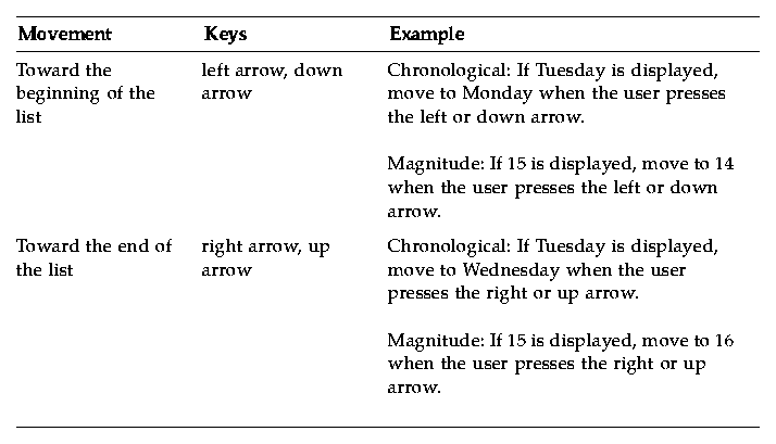
Recommended [ ]yes [ ]n/a [ ]no
hy:
- Values can be set using the arrow buttons or through keyboard input. Values should be evaluated immediately upon entry. If a value is entered that is already in the list, scroll to the position of that entry in the list.
Recommended [ ]yes [ ]n/a [ ]no
hz:
- If entry of non-listed items is permitted, use the following behavior. When a new value is entered, scroll the list to the position appropriate for the new entry. If the user scrolls off the new entry, scroll to the next appropriate value in the list and the keyboard-entered value is lost.
Recommended [ ]yes [ ]n/a [ ]no
ia:
- On entry of an invalid value, an auditory warning and error message should be provided.
Text
Required [ ]yes [ ]n/a [ ]no
7-59:
- In a multiline text component, the Up Arrow key moves the location cursor up one line, and the Down Arrow key moves the location cursor down one line. In a single-line text component, the Up Arrow key navigates upward to the previous component, and the Down Arrow key navigates downward to the next component, if the text component is designed to act like a basic control.
The up and down arrow keys provide a uniform means of navigation within text components.
Required [ ]yes [ ]n/a [ ]no
7-60:
- The Left Arrow key moves the location cursor left one character, and the Right Arrow key moves the location cursor right one character.
The Left Arrow and Right Arrow keys offer a consistent way of navigating within text components.
Required [ ]yes [ ]n/a [ ]no
7-61:
- In a text component used generally to hold multiple words, Control+Right Arrow moves the location cursor to the right by a word, and Control+Left Arrow moves the location cursor to the left by a word.
Control+Right Arrow and Control+Left Arrow provide a uniform way of navigating by words in a text component. Moving right by a word means that the location cursor is placed before the first character that is not a space, tab, or newline character after the next space, tab, or newline. Moving left by a word means that the location cursor is placed after the first space, tab, or newline character preceding the first previous character that is not a space, tab, or newline.
Required [ ]yes [ ]n/a [ ]no
7-62:
- In a text component used generally to hold multiple words, the Begin key moves the location cursor to the beginning of the line, and the End key moves the location cursor to the end of the line.
These keys allow the user to move quickly to the beginning or end of a line of text in a text component.
Required [ ]yes [ ]n/a [ ]no
7-63:
- In a multiline text component, Control+Begin moves the location cursor to the beginning of the file, and Control+End moves the location cursor to the end of the file.
These keys permit the user to move quickly to the beginning or end of a file in a text component.
Required [ ]yes [ ]n/a [ ]no
7-64:
- Your application uses Spacebar or Shift+Spacebar to insert a space in a text component. Modifying these with Control invokes the normal selection function.
This specification ensures that selection is available from the keyboard in a text component.
Required [ ]yes [ ]n/a [ ]no
7-65:
- Return in a multiline text component inserts a carriage return. The Enter key or Control+Return invokes the default action.
This specification ensures that activation is available from the keyboard in a text component.
Required [ ]yes [ ]n/a [ ]no
7-66:
- In a multiline text component, Tab is used for tabbing. In a single-line text component, Tab is used either for tabbing or to move to the next field.
Tab is used for tabbing in multiline text.
Required [ ]yes [ ]n/a [ ]no
7-67:
- If a text component supports replace mode, insert toggles between insert mode and replace mode.
By default, the component starts in insert mode, where the location cursor is between two characters. In insert mode, typing a character inserts the character at the position of the location cursor.
In replace mode, the location cursor is on a character. Typing a character replaces the current character with that newly entered character and moves the location cursor to the next character, selecting it.
These rules ensure the uniform operation of a text component with a replace mode.
Required [ ]yes [ ]n/a [ ]no
7-68:
- Your application uses BSelect Click 2 to select text a word at a time.
Double-clicking with mouse button 1 provides a convenient mechanism for selecting words in a text component.
Gauge
Required [ ]yes [ ]n/a [ ]no
ib:
- A gauge is similar to a scale except that a gauge is a display-only device with no user interactions. The appearance of a gauge is similar to a scale, but the gauge lacks a scale slider.
Optional [ ]yes [ ]n/a [ ]no
ic:
- Despite being a display-only device, a gauge should get keyboard focus so that the user can access Help or Settings for that control.
Accessibility
Recommended [ ]yes [ ]n/a [ ]no
id:
- All application functions are accessible from the keyboard.
Recommended [ ]yes [ ]n/a [ ]no
ie:
- Colors should not be hard coded.
Recommended [ ]yes [ ]n/a [ ]no
if:
- Graphic attributes, such as line, border, and shadow, should not be hard coded.
Recommended [ ]yes [ ]n/a [ ]no
ig:
- Font sizes and styles should not be hard coded.
Recommended [ ]yes [ ]n/a [ ]no
ih:
- All application code uses descriptive names for widgets. Such descriptive names for widgets using graphics instead of text (for example, palette items and icons) allow screen reading software to provide descriptive information to blind users.
Recommended [ ]yes [ ]n/a [ ]no
ii:
- Interactions do not depend upon the assumption that a user will hear an audible notification.
Recommended [ ]yes [ ]n/a [ ]no
ij:
- Where appropriate, users can choose to receive cues as audio or visual information.
Recommended [ ]yes [ ]n/a [ ]no
ik:
- The application does not overuse or rely exclusively on audible information.
Recommended [ ]yes [ ]n/a [ ]no
il:
- Users can choose to configure the frequency and volume of audible cues.
Recommended [ ]yes [ ]n/a [ ]no
im:
- Tear-off menus and user configurable menus for key application features may be provided for users with language and cognitive disabilities.
Recommended [ ]yes [ ]n/a [ ]no
in:
- Application keymappings do not conflict with existing system-level key mappings reserved for access features in the X Windows server as shown in
Table 10-6.
Table 10-6 Keyboard Mappings for Server-Level Access Features
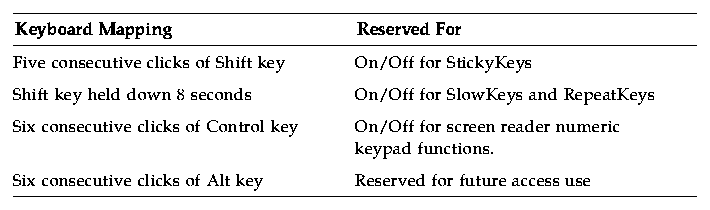
Generated with CERN WebMaker